Complete marketplace website design requires investment. It may need a professional engineering team, marketing assistance, and financial consulting. At least, these are the most popular things you should consider when planning to create your own marketplace.
In the industry, marketplace UX design is often undeservedly omitted. In Codica, we value marketplace design as its main goal is to attract customers and, thus – increase revenue.
High-quality solutions will not only improve your online marketplace design. With a smooth and creative design, you can easily gain your customers’ trust and make the user journey on the website simple and convenient without any additional clicks or distractions.
So, read our expert guide to learn how UI/UX will make your marketplace a lovely place to sell and buy.
What is UI/UX design?
When delving into the design, it’s crucial to understand what UI and UX stand for and how they balance each other.
UI design. It stands for user interface and covers all stylistic parts of the screen. In other words, all interface elements the user interacts with: input controls, navigation elements, and more. UI is about inspiration, where designers work specifically on style, colors, and other creative visual details.
For example, the popular online marketplaces we love like Amazon, Flipkart, and Walmart are very rich in terms of functionality, yet very simple in usage. In this matter, designers ensure that all UI elements are clear and visible, all demanded functionality is accessible and stands out and the user’s attention is focused where the designer wants it to be.
UX design. It stands for everything people experience while using a product, app, or website. This includes navigation within an app, interacting with buttons, website loading speed, or the app’s responsiveness while the connection is bad.
UX designers often compose user flows – a diagram that documents every step within an app or website. Such illustrations come in handy to plan new features or improve existing ones.
In UX design, attention to detail matters. As a great example, take a look at how Slack decides when to send a simple notification to the user.
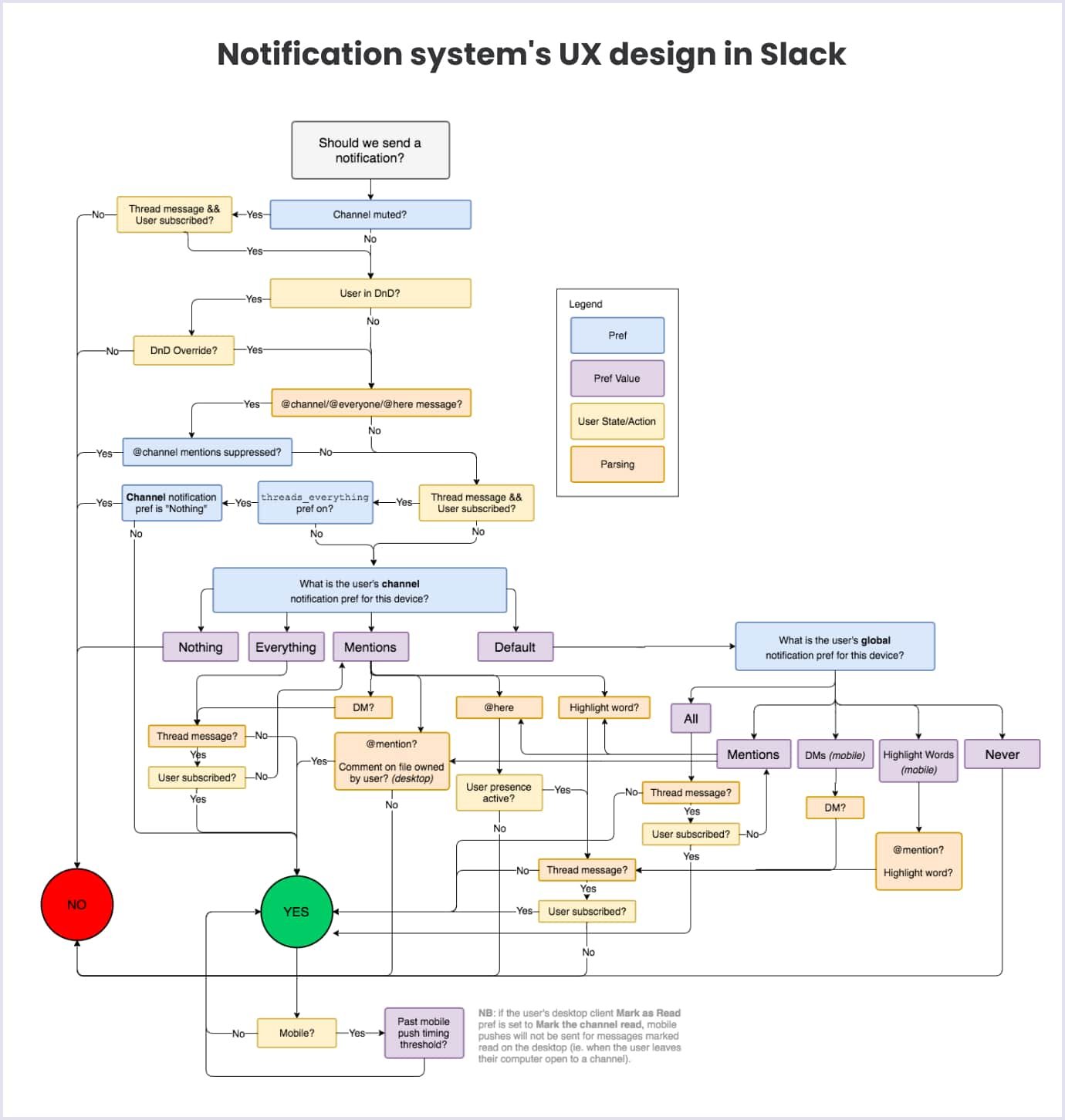
As we see, even the smallest things are thoroughly designed to ensure the best user experience. This way of thinking about small details is what you should be looking for when hiring a professional business team to take care of your product.
The role of UI/UX design in marketplace development
We all love eye-catching designs that stand out. Lovely color palettes, intuitive icons, and a clear user-friendly style are able to attract many people to your marketplace. With enough time and effort investment, a well-thought-out online marketplace design can do wonders in terms of money and daily visits.
Speaking of examples, Uber is quite fitting. Everything from the website to the mobile app’s background is designed in solid monochrome colors. Such an accent on the palette and different fonts greatly associates with confidence and reliability.
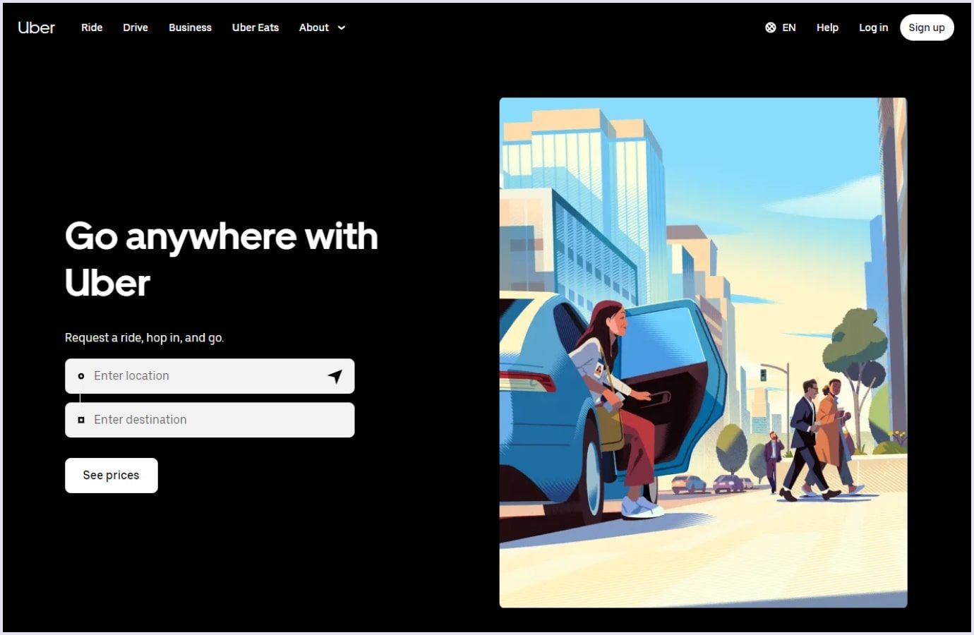
Apart from the visual aspect, thoughtful UI/UX design services can help you fix many problems that don’t depend on the engineering team. When, for example, the user’s connection is slow, a UX designer may come up with a solution to hide the “frozen” screen behind a beautiful loading page.
What makes the marketplace website design even more valuable is that lots of businesses have alternatives, unless a marketplace offers something very unique. In other words, a rational design approach helps to stand out among rivals.
Related reading: Top UI/UX Trends to Follow in 2024
We successfully implement this strategy when working on all of our products at Codica. One of the most winning design decisions among our case studies was the lovely style of PlanMyKids, an online service marketplace for booking kids’ spare time activities.
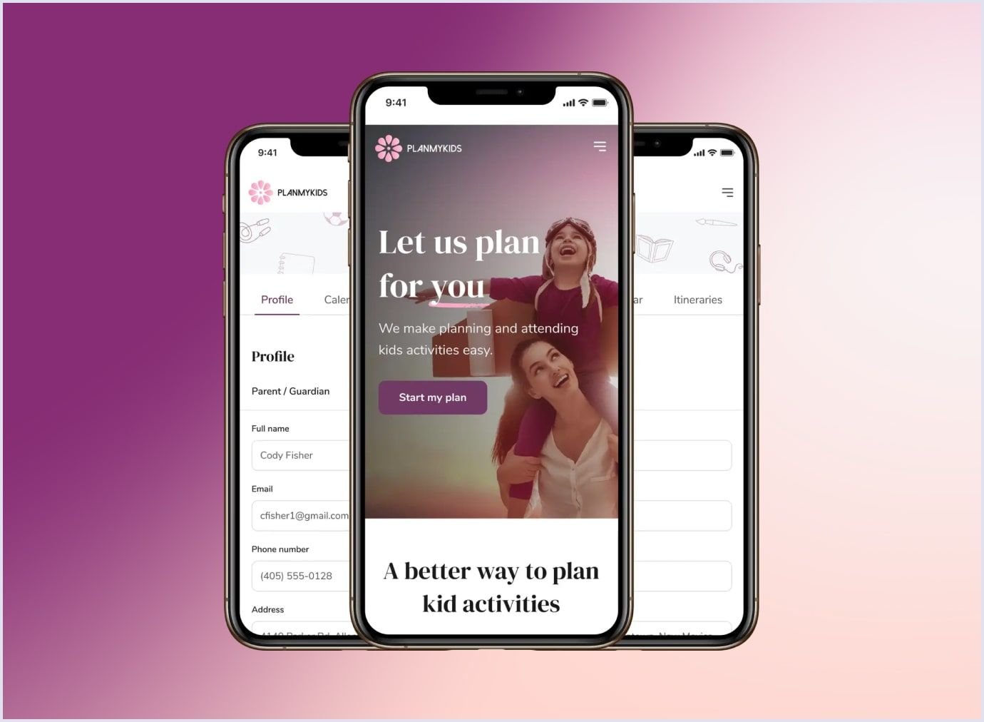
This PWA custom marketplace was intentionally created to be more friendly. Being centric on kids and their activities, PlanMyKids focuses on details – typography, illustration, and color palette. We aimed at making the product easy-going at a glance, attracting both parents and their children.
By combining powerful tools like React, Ruby, AWS, and many others, we shipped the final version accessible on mobile and desktop within the discussed time span.
What problems does marketplace design solve for you?
While planning to build a marketplace from scratch, never omit designers' participation and their potential contribution. A thoroughly planned app can reveal many lacking elements in both early and late-stage development. Let’s look at some of them and see what problems might show up in a marketplace and what approach designers think of to fix them.
Problem 1: low user involvement
Every marketplace’s main target is to attract new visitors and care about retaining the actual ones, as the income directly depends on their activity. Low customer acknowledgment might be very frustrating and, at first glance, impossible to fix. That’s the point when designers come into play, as their work can do wonders with the right plan and strategy. Here are some solutions to increase your marketplace’s conversion rate.
Make clear marketplace idea
First of all, make it evident and catchy what goods and services your platform sells. Clarify accents on things your users potentially search for on your marketplace. Average Internet searchers don’t really like solving puzzles. Instead, everyone needs things to be easy to find and accessible. Your marketplace philosophy and mission should be apparent to any platform visitor from the first seconds they spend on the website.
Build the marketplace with customers in mind and make sure they know what your website is about and what to do next at each stage of the purchase. Show the main product offerings so that everyone can start shopping immediately, without hesitation or wearisome search session through thousands of filters.
The online marketplace development team, apart from building a working website, has to create a site that loads faster, boasts user-friendly animations, and runs smoother. Remember that small details you might not pay attention to matter to others and may influence their moods.
The ultimate solution to make your customers stick to your website more is not to overload the page with ads. Yes, ads are an important part of income and your marketing strategy, but they have to be shown naturally and not cover any actual products or sections.
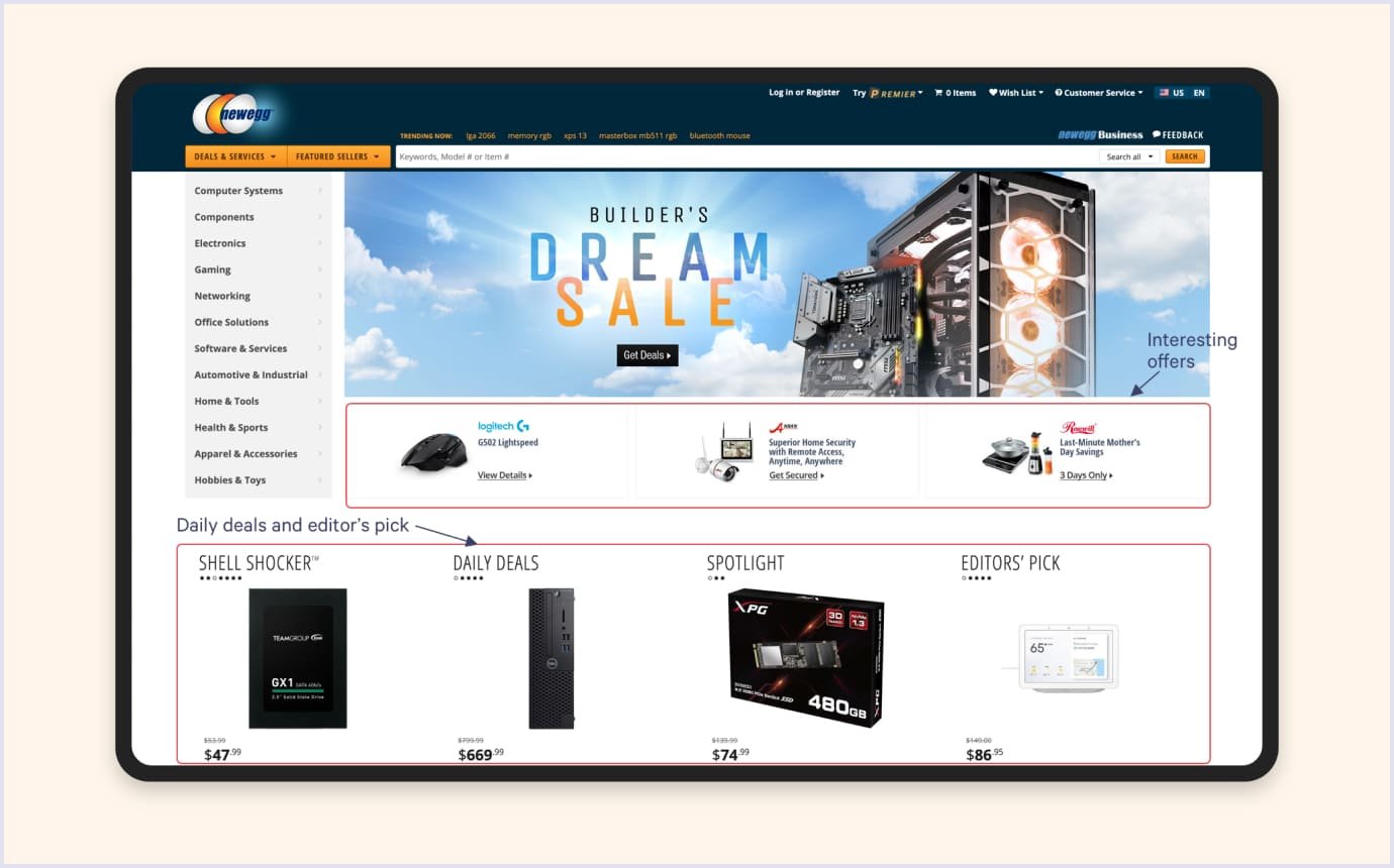
Let’s take the Newegg website as an example, which offers PC and electronics related products. Everything is arranged perfectly, so you can seamlessly reach the data needed.
Related reading: Common Web Design Mistakes to Avoid
Nice and clean design
Anyone can remember that one awful website experience when there were just too many objects on a screen with an old-school background. Probably ads were ruining the user experience, or maybe a poorly created user flow. Whatever it is, the designer's main responsibility is to cover all issues and create the most comfortable experience for sellers and buyers.
Nice and clean design plays an enormous role. Although most marketplaces usually have rich functionality, many categories, or different sections, all these features must be thoughtfully designed so as not to confuse the potential customer.
As an example, one of our designers in Codica suggested probably the most significant thing most marketplaces pass on. It is all about proper categories section design. They must always be neat and compact, offering users additional buttons only if needed.
However, final design decisions strongly depend on the niche of your marketplace.
Say if you are planning to list literally everything as AliExpress does, create a smart system to divide goods into subcategories (i.e., electronics, domestics, clothing, etc.). On the contrary, if your major niche is narrow, the fewer options customers see, the faster they will find the needed one. Let’s list some more of those categories' improvements:
- Use phased displaying if there are many categories. This technique allows to collapse of a category to see more and hide it accordingly;
- Different subcategories can occur within different directory structures, but overlapping ones should not be added (i.e., “cosmetics” and “herbal cosmetics”);
- Avoid too many details as the screen becomes too cluttered;
- Don’t lump a bunch of sections into one category (i.e., “smartphones, tablets, audio, and gaming peripherals”);
- Hide categories without goods. Make sure sections without something to sell automatically hide so as not to confuse visitors;
- Make your sections look the same on both mobile and desktop versions;
- Consider sorting your categories by popularity or user preferences.
Problem 2: low traffic
Traffic stands for the number of people who visit a certain website. Everything that brings money to a marketplace involves traffic because the more people visit the site or see your ads – the more purchases they will make. This indicator totally relies on marketing teamwork, which in turn consists of designers, SEO specialists, promoters, PR, and sales managers. The main reasons why low traffic may have its place are as follows:
- The website doesn’t keep up with the latest design trends;
- Lack of cross-platform optimization;
- No search engine optimization (SEO);
- Outdated information;
- Long loading time.
Optimize for mobile users
Nowadays, smartphones can do practically everything the PC can. No wonder many corporations or startups building their products just have to consider cross-platforming.
According to Global Stats, as of March 2024, 47.81% of all web searches are mobile, whereas 52.19% are from a desktop. Considering that mobile users account for almost 50% of the market, it would be reasonable to turn to cross-platforming when developing a marketplace.
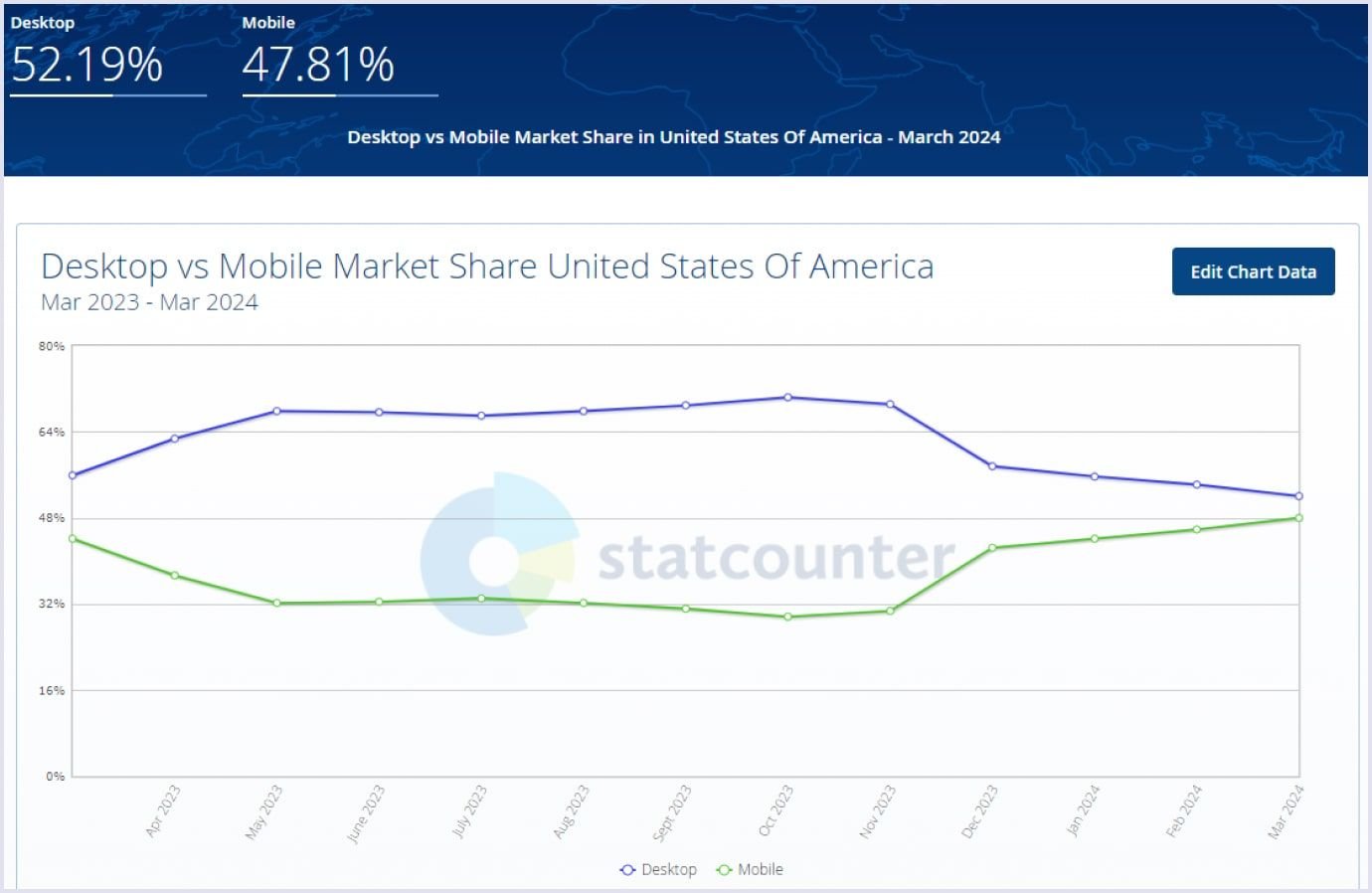
The important thing to notice is that the web design of a marketplace has to be practically the same on every platform, whether desktop or mobile. Don’t consider significant style changes on new platforms, as they may be uncomfortable for long-time buyers. Besides, it will be more difficult to maintain two different versions.
Make intuitive user suggestions
When we start using any popular modern app, it asks us about our preferences. X (Twitter) allows you to personalize the content you see, your visibility for others on X, set preferences for direct messaging, and more. These techniques are mainly used to show users what they might like instantly.
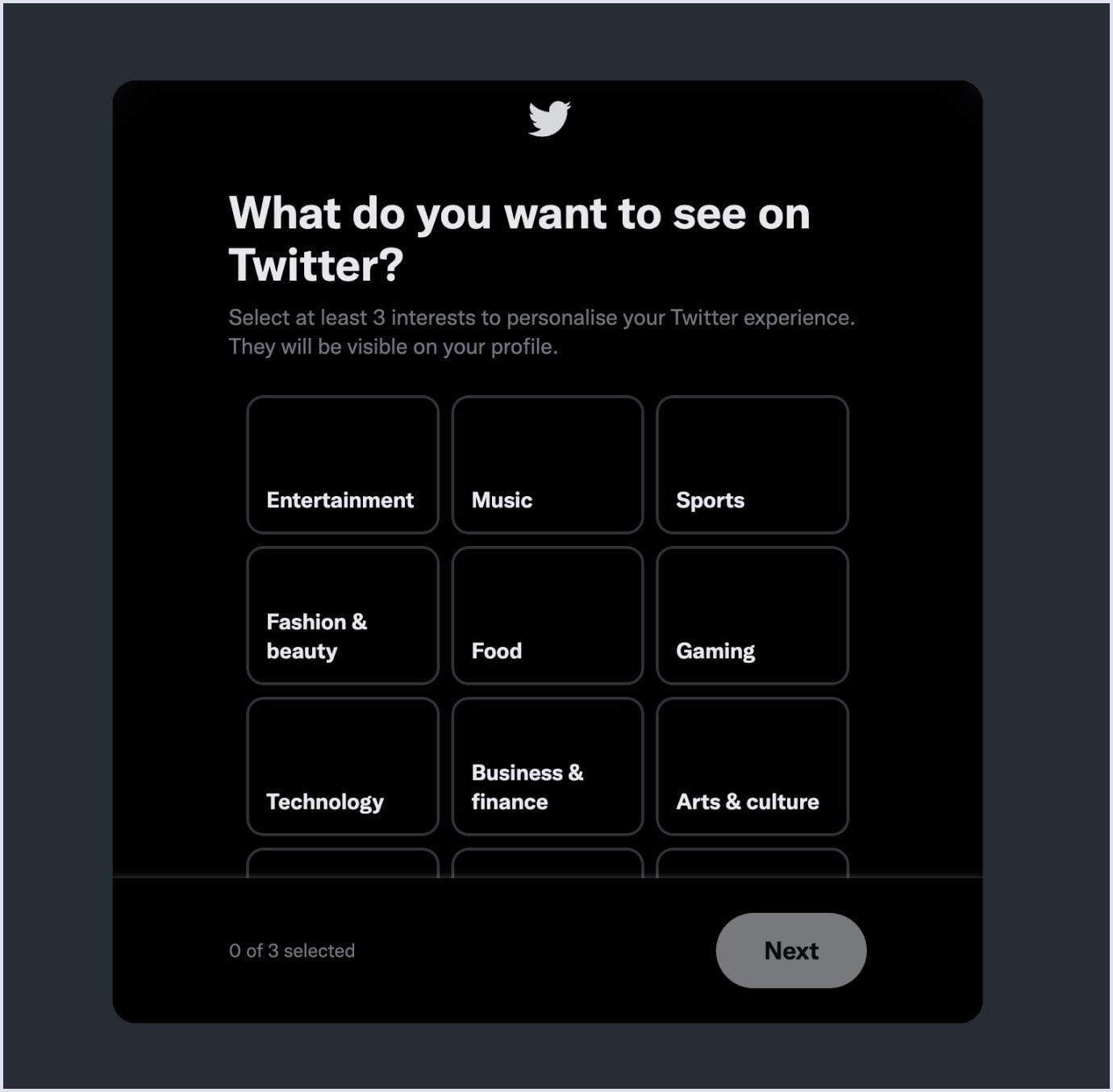
The speed with which people can find what they are looking for is super important. In this case, intuitive user suggestions will be a nice addition to your marketplace. Luckily, modern technologies can provide this functionality with one single integration.
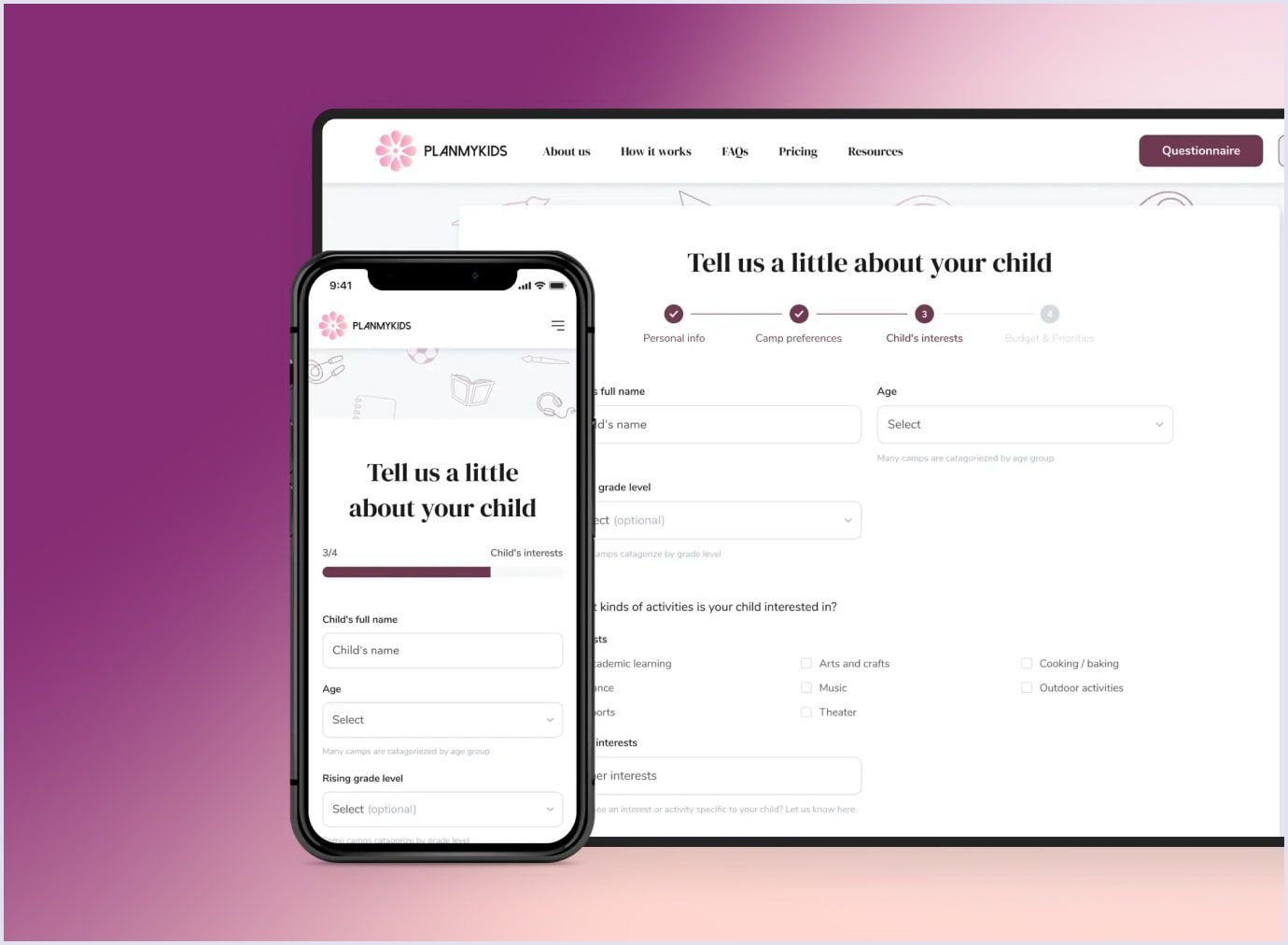
In Codica, when we need to take advantage of users’ preferences and suggest the best of what they might like, we use Zoho Forms. For instance, the same activity booking platform we mentioned earlier also utilizes user preferences. It allows us to suggest the best activities for kids based on their hobbies, age, location, and other variables.
Problem 3: lack of trust
Your marketplace’s success heavily depends on safety and reliability. This ensures your customers won’t hesitate before making a purchase. Moreover, even if they have a bad experience with a refund or suspicions of forgery, they won’t return.
Think of popular services we use every day. What makes you feel confident that there’s nothing to worry about? Probably, they have many collaborations with other trustworthy platforms, or maybe they have been on the market for years already. It’s the designer's job to attract users’ attention to how safely the transaction will go.
Besides, a massive part of a designer’s work has a demonstrative function. For instance, they have to persuade the vendor of the platform’s reliability naturally. The more promising your marketplace is, the more likely vendors will list their goods. Thus, it will help you solve the chicken and egg problem when attracting buyers and sellers to your platform.
Now, let’s look at how to make your marketplace feel safer and earn customers’ trust.
Full product description
Regardless of what products or services you will sell, you must provide a description. Customers tend to pay attention to overviews, especially when the purchase is pricey. Thus, providing a detailed description of the product will ensure customers know what they’re about to buy. Similar descriptions were implemented in TradeRVs – an online marketplace for campers.
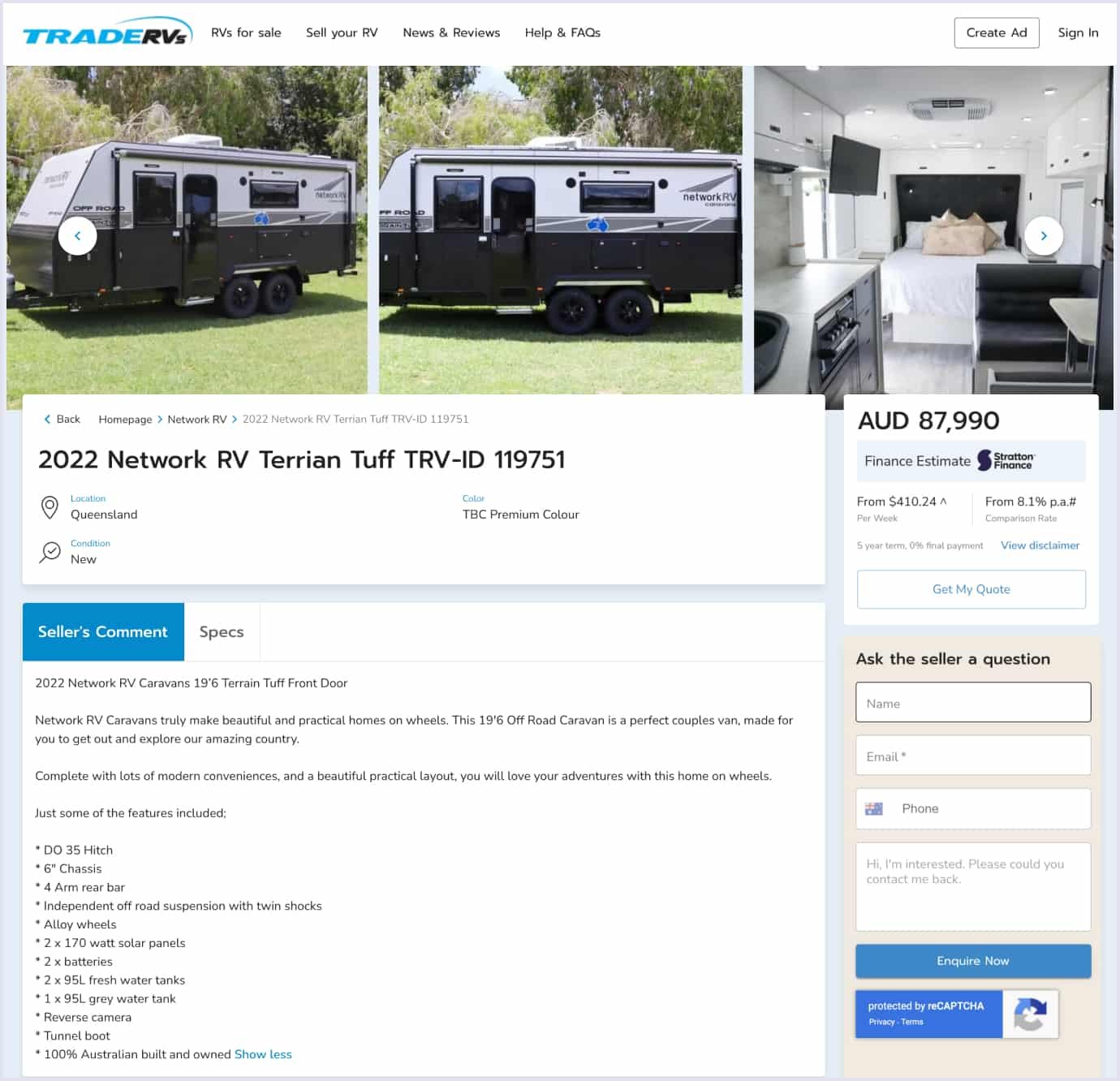
Product or service descriptions are also a great way to showcase creativity. A good designer can compose a product page not only with simple images and textual characteristics. Adding video overviews, showcases, and even 3D tours became popular. However, all of these require additional time to design and develop.
Verified payment methods
Everything that covers transactions, bank details, and money requires a well-thought-out payment process. This point is essential for your business as your users will constantly purchase and expose their private information to the website. Thus, they automatically expect transactions to be safe.
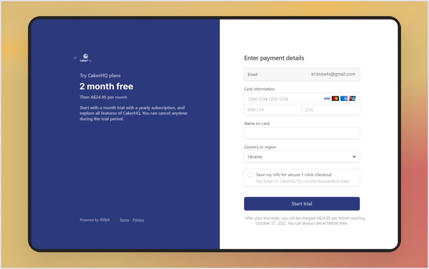
Companies use many trustworthy payment integrations nowadays. Based on our experience, we recommend using Dwolla or Stripe for two-sided marketplaces, BitPay or Coinbase for blockchain-based platforms, and Google and Apple Pay are the best mobile payments.
Ratings and reviews
When a marketplace grows, more goods appear, and the ability to leave feedback becomes significantly important. This way, customers acknowledge others about small but catchy details of the product, suggest changes, and more. Generally, both seller and customer benefit from the review option as it’s the right way to improve. Apple’s AppStore is a great example of this interaction.

For instance, when single developers publish their new apps on the store, users’ feedback often sets the tone for further version updates. Some clients need a toggle to change dark/light mode, some demand more accessibility features.
Besides, adding micro markup to reviews and scores on the marketplace is also quite beneficial. This allows you to rank a marketplace higher in search results and, thus, attract more clients.
Integral parts of marketplace development
In Codica, our designers have rich experience working on big marketplaces’ memorable styles. Consulting with the UI/UX designers team revealed their approach and what marketplace features they focus on the most during development.
Convenient search system
A comfortable marketplace search UX system is a must to make the user experience flow as smoothly as possible. First, the search text field and a button must stand out a bit to be fully visible. To do so, designers use more saturated colors, increase the font size, or add text formatting.
Having a thought-out set of filters and a conveniently built catalog in the web design of a marketplace is also beneficial. People don’t have time to search for the right category and often don’t want to. The most winning approach is to test the functionality you built in an early access form. This method allows a limited number of users to try your product and see whether everything works as intended. Later, you can always publish updates and performance improvements.
Navigation
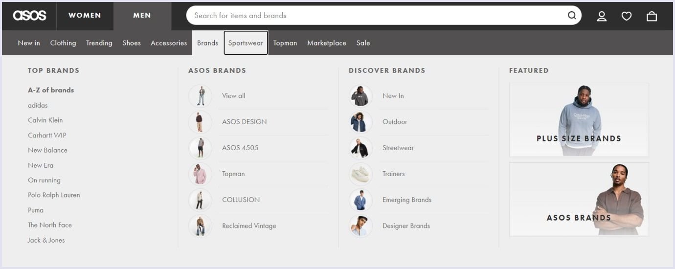
Proper navigation in the marketplace, which is very interconnected with the search system, deserves a separate paragraph due to its importance. Without wisely designed navigation, the convenient search system we mentioned earlier feels useless, as users will simply get lost in the marketplace.
Structured navigation logic can save time and effort in finding needed goods. For instance, both headers and footers have to be accessible and understandable at a glance.
Another important thing is the so-called “bread crumbs”. In web design, they stand for secondary navigation helpers. They display the user’s position on the website. Looking at bread crumbs, customers can see in which category they are in right now.
Also, with this feature, you can easily rewind to the previous page without the need to scroll again or retype their search parameters.
Loading speed
Proper optimization is the key to establishing a stable connection between your marketplace and the end user. This process covers several important aspects, such as improving page loading speed and optimizing visual content.
To make your website load faster, decrease the number of HTTP requests on your page. Overall, pay attention to small details: compress files and website pictures until they reach optimal size and quality, and make sure all fonts are clear and everything works as intended on all platforms, including desktop, mobile, and tablets.
Another good tool web designers use is Google PageSpeed Insights. PSI analyzes users’ overall experience and shares suggestions for improvement. With many valuable metrics, this service has become entirely accurate and reliable regarding website optimization.
Shopping cart
In marketplaces, a shopping cart is the page where users add items they decide to buy. We adhere to some core principles when designing the right cart functionality.
- Visualization. Listed goods must have an image. Moreover, the image has to be the same as in the catalog where the user decided to buy it.
- Compact but informative. Items in the cart have to be compact, as users may make many purchases. At the same time, goods icons must provide all the necessary information, such as color, size, and a universal product code (UPC).
- Flexible. Let users return to the product page with a click/tap gesture as they may change their plans. Ideally, you can also add this functionality within the cart so users can add more or delete goods without leaving it.
- Details are important. Allow people to see them opportunely. Adding some brief information (if applicable), like a warning about shipping issues, a stock shortage, and a reminder to set the delivery address, would be a great decision.
- Accessible from everywhere. Let people seamlessly access their carts despite whatever they are doing now. We recommend placing a cart button in the header, along with other essential shortcuts. You can also take it to another level by adding a cart pop-up whenever users browse goods to create the best marketplace UX.
Checkout stage
Speaking frankly, the checkout stage is the last step that separates you from earning and the client from their purchase. Pay special attention to the smallest details and eliminate any issues sellers and buyers might encounter.
The checkout stage should be divided into short steps. Four subpages with two text fields are comfier than a single page with eight blank spaces. Checkout is the final stage where trust issues may appear. For instance, pay close attention to the third-party payment integration you use. It must be certified and time-tested. Thus, ensure everything works naturally and users feel comfortable with the process thanks to the marketplace UX.
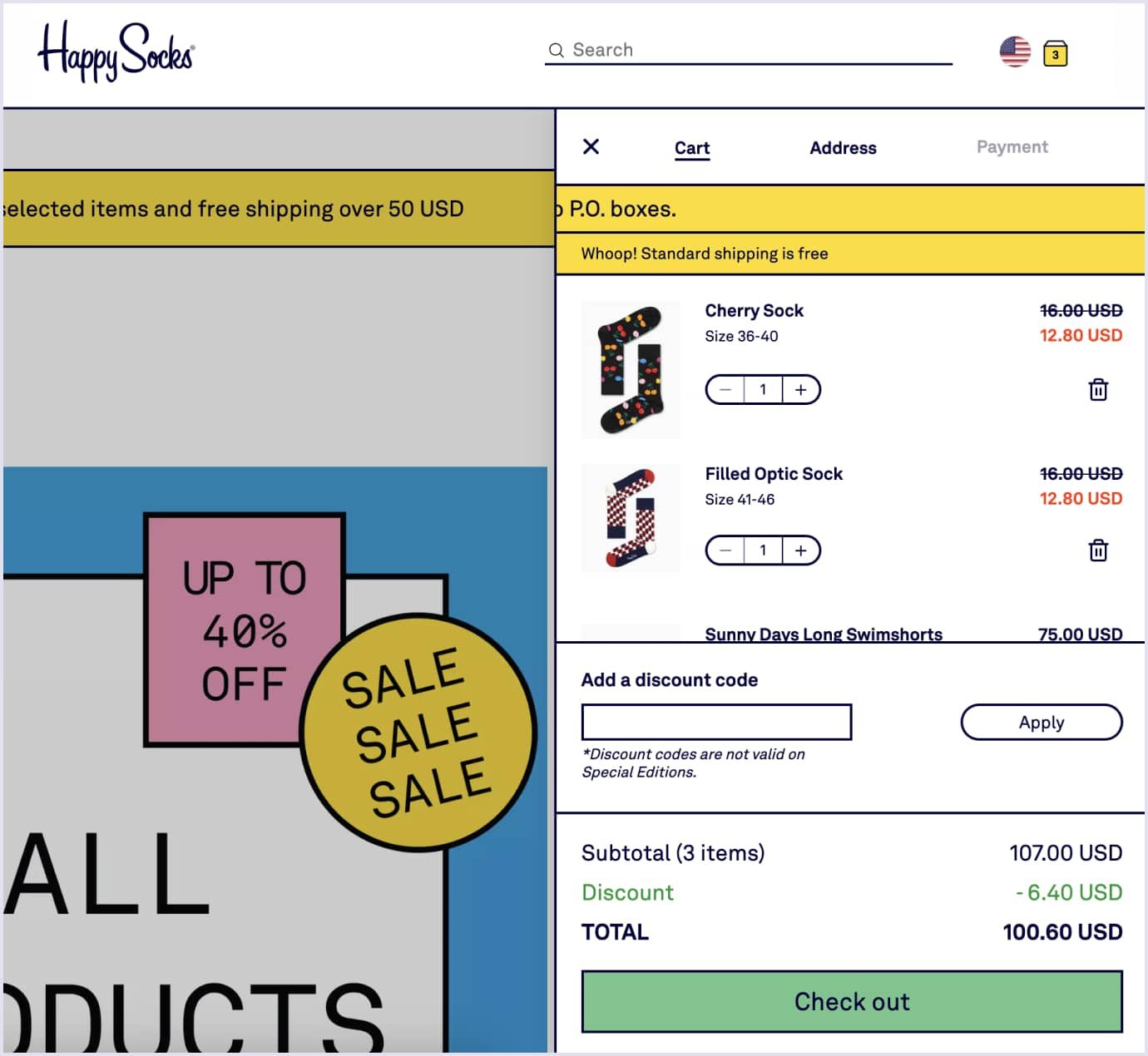
Integrate a reliable payment system and add badges that ensure the purchase process is totally secure. Alternatively, you can add quick payment methods like Google Pay and Apple Pay. This method works particularly well in marketplaces’ fast-growing environments.
After the payment, you can add information about your brand's mission and future growth plan. This would be particularly appropriate if your marketplace is relatively new and hasn't been tested for years.
Your profile
Web purchases, as many users say, are sometimes associated with risk. Indeed, there are many doubtful sellers or marketplaces on the Internet. To ensure your marketplace won’t get listed there, let users set up their accounts along with other suggestions mentioned above. Not register-only ones with scheduled marketing emails, but useful accounts, with all the information users might need.
A personal account should generally have several key features, such as purchase history or parcel tracking functionality. Customers usually feel safer when they can see the approximate delivery time and where their parcel is currently.
Customers may also have various questions that not every FAQ part can predict. Adding a section to contact the support team, ask something, or receive a consultation would also be a key to success.
The same goes for different promotions, personalized sale offers, etc. In general, let your visitors see their account as their so-called “home” in your marketplace. Hopefully, they will stick around for a long time, and all these features will pay off.
Marketplace design workflow: Codica insights
Speaking from our experience, there’s usually a considerable gap between a simple marketplace concept and its proper implementation. We break down the design workflow into several steps to close the gap. In Codica, we take marketplace development seriously, involving multiple stages even before the engineering team starts to work. Here’s how our designers work on new projects.
Research
This is the point where we do our best to understand your vision of the future marketplace. We thoroughly study what average customers would need, what problems they might have, and how can the marketplace help to solve them.
After studying your product ideas, we analyze the market. We figure out potential competitors and set a plan to develop a platform for your online marketplace.
The research stage helps you create a thorough plan, optimize the development, and reduce the costs of building a marketplace.
Prototyping
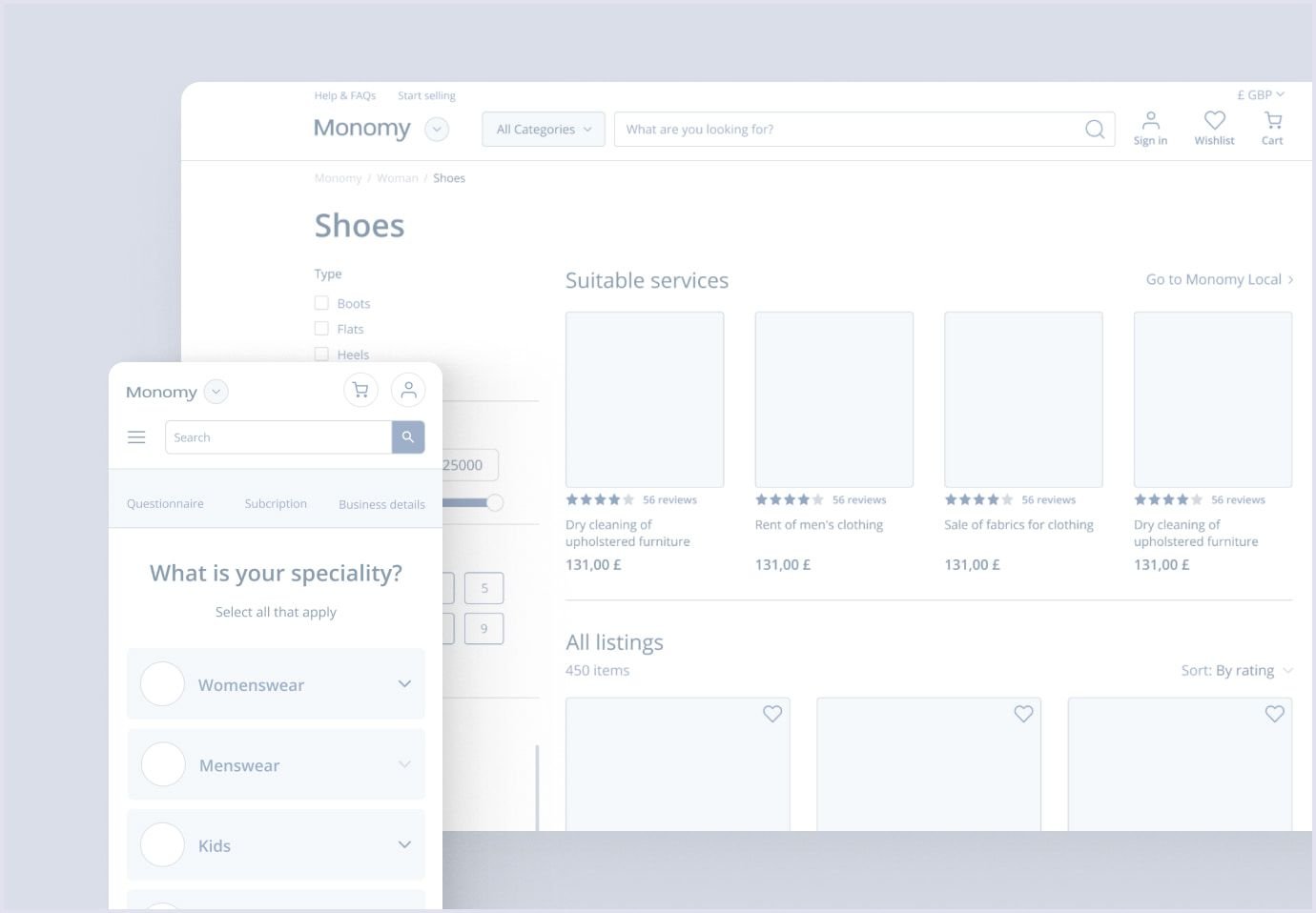
When we want to deliver the best marketplace UX, logic is essential. Prototypes are an excellent tool for visualizing the workflow and avoiding potentially harmful UX decisions. In the early development stage, adding or removing some parts is cheaper and more accessible than editing the code and publishing an update.
The prototype is a way to envision a user journey in the marketplace. Here, we zoom in on the patterns users follow and determine which parts are more critical than others.
In the prototyping stage, we add minimum coloring and avoid other stylistic additions in the marketplace UX. Instead, we schematically visualize users’ flow. Later on, this early prototype can be made clickable and presented to the client.
A good example of using prototypes is an online marketplace platform we recently developed. Here, we built a detailed prototype of the whole app that covers every important aspect of the future product.
Visualization
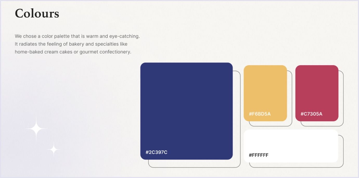
The visual brand of a marketplace is crucial. During this step, we develop logo concepts, possible color schemes, and fonts for the marketplace UI. These moments are essential as the dominating colors or logos usually form a firm association reference and make your product memorable.
At this stage, we cooperate with the client a lot, as they might reject some color schemes due to bad associations or personal liking. We do our best to envision their idea and, in the meantime, make it profitable, creative, and easy-going.
We did the same with CakerHQ – a custom SaaS solution for bakery. Our designers studied the idea and came up with a suitable color scheme and catchy fonts to deliver the best UI design.
Design
We compose documentation according to the visual plan we made. In these guidelines, we point out all required font sizes and styles and provide button assets, color palettes, and more. Having such tools is beneficial for all departments involved in development.
We use it to design all web pages, including those for different platforms like mobile or tablets. Guidelines are also a key tool for developers and engineers, as they can totally rely on them and focus on building a server-side UI, adding integrations, etc.
One of our recent projects is quite a fitting example. Combining B2B and C2C business models, we built an outstanding multi-vendor marketplace platform. In this project, we made a significant accent on design to make sure users feel safe and sound surfing through.
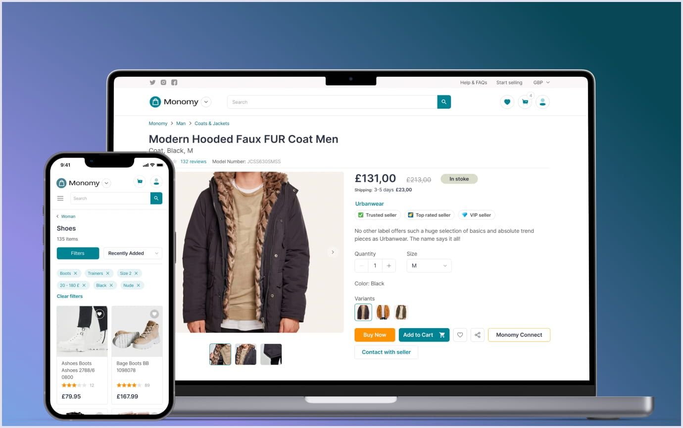
In the build, we used many tools mentioned earlier. For instance, we knew a proper search system is crucial to navigate consumers in a vast marketplace, so we successfully implemented it. Besides, knowing all those tiny details we took closely helped us to create a solid custom ecommerce marketplace solution with a rich yet easy-going design.
Again, referring to the improvement suggestions mentioned, we ensured the marketplace was trustworthy and that the payment details were delegated with Stripe integration.

Helpful UI/UX tips for marketplace owners
The marketplace is a fast-growing environment that highly relies on regular updates and trends. Nowadays, dozens of strategies exist to manipulate users' attention and provide the best experience possible. Let’s break down several worthy improvements we recently took advantage of.
Trends to follow
Trends fluctuate a lot. They may change on a seasonal basis or be absolutely unpredictable. To stay on the market, the whole team of designers, marketers, SEO specialists, and sales managers has to keep an eye on these changes and update content or design accordingly. People like following things that are popular, and implementing trending features can give a good boost to your marketplace startup sales and income overall.
By the way, check out our blog post on the top UI/UX trends 2024. Perhaps one of these trends will become the most fabulous idea for your digital solution!
For instance, technologies like motion effects, 3D visualization, and AI are now prevalent. Implementing 3D overviews of the goods you sell can benefit you easily enough. There are dozens of possible implementations for designers to consider. Our experience can be a handy example here if you feel uncertain about it.
When working on a real-estate SaaS platform, we successfully implemented 3D tours to let tenants see their future homes from any aspect and angle. You might have come across it, as, for example, many electronics marketplaces use them to show device overviews.
It turned out that this was a winning decision in the real estate realm. Now, estate providers can upload such 3D tours to attract more customers. Tenants, in turn, can take a closer look without needing to be physically present on site.
By combining robust backend services, a user-friendly UI, and a swift search system, we developed an outstanding product of which we’re truly proud.
UI card components
Recently, it became popular to use card components that lighten the visual load the UI/UX design for a marketplace. First and foremost, this approach facilitates planning. See, when website elements have similar card shapes, it’s easier to create a website’s blueprint. Thus, composing how the final version will look takes less time.
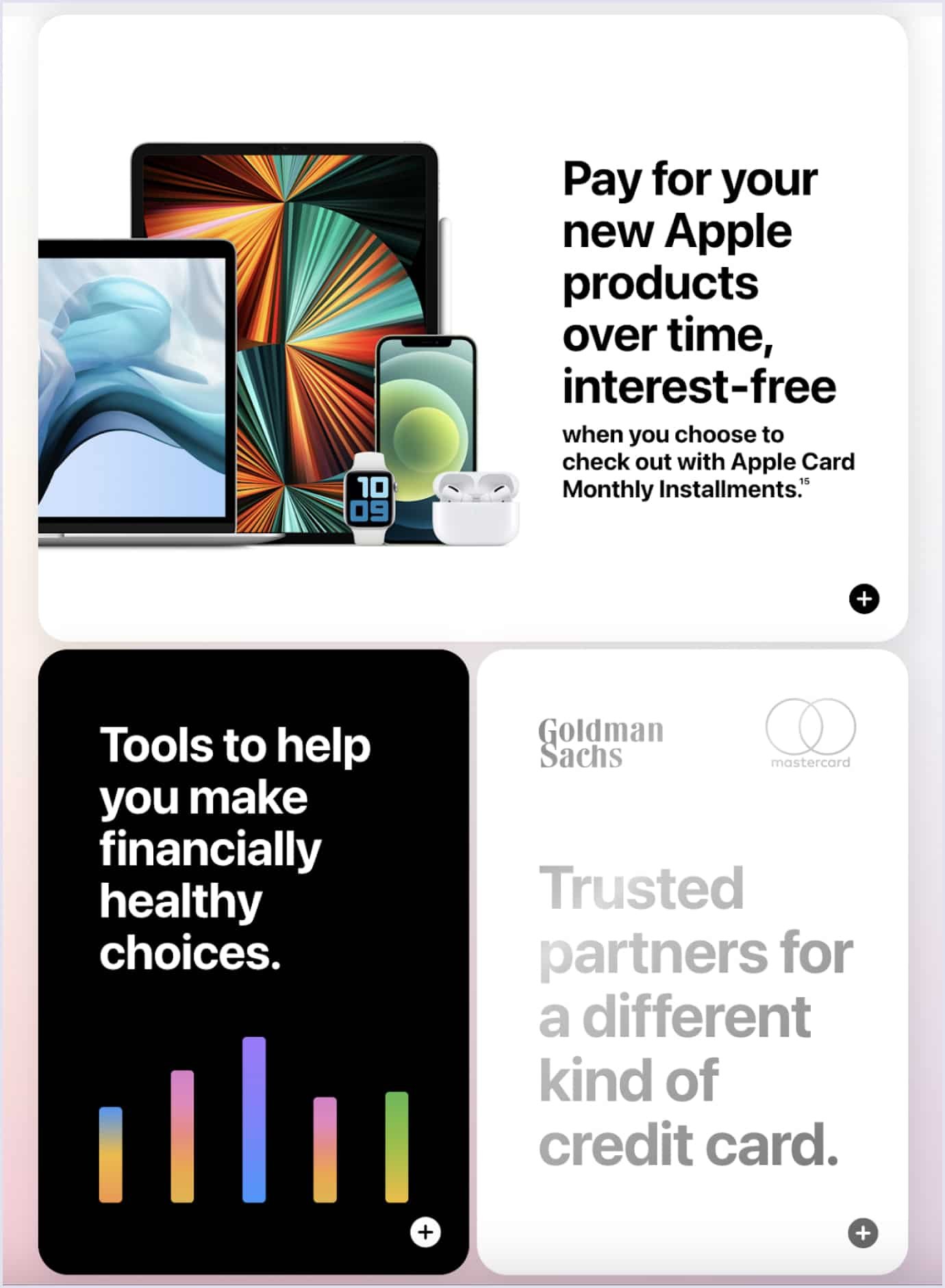
Such cards have to display only the most weighty information to the user. Rationally use all the available space, set accents, and be concise with the marketplace app design. This way, the information will be easier to read, and users will not feel confused. Our designers advise clearly prioritizing target actions, placing one contrasting CTA (call to action) button, and making it available on the page scroll.
Accessibility
In the web design of a marketplace, accessibility is not just a trend; it is a modern necessity. Nowadays, thanks to technology, we can create any website or app that is accessible to many people with different capabilities. Luckily, adopting it doesn’t require a lot of engineering power, but a thoroughly designed workflow for such users is super important.
Accessibility covers a broad range of crucial tools for different needs. These can be color scheme changes so colorblind people can enjoy your marketplace’s beauty or text improvements. Lastly, giving people with vision problems the ability to change font size is crucial, as they are also your potential customers. However, note that the design you create has to adapt to changes. For instance, make sure font changes don’t break the layout or cover images.
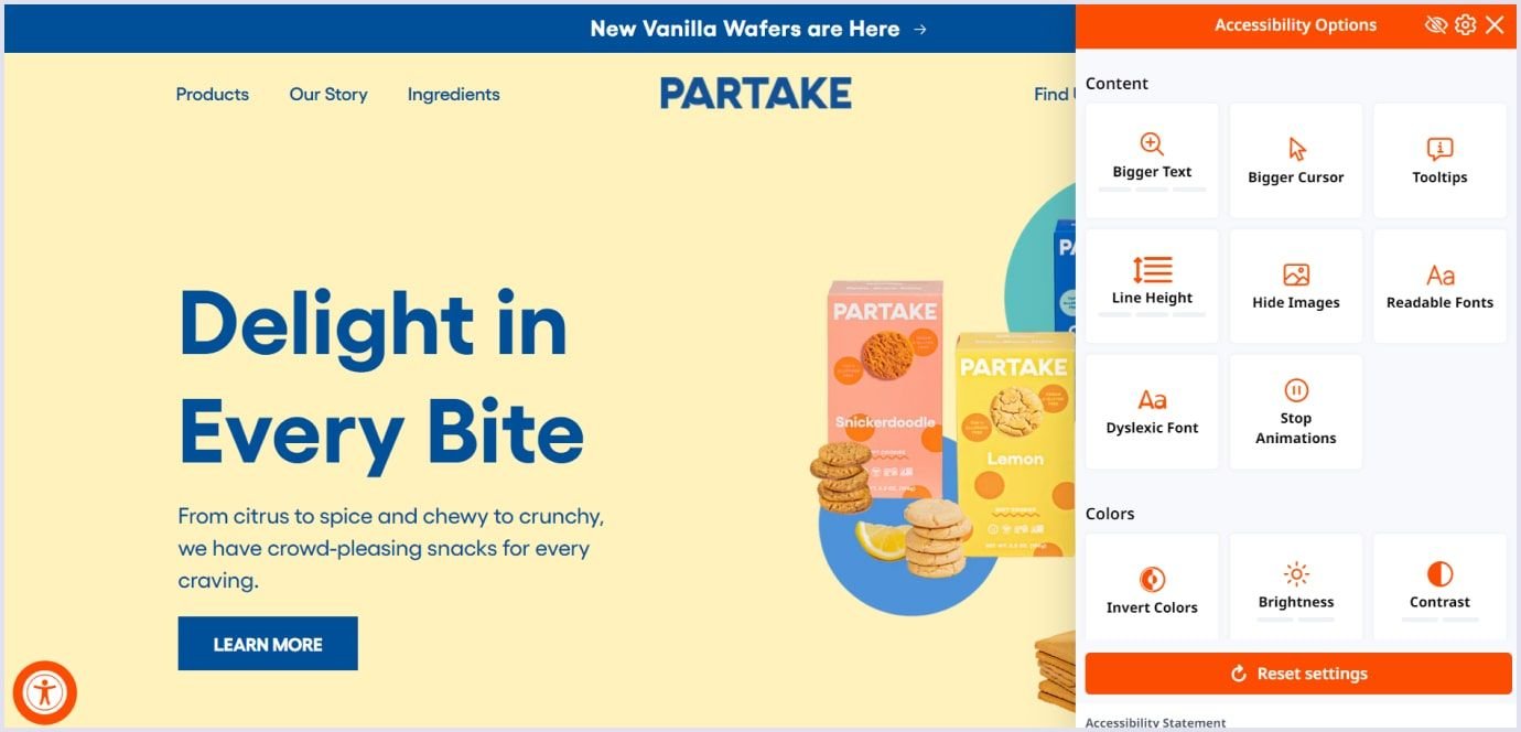
The Partake website is an excellent example of this matter. It allows customers to change numerous variables and add new functionality, like a screen reader or animation pause.
How you can avoid online marketplace UI/UX design mistakes
Creating a balanced and appealing UI/UX design for a marketplace is possible when you follow the best practices and standards. Let’s consider them in detail.
Put your customers first. You design your marketplace for your customers. So, your platform must be convenient and accessible to users with different goals, needs, and capabilities.
Approach the design with a mobile-first method. This technique has become necessary since almost half of the traffic comes from mobile devices, as we mentioned earlier. With this approach, your marketplace will be available to a broader audience, and you can expand your market outreach.
Keep the vital points clear and visible. Search, product details, checkout options, payment methods, taxes, and delivery statuses should be outlined and seen clearly. Thus, your marketplace will make selling and buying processes easy and smooth for your users.
Prove your marketplace to be a secure place. Include trust badges in your marketplace app design to highlight your security standards and technologies. Outlining your security practices will make your platform trustworthy and strengthen the connection with your audience.
The cost of UI/UX design for a marketplace
When calculating the marketplace’s UI/UX design cost, the complexity of your platform and the designers’ hourly rates must be considered.
In Codica, we provide UI/UX design services for $50 per hour. If you build a marketplace MVP (minimum viable product), it will take you around 200 hours to create its design. For medium to big platforms, it takes 200 to 400 hours to design a marketplace.
| Epic | Hours | Cost, $ |
| Design system | 16 | $800 |
| Manage listing & public page | 40 | $2,000 |
| Cart & checkout | 16 | $800 |
| Search & storefront | 32 | $1,600 |
| Homepage | 16 | $800 |
| Authentication & account | 32 | $1,600 |
| Orders | 16 | $800 |
| Chat | 16 | $800 |
| Dashboard | 8 | $400 |
| Email template, favs, cookies | 8 | $400 |
| Total | 200 | $10,000 |
Summary
Yes, the marketplace website design is challenging. To make it feel less so, a proper approach must be thoroughly thought out at all stages, from a concept to the final product.
Over the years, we have built a serious expertise background, worked on various marketplaces, and delivered glorious products. Head to our portfolio for more inspiring designs.
We hope our article helped you to focus on topics that deserve special attention as well as on those you should simply not omit.
If you run a marketplace that suffers from rivals or has low active traffic, we would be glad to help you with an outstanding design that supports your brand identity. Feel free to contact us, and we will be in touch within one business day to discuss your project and give you a free quote.

