Colors in web design are like paintbrush strokes that give life to a digital canvas, infusing emotions, guiding interactions, and defining identities. Like artists select hues from their palette, web designers meticulously choose colors to create a visual symphony that resonates with visitors.
In fact, colors surpass mere aesthetics; they wield psychological influence, setting the mood and evoking reactions. Colors in web design also serve as a language, conveying brand messages and cultivating recognition. The right palette can encapsulate a company's ethos – bold and adventurous or minimalistic and refined.
So, colors in web design are the emotional conduits that transform pixels into experiences. They create connections that resonate with visitors, leaving an indelible imprint of a website's essence long after clicking away.
Imagine you've already formulated a specific color palette for your website. It's a promising beginning. But it's crucial to deliberate on the message you wish your website's color scheme to convey before impulsively diving in.
Questions arise: should my design exude warmth? Audacious provocation? Or perhaps intellect and refinement?
Our expert team has prepared a thorough and immersive guide that will help you decide on the best color wheel for your solution. So, let’s dive in, shall we?
The importance of the website color schemes
The significance of website color schemes goes beyond mere visual appeal. These color combinations possess the ability to shape user behavior and perceptions in impactful ways.
Below, you can see an exploration of their importance.
Boost conversions
The colors you choose for your website can substantially impact your conversion rates.
As per a study conducted by Quick Sprout, a staggering 90% of product evaluations hinge solely on color. Color itself plays a substantial role (making up 85%, to be precise) in the decision-making process for consumers when they choose to buy a particular item. Considering the provided statistics, it is a reasonable deduction to make that the presence of colors significantly impacts the rate of conversions.
Different colors can evoke specific emotions and steer users toward desired actions. By strategically implementing colors that resonate with your target audience, you can instill feelings of trust, urgency, or comfort, effectively guiding visitors to make purchases, subscribe, or engage more deeply.
Establish brand identity
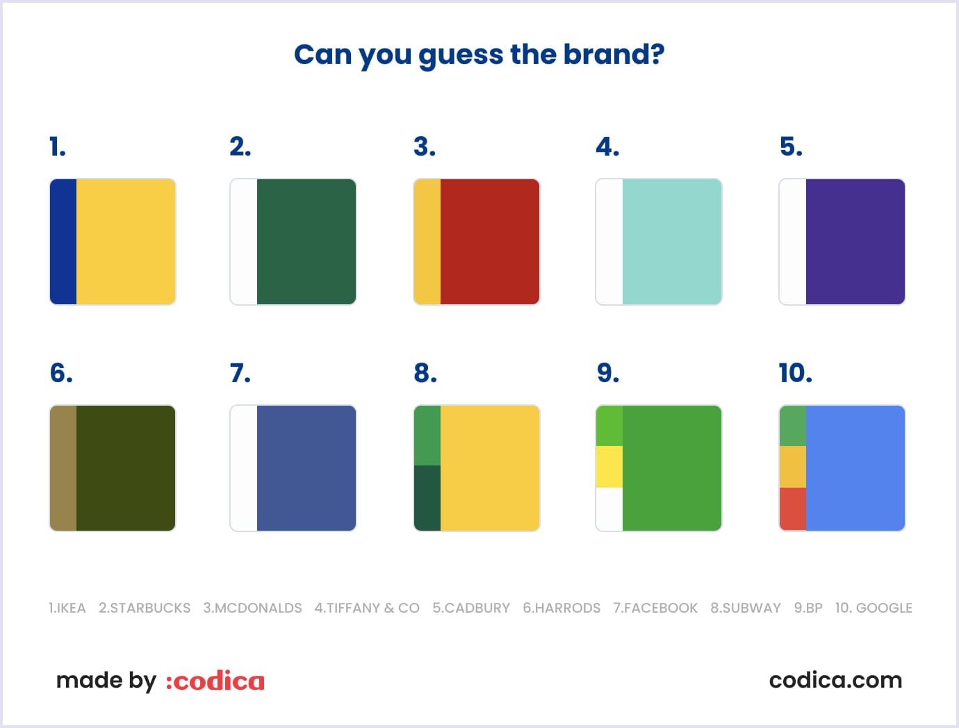
Colors play a central role in defining your brand's identity. Making prudent selections of brand colors shapes the way in which individuals perceive your brand. Incorporating a distinctive color linked to your brand can result in an impressive 80% enhancement in brand recall.
Consistency in color usage across your website aids in reinforcing your brand's character and principles. When visitors associate your website's color palette with your brand, it enhances brand recall and fosters a stronger affinity. This cohesiveness cultivates a sense of familiarity and confidence among users, ultimately encouraging lasting brand loyalty.
Retain visitors
A visually pleasing and harmonious color scheme contributes to an overall positive user experience. Colors that align seamlessly with your content and website's purpose create an inviting environment, prompting visitors to delve deeper and spend extended periods exploring.
On the contrary, clashing color choices or disjointed palettes can lead to discomfort, potentially driving users to exit swiftly.
Read also: Top UI/UX Trends to Follow in 2023
Top 30 website color schemes
Color is the brushstroke that paints emotions, shapes perceptions, and produces user experiences. Each color palette has been meticulously assembled, drawing inspiration from diverse sources - nature's elegance, urban aesthetics, cultural tapestries, and minimalist modernism. Let's check the harmonious symphony of website color schemes that resonate with your vision, captivate your audience, and rock a unique narrative within the digital domain.
1. White and black
The interplay of stark white and deep black creates a sense of sleek, minimalistic allure. This classic combination transcends color trends, offering a canvas of understated elegance and timeless sophistication.

2. Dark green, ivory, and yellow
Channeling the essence of nature, this triadic blend harmonizes the vitality of dark green with the calming influence of ivory and a pop of refreshing yellow. A palette reminiscent of sun-dappled forests.

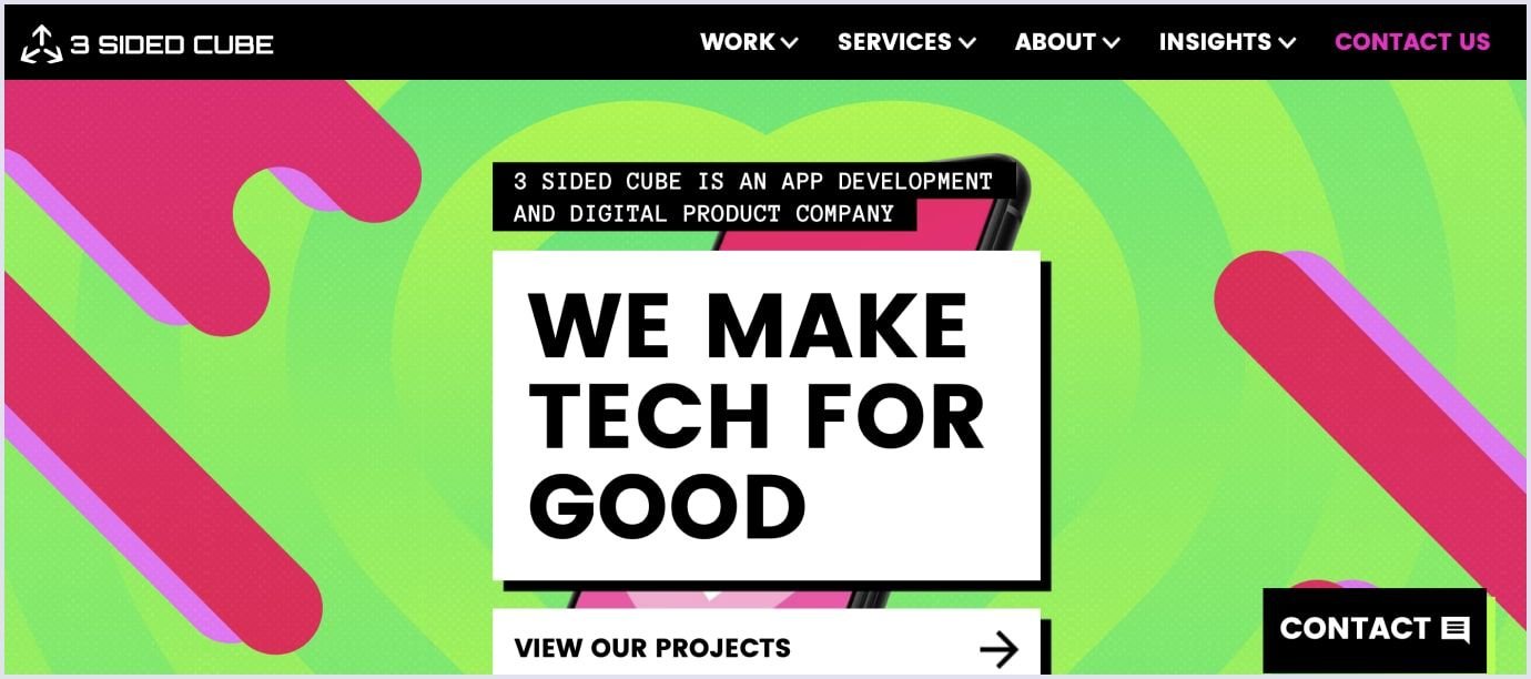
3. Bright green and hot pink
A daring rendezvous between bright green and hot pink sparks an explosion of energy. This audacious duo is tailored for designs that seek to infuse a lively dynamism into the interface.
4. Dark grey and yellow-green
An alliance of dark grey and yellow-green evokes a sense of modern professionalism. Muted yet invigorating, it seamlessly marries sophistication with a touch of organic vibrancy.

5. Blue shades and white
The alliance of serene blue hues and the purity of white crafts an ambiance of trust and tranquility. An ideal choice for designs aimed at instilling calm and confidence.
6. White and lime green
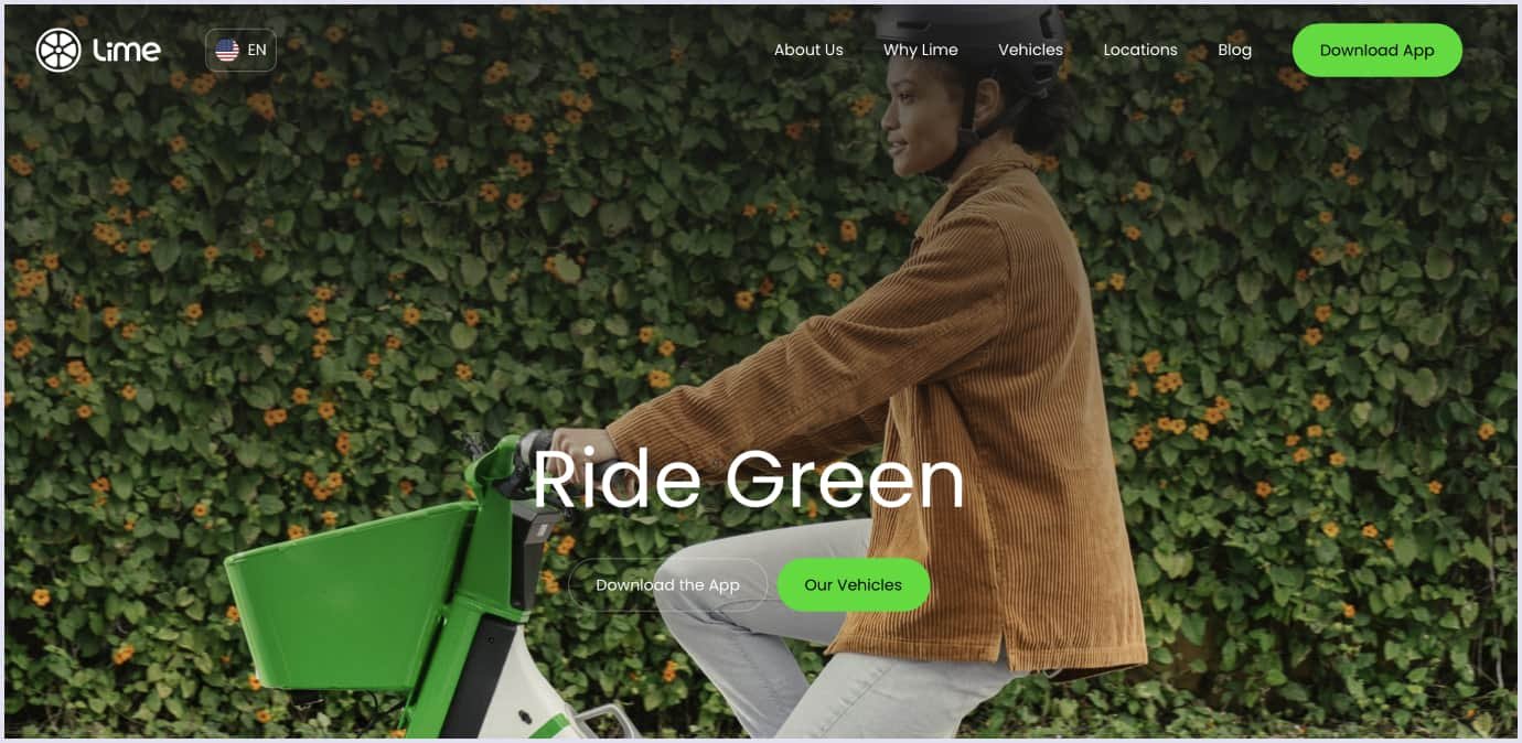
Conveying an aura of zesty freshness, the duo of white and lime green electrifies the design with a burst of invigorating vibrancy. A combination that breathes life into any interface.
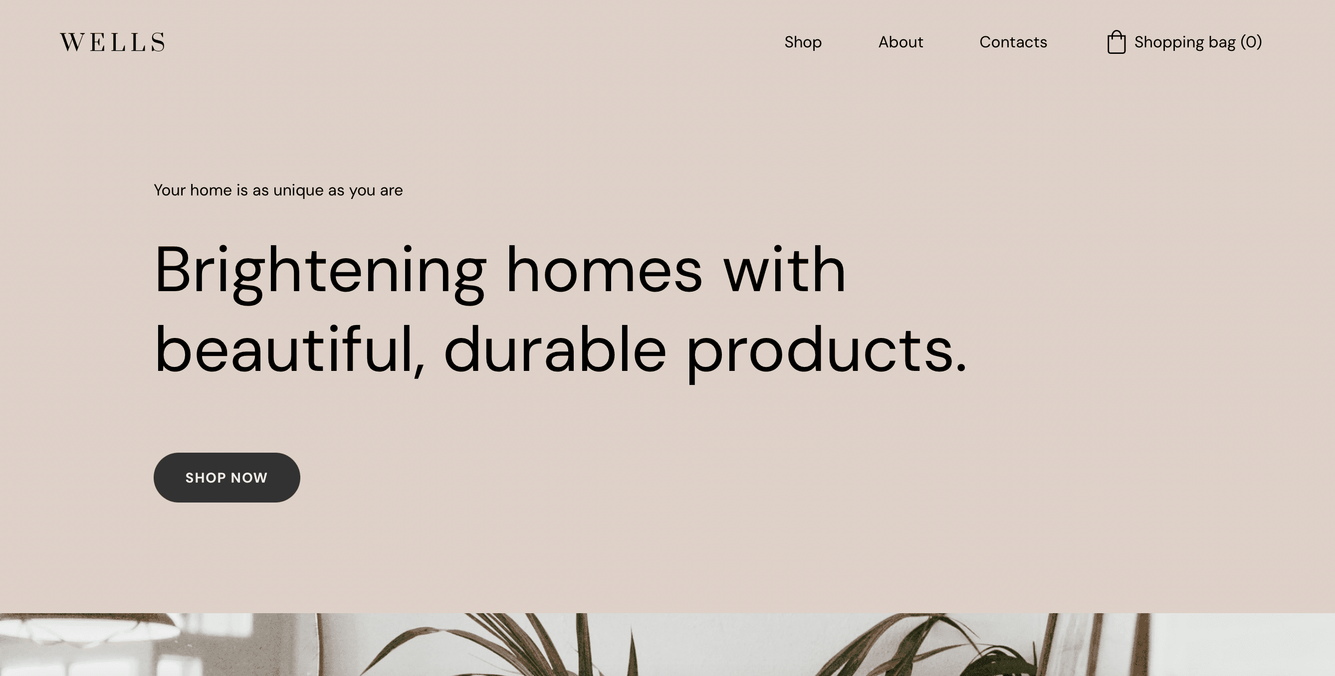
7. Beige and dark grey
Reflecting timeless sophistication, the pairing of beige and dark grey imparts an understated charm. This combination resonates with an enduring elegance that transcends passing color trends.
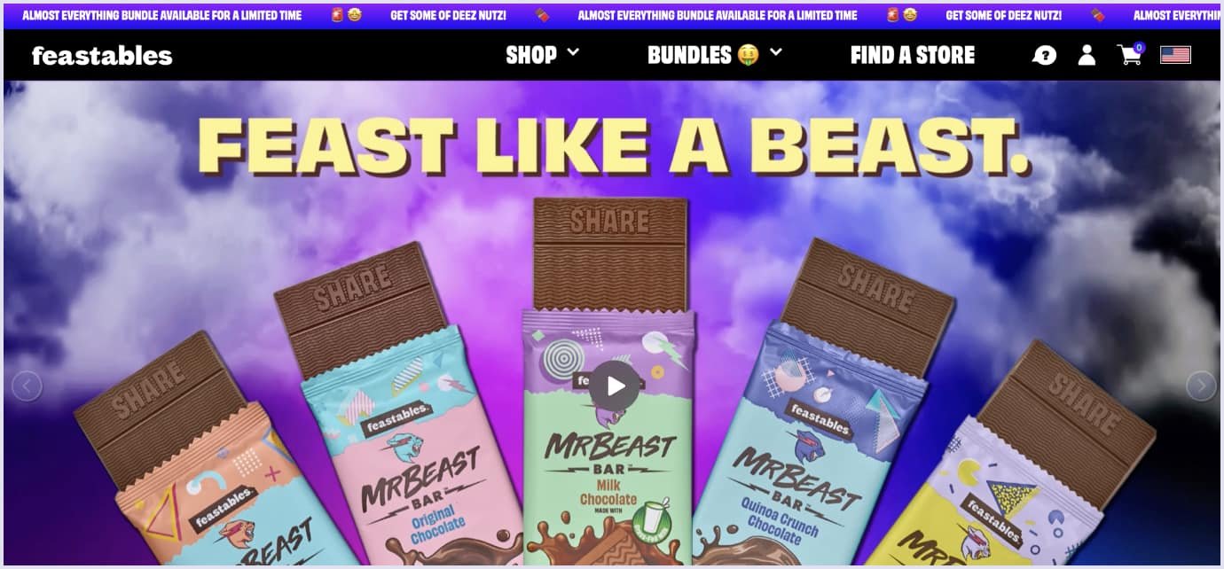
8. Black and neon blue
The futuristic amalgamation of bold black and striking neon blue color scheme elicits attention and establishes a cutting-edge aesthetic. This combination thrives in designs that dare to be avant-garde.

9. Orange shades and blue
The harmonious fusion of warm orange shades with cool blues creates a balance of energy and calm. This blend engages the user through visual equilibrium and emotional resonance.

10. Pale pink and navy blue
A delicate synergy unfolds with the juxtaposition of pale pink and deep navy blue, melding softness and depth. Ideal for designs that seek a refined equilibrium between approachability and professionalism.
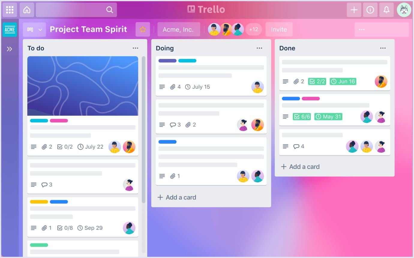
11. Pastel purple and neutral accents
The ethereal charm of pastel purple converges with the calming influence of neutral accents. This palette evokes an air of whimsical elegance, making it perfect for designs that seek a touch of otherworldly allure.
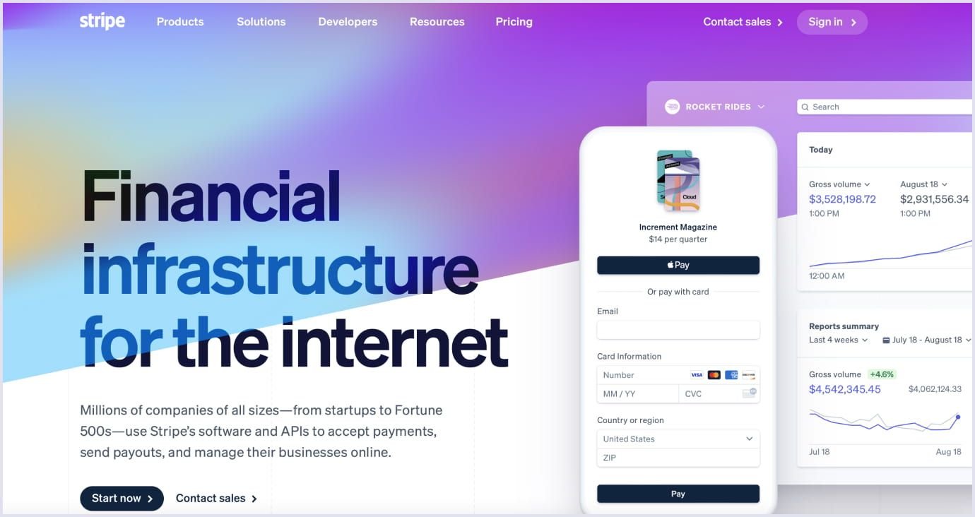
12. Navy blue and electric blue
Channel the depths of the ocean with the dynamic interplay of navy blue and electric blue. This duo navigates the spectrum of blues, encapsulating a sense of depth and boundless exploration.

13. Color gradient, white and dark blue
Embrace the gradient trend by infusing a seamless transition of hues. Coupled with the purity of white and the depth of dark blue, this scheme delivers an avant-garde aesthetic that seamlessly shifts across the spectrum.
14. Beige, orange, and white accent
Invoke the warmth of sunsets and earthy landscapes with the trinity of beige, light orange, and a touch of pristine white. This combination radiates a cozy and welcoming ambiance reminiscent of serene horizons.
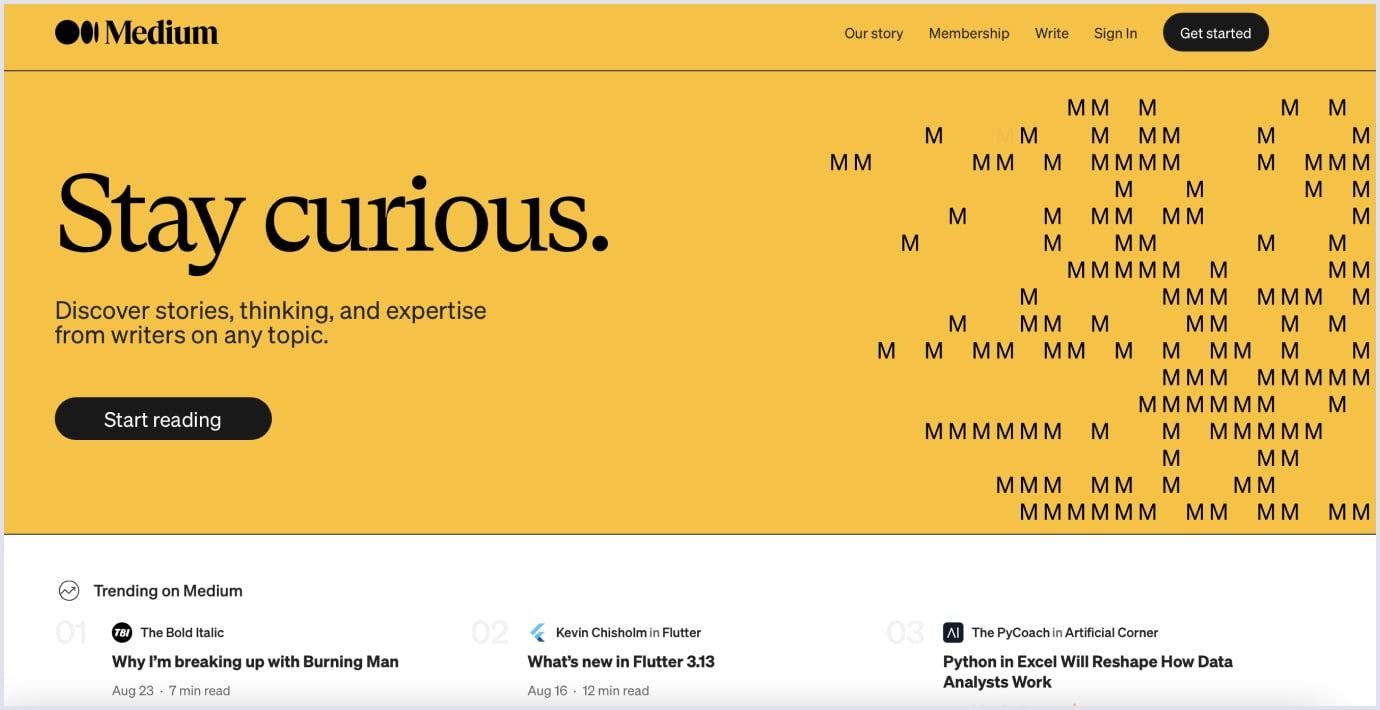
15. White and blue-grey
The fusion of pristine white with the muted sophistication of blue-grey creates an understated yet chic aesthetic. This palette celebrates minimalism, accentuating clean lines and uncluttered elegance.
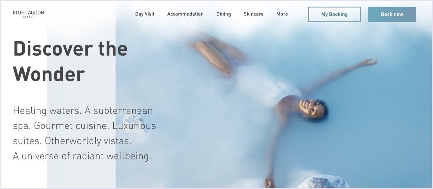
16. Bright red and white
For designs that demand attention, the vivid contrast of bright red against white offers an unmistakable allure. This high-energy duo excels in capturing the viewer's gaze with its dynamic interplay.

17. Classic blue, turquoise, and gold
Channel an ageless charm by marrying classic blue's tranquility with turquoise's refreshing liveliness. The addition of gold infuses a touch of luxury, echoing a regal sense of harmony.
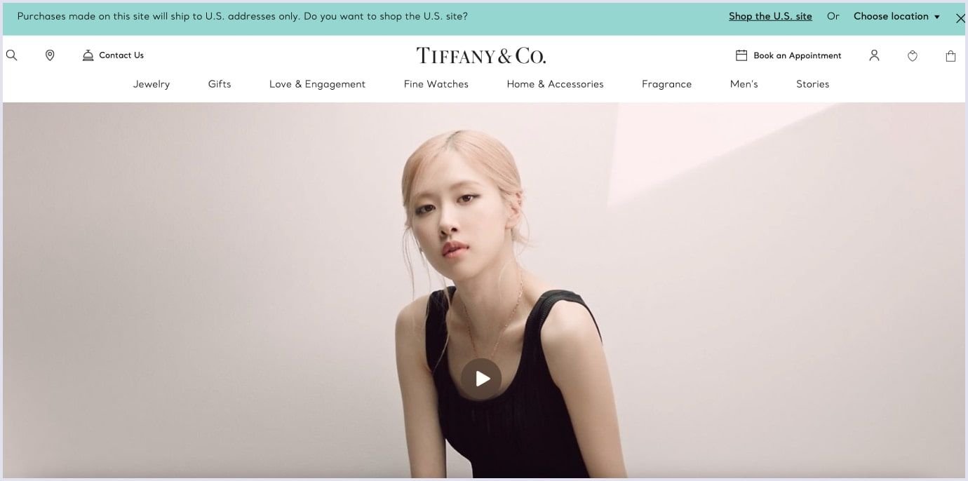
18. Yellow and blue
The vivacity of yellow converges with the calm composure of blue to create a playful juxtaposition. This pairing vibrantly captures attention while retaining a sense of balance.
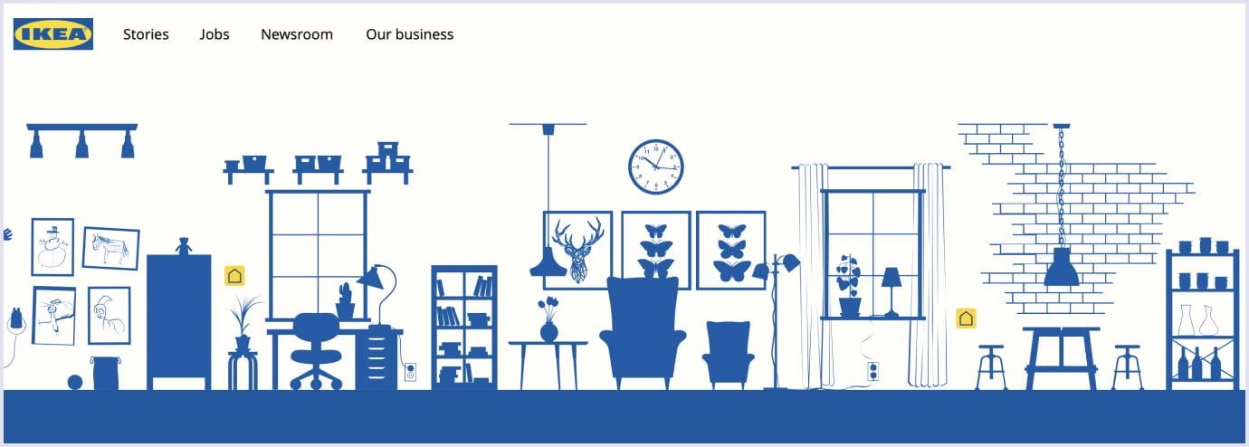
19. Dark royal blue and gold
Experience a taste of opulence with the majestic alliance of dark royal blue and regal gold. This palette exudes luxury and sophistication, making it an ideal choice for designs that seek to leave a lasting impression.

20. Blue, beige, and coral red
Dive into a palette inspired by oceanic vistas. The interplay of serene blue, comforting beige, and invigorating coral red conjures images of sunsets over tranquil waters, imparting a soothing yet invigorating aura.
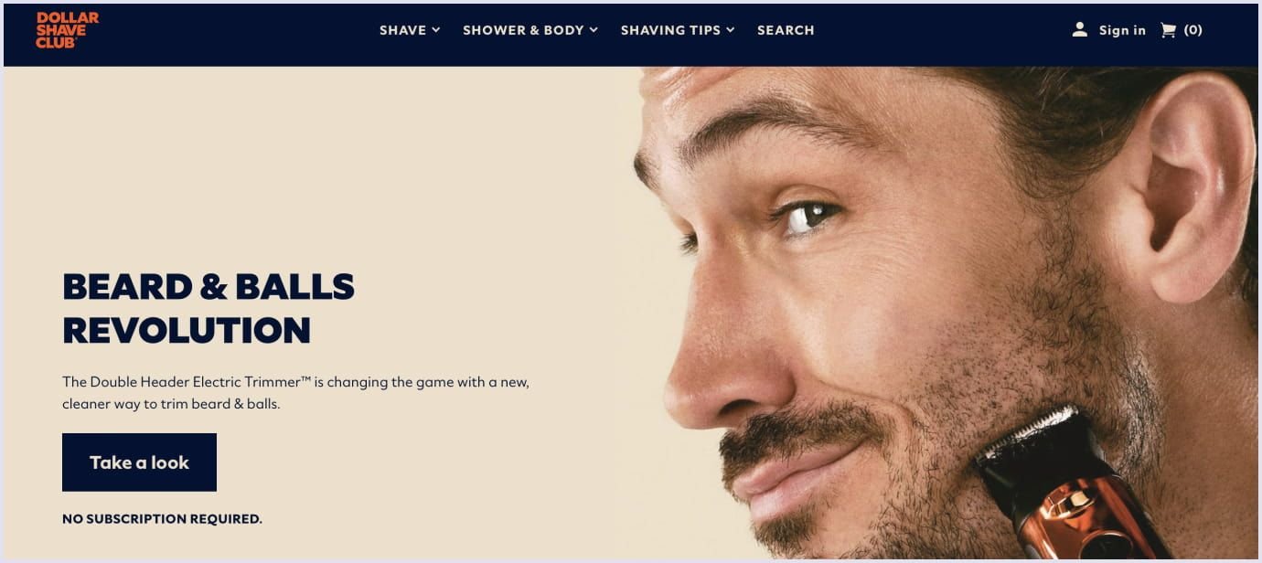
21. Red and yellow
The fusion of vibrant red and energetic yellow generates a captivating color scheme that radiates warmth and enthusiasm. Often utilized to grab attention and emphasize urgency, this combination is a favorite among brands seeking a bold and lively impression. Its popularity lies in its ability to highlight call-to-action buttons and promotional banners with flair.

22. White and purple
The pairing of pristine white with regal purple strikes a balance between sophistication and contemporary style. The contrast between the neutral purity of white and the enigmatic allure of purple results in a high-class, upscale ambiance. This color scheme often graces luxury, fashion, and creative arts websites.
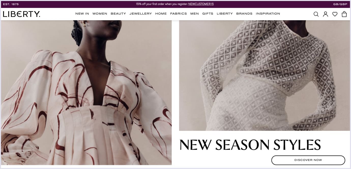
23. Beige and red
The fusion of inviting beige and impactful red creates a captivating and welcoming color scheme. Beige provides a comforting backdrop that amplifies the impact of red accents, making it ideal for websites that aim to convey both comfort and excitement. It's a popular choice for food and lifestyle blogs seeking to inspire engagement.

24. Blue shades, white, and red-violet
The orchestration of various shades of blue alongside accents of red-violet creates a balanced and serene color palette. Blue shades evoke trust and calm, while the addition of red-violet hints at creativity and modernity. This color combination is often embraced by websites associated with technology, healthcare, and well-being.

25. Teal and white
The fusion of teal - a blend of green and blue - with pristine white generates a lively and welcoming color scheme. Teal signifies tranquility and growth, making it an ideal choice for websites centered around nature, travel, and eco-conscious products. The addition of white accentuates the clean and contemporary essence of the design.

26. Light and reddish orange
Marrying a light color with reddish-orange creates a visually appealing contrast that exudes vibrancy and energy. This color scheme is well-suited for websites targeting youthful and dynamic audiences. It finds effective applications in promoting events, entertainment, and lifestyle-related content.

27. White, purple, and orange
The trinity of white, purple, and orange offers a versatile and harmonious color palette. Combining a clean base, a regal secondary color, and a spirited accent creates numerous design possibilities. This color scheme resonates well with websites seeking to convey sophistication while maintaining a touch of playfulness.
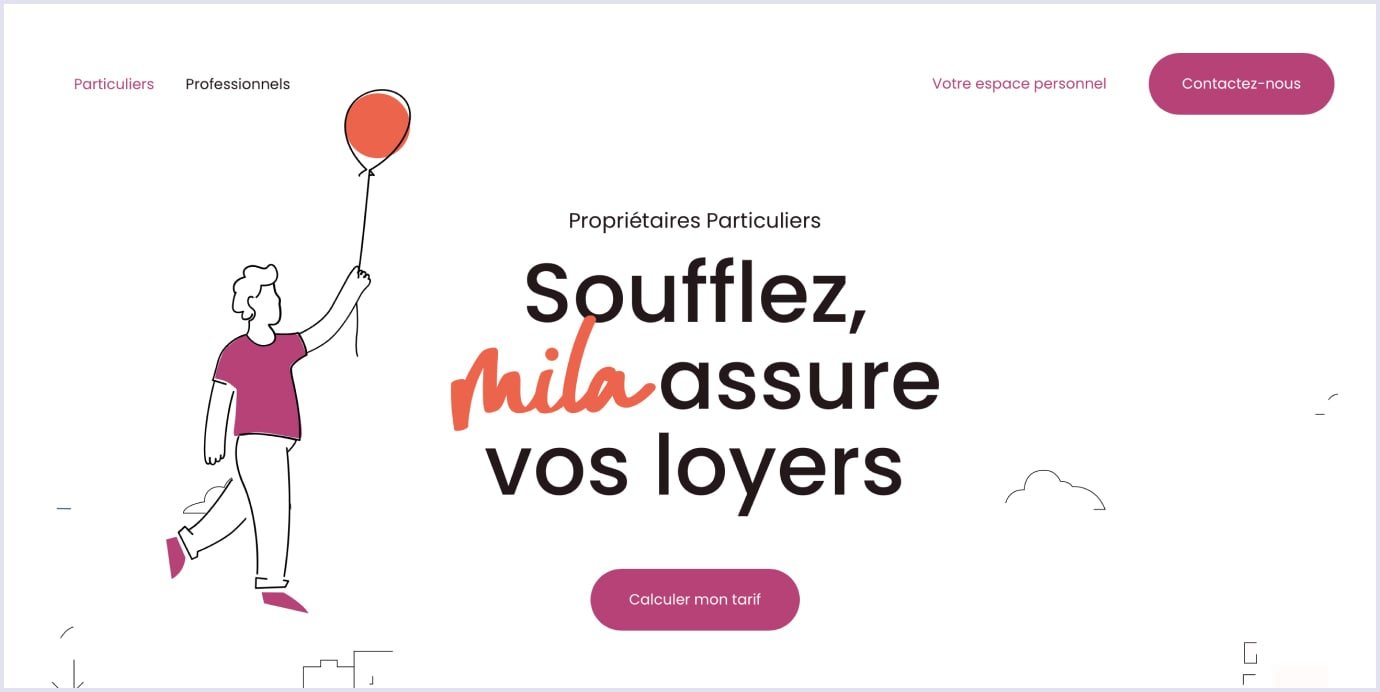
28. Yellow, brown, and purple
The unexpected yet captivating fusion of vivid yellow, brown, and purple creates a vibrant color combination. The earthy tones of brown complement the vibrancy of yellow and purple, resulting in a design that feels grounded yet spirited. This palette is well-suited for websites embracing organic products, crafts, and bohemian aesthetics.
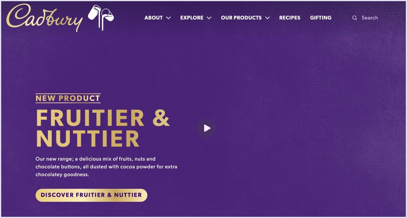
29. Deep purple, orange, red, and pink
This daring color scheme amalgamates deep purple, vivid orange, vibrant red, and soft pink into an attention-grabbing, visually engaging design. The striking contrast between these hues makes it a popular choice for websites catering to creative industries, music, and entertainment.
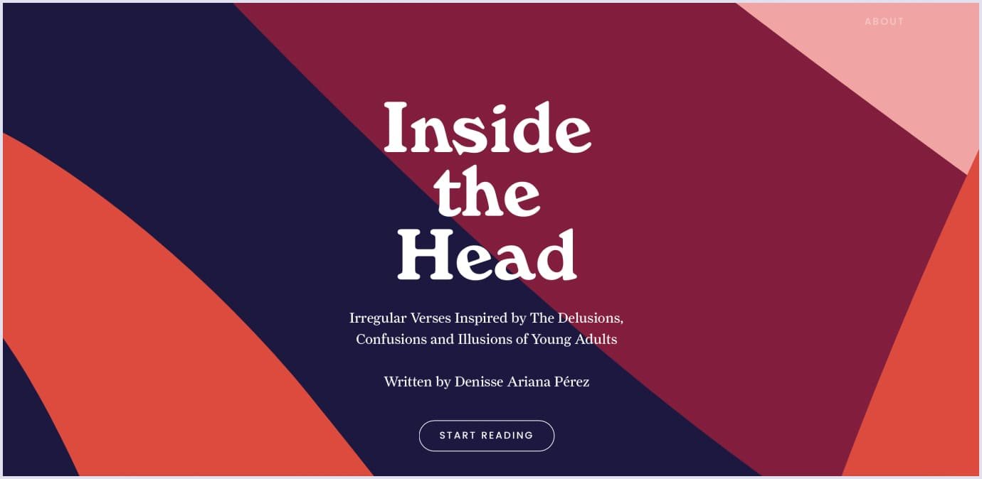
30. Brown and beige
The timeless combination of brown and beige imparts a cozy and down-to-earth aura. This color scheme is often selected by websites aiming to create an inviting and comfortable atmosphere. It's frequently employed in websites focused on home decor, family-oriented content, and lifestyle blogs.
Thus, the selection of these color schemes significantly influences the ambiance and message of a website. Each combination possesses a unique appeal capable of eliciting emotions, conveying values, and shaping user behavior. Designers thoughtfully choose these colors to align with their brand identity and establish meaningful connections with their intended audience.
You may also like: How to Choose the Right Font for Your Website: Typography Advice by Codica
Using color psychology for website design
The field of color psychology delves into the profound impact that colors wield on human perception, emotions, and behavior. This study reveals how each color possesses distinct attributes that evoke inherent emotions within individuals. Furthermore, the influence of color varies across genders, age brackets, cultural backgrounds, and different generations, resulting in a multifaceted interplay of reactions.
Based on findings by Kissmetrics, a staggering 85% of shoppers attribute their purchase decisions to a product's color, emphasizing its primary influence. Implications? This underscores the significant impact of color knowledge on your business, highlighting its pivotal role in determining success or failure.
But how to create a design that will impact user engagement in the best way? We will share helpful tips with you.
Define your objectives and target audience
Before delving into color selection, it's imperative to outline your web design goals and identify your intended audience:
- What purpose does your website serve?
- What message are you aiming to convey?
- Who are your prospective users, and what are their desires, inclinations, and anticipations?
So, these inquiries will guide your color choices in alignment with your objectives and audience.
At Codica, we offer product discovery sessions to validate your idea and conduct research on the target audience.
A significant focus is placed on the initial stages of product discovery. This involves in-depth conversations with the client regarding the product, its business objectives, and the intended audience. Our approach consists of a series of thought-provoking inquiries that empower our project team to delve into the core subject matter. This approach helps us identify potential hurdles, present overarching solutions, and provide our clients with accurate project costs and timeline projections.
In the grand scheme of things, we go beyond discussions by presenting clients with application wireframes and interactive prototypes. These components mirror the eventual product interface and offer a simulation of user engagement, ensuring that the discovery research aligns perfectly with the envisioned outcome.
Here, you can see what you will obtain at the end of the product discovery phase.
Comprehend color connotations and symbolism
Colors hold diverse meanings and connotations, shaped by culture, context, and personal encounters. For instance, red can signify passion, urgency, or danger, while blue might evoke tranquility, trust, or professionalism. Understanding how colors influence mood, emotions, and user perceptions is crucial. It's equally essential to grasp how colors can mirror your brand's identity and principles.
Opt for a color scheme aligned with goals and audience
A color scheme weaves colors together to craft harmony, contrast, and equilibrium within your web design. Different color schemes - monochromatic, analogous, complementary, triadic, or tetradic - employ distinct principles of color theory to achieve varying effects. The choice of a color scheme should correspond with your goals and resonate with your audience, culminating in a unified and consistent visual portrayal of your website.
Employ the 60-30-10 rule for color composition
The 60-30-10 rule provides a blueprint for color distribution in web design. It suggests utilizing 60% of a dominant color, 30% of a secondary color, and 10% of an accent color. The dominant color establishes the website's mood, the secondary color bolsters contrast, and the accent color attracts attention and promotes engagement. Adhering to this rule fosters a balanced and pleasing color palette for your design.
Enhance readability and accessibility through color contrast
Color contrast refers to the distinction in brightness and hue between two colors. It profoundly impacts readability and accessibility in web design, influencing how text and elements blend with or stand out from the background. Employ color contrast to augment readability and accessibility. Opt for colors that provide sufficient contrast to ensure clarity and legibility, all while adhering to Web Content Accessibility Guidelines (WCAG) standards.
Iterate and hone your color selections
The culmination of the process entails refining your color choices by soliciting feedback from users, clients, or peers. Incorporate tools and resources to assess your web design's visual impact. Test the compatibility of your chosen colors across different devices, browsers, and screen sizes. Gauge how these colors influence user experience metrics such as engagement, conversion rates, user retention, and overall satisfaction. This iterative approach ensures your color choices harmonize effectively with your design's objectives and user preferences.
Further reading: Minimum Viable Product Design: How to Build a Successful MVP
Psychology of basic colors
Understanding the influence of color on human psychology enables you to ensure that the color palette of your website’s design is aligned with your goals.
Let's delve into some fundamental insights about color.
Red
The color red can elevate the heart rate and quicken breathing. It is synonymous with passion, excitement, love, energy, and dynamism. However, it also carries potential negative associations such as conflict, fire, anger, and danger.
The strategic use of red
Red can be employed as an accent to grab attention or instill excitement. It suits sectors like food, entertainment, sports, marketing, and emergency services.
Exercising caution with red
Overuse of red can become overwhelming. It may not align well with luxury or nature-oriented contexts.

Yellow
In general, yellow radiates as the brightest color, linked with competence, happiness, optimism, and youthfulness. Yet, it also carries connotations of deceit and shallowness.
Timely utilization of yellow
Employ bright yellow to invigorate or create a sense of joy. Soft, light yellows foster calmer happiness.
Prudent handling of yellow
So, yellow in excess can strain the eyes. It's advisable to apply it sparingly to avoid overpowering the visual experience.

Orange
It is well-known that orange exudes energy and vibrancy, which are synonymous with fun, warmth, and enthusiasm. However, it can also communicate caution.
Strategic use of orange
Use orange to highlight calls to action, clearances, or sales. Effective for ecommerce, technology, food, and childcare sectors.
Balancing orange usage
Exercise caution to prevent overwhelming the design, even though orange is less intense than red.
Green
In turn, green offers harmonizing effects and is linked to growth, health, nature, and wealth. It signifies calmness, generosity, and harmony.
Tactical application of green
Generally, green fosters relaxation and is apt for representing nature, new beginnings, and wealth. Effective in the medical, science, environment, and sustainability domains.
Minding green's limits
While suitable for many contexts, green might not align well with luxury goods or content for adolescent girls.

Blue
To begin with, blue conveys dependability, trust, wisdom, and calmness. It's associated with strength, and security.
Strategic integration of blue
Thereby, blue's non-invasive nature suits corporations, healthcare, government, and legal sectors. It's linked with dependability and quality.
Balancing blue's use
So, using specific shades or excessive blue can lend a cold or distant feel to your site. Be cautious in using it for food-related content due to its potential appetite-curbing effect.
Purple
Undoubtedly, purple denotes royalty and signifies creativity, authority, and wisdom. It's associated with luxury, power, and spirituality.
Effective deployment of purple
Dark purples evoke luxury, while light purples can evoke spring and romance. Ideal for beauty products.
Mindful use of purple
Avoid using too much purple, as its calming nature might not be suitable for drawing attention.
Brown
Plainly, brown carries warmth and naturalness, symbolizing earth, reliability, and stability. It's associated with friendship and nature.
Strategic usage of brown
Of course, brown suits food-related content, real estate, animals, and finance. It's often a suitable background choice.
Balancing brown's application
While versatile, brown might come across as dull if overused. It's not ideal for attention-grabbing elements.
Black
Obviously, black signifies sophistication, power, and elegance. It's linked to formality, authority, and strength, but can also evoke mystery and rebellion.
Effective incorporation of black
Depending on pairing, black can be elegant or modern. It's suitable for luxury goods, fashion, and cosmetics.
Mindful utilization of black
Avoid excessive use, as too much black can be overwhelming or evoke negative emotions.

White
In fact, white represents purity, cleanliness, and safety. It's linked to sincerity, happiness, and virtue.
Strategic application of white
Suited for healthcare, high-tech, and science-related websites. When combined with specific colors, it's great for luxury goods.
Balancing white's utilization
White's effects depend on accompanying colors, making it versatile across various website types.
Grey
In general, grey exudes professionalism, sophistication, and practicality. It's associated with timelessness and strong character.
Thoughtful utilization of grey
Ideal for professional websites and luxury goods. Can create a balanced and calming atmosphere.
Balancing grey's usage
Certain shades of grey might feel detached or cold. It's not optimal for elements intended to grab attention.
Pink
To begin with, pink, a tint of red, conveys sophistication, romance, and love. It carries a gentle and soothing demeanor.
Strategic integration of pink
The power of pink lies in its emotional impact and ability to guide user behavior. Then, pink can draw attention to specific elements on a webpage, such as calls to action or important announcements.
Balancing pink's presence
Bright pinks can be excessive, while light pinks might feel overly sentimental for certain contexts.
All in all, color psychology extends its influence across various demographics, encompassing age groups, social classes, education levels, and even geographical climates. These intriguing insights offer a deeper understanding of basic colors in web design.
Color preferences
Brighter shades like red, yellow, blue, orange, green, and purple capture the fascination of young children. They gravitate towards solid, vibrant colors over intricate patterns.
Teenagers show a penchant for black and are receptive to sophisticated hues and graphics, distinguishing them from their younger counterparts.
As individuals transition into adulthood, preferences often veer towards more subdued tones, with established color choices that tend to remain consistent.
Shifts in color preferences with age: adults aged 65 and above develop a preference for blue, pink, and green while exhibiting a dislike for yellow. Calmer shades garner preference over vivid ones. Additionally, purple gains more popularity among aging people.
Geographical climate's impact on color preferences: Climate plays a role in color attraction. Residents from tropical climates resonate with warm, vivid colors that align with their surroundings.
Cultural significance of white: First, white's symbolism varies across cultures. In Western societies, white epitomizes purity and cleanliness, evident in its use during weddings and healthcare settings. However, in Eastern cultures, white is linked to death and sorrow, often intertwined with funeral rituals.

How to create a color palette for a website
Crafting an effective color palette for a website involves several vital steps to ensure a cohesive and visually appealing design. Let’s consider a breakdown of the process:
1. Choose a primary color
Begin by handpicking a primary color that aptly embodies your brand's essence and the ambiance you intend to project. This color often dominates your website, dictating the overall vibe. Delve into your brand's core values, target audience, and the emotions you aim to elicit. Your primary color should harmonize with your message and leave a lasting imprint.
2. Choosing secondary colors
Once the primary color is in place, curate a collection of secondary colors that harmonize with it. These shades should seamlessly complement one another, resulting in a visually balanced experience. Secondary colors typically play for website sections like headings, subheadings, backgrounds, and buttons. Add warm and cool tones to infuse your palette with dimension and diversity.
3. Choose an accent color
An accent color, vibrant and bold, serves as a strategic tool to accentuate specific elements - such as call-to-action buttons or critical information - throughout your design. This color should sharply contrast with your primary and secondary colors. Its purpose is to create focal points and guide users' gazes to crucial segments of your website.
At Codica, we use all the best and most innovative design practices to create engaging online solutions. For example, the PlanMyKids service marketplace is a great example of the successful combination of colors in design. This is a platform intended for busy parents. Using this online booking platform, parents can discover and book activities for their children nearby.
Displayed below is the color palette we embraced for the design of PlanMyKids.
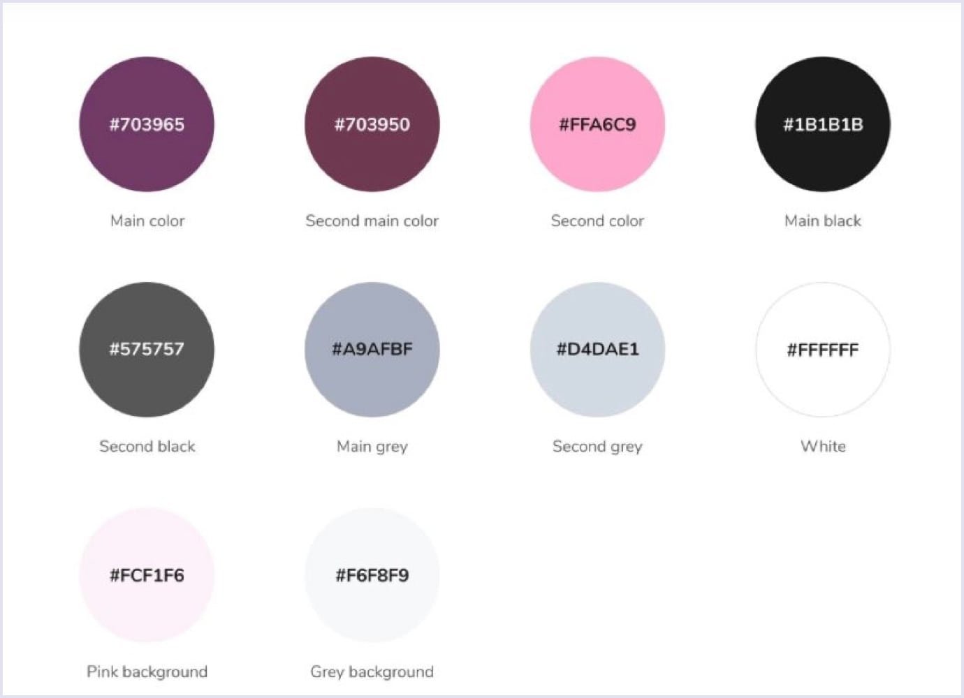
As we constructed the children's marketplace, our intention revolved around cultivating an informal and approachable atmosphere. This ethos resonates throughout the PlanMyKids website's graphic design, permeating its colors and imagery.
Notably, our design team meticulously selected a color palette tailored to this virtual haven for parents. Our objective entailed harmonizing colors seamlessly.
Consequently, the focal colors chosen were shades of purple and pink. These vibrant hues often evoke notions of creativity and boundless energy, rendering them a fitting choice for an online platform catering to children.
Simultaneously, the fusion of pink and purple adds a touch of sophistication to the website's aesthetic.
By the way, below, you can see the video of how this service platform works in life.
Also, you can check more designs in our portfolio and on Behance.
Learn the art and strategy of prominent websites
Here are examples of prominent websites and how their unique amalgamation of colors molds user perceptions and actions:
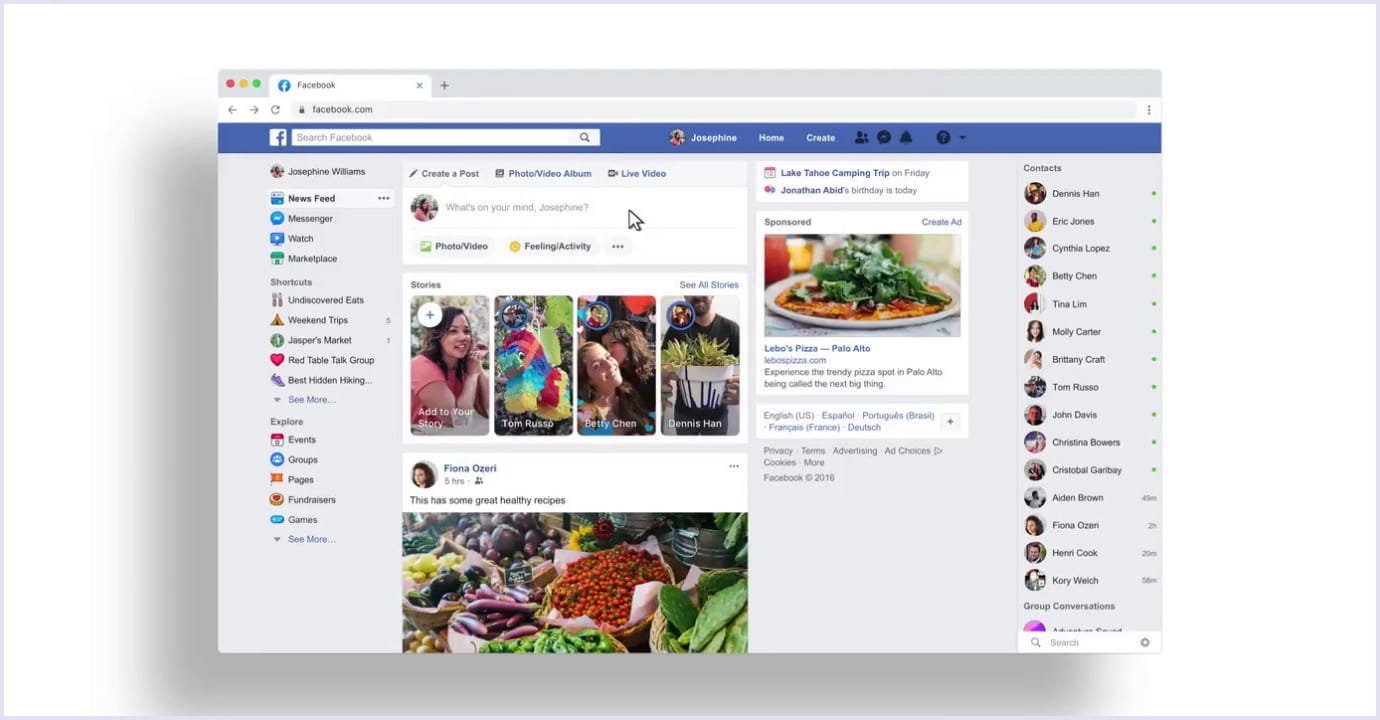
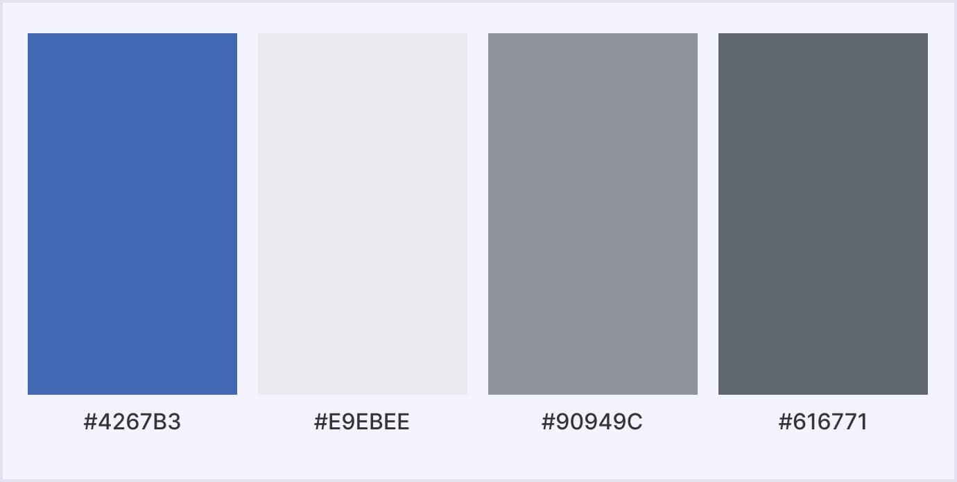
The marriage of blue and white on Facebook creates an atmosphere of reliability and trustworthiness. Blue, synonymous with communication and technology, emits a tranquil effect that entices users to explore the platform extensively, immersing themselves in its content and connections.
YouTube
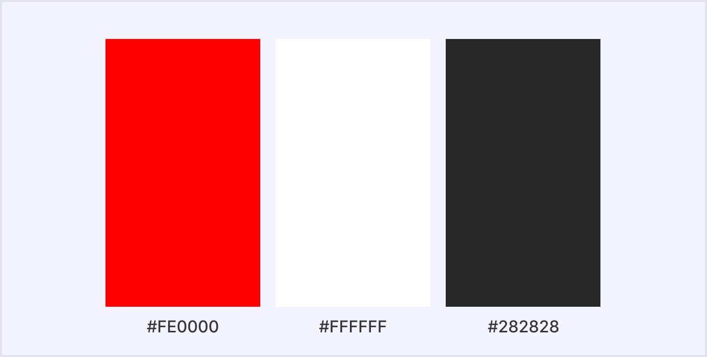
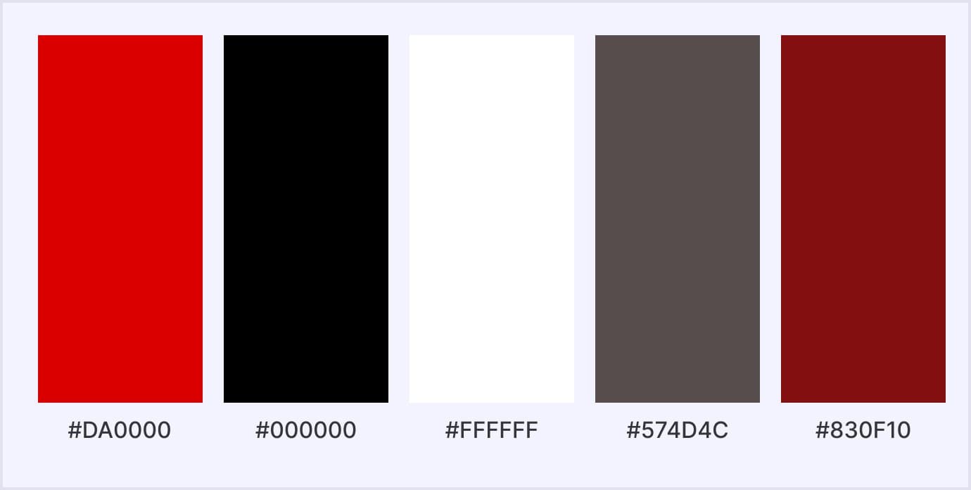
Painted predominantly in red, YouTube's branding radiates energy and excitement. This chromatic selection ignites action and captures users' attention. The fusion of red and white forms a striking and unforgettable visual emblem, prompting users to watch, share, and actively interact with videos.
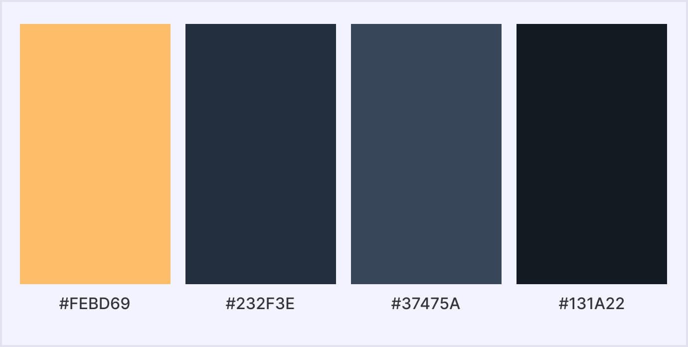
With its use of orange and black in its logo and design elements, Amazon projects an image of affordability and convenience. Orange exudes friendliness and subtly hints at cost-effectiveness, while black adds a layer of refinement. This combination encourages users to delve into products and confidently make purchases.
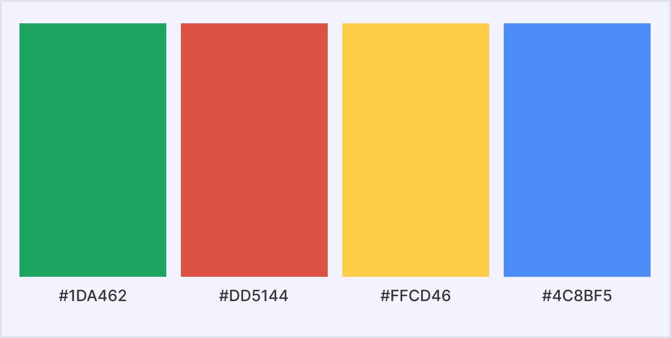
The Google logo, adorned with primary colors like red, blue, green, and yellow, evokes a sense of creativity and playfulness. These colors resonate with innovation and diversity. The vivid interplay of contrasting colors captures attention and lends the interface an accessible and user-centric feel.
By blending red and black, Netflix's website evokes feelings of excitement and entertainment. Red triggers strong emotions, complemented by the sophistication of black. This amalgamation propels users to explore and engage with content for extended periods.
Apple
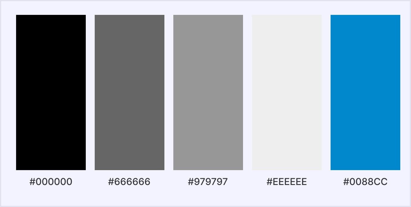
So, Apple's affinity for minimalism, employing a clean white backdrop coupled with sleek grayscale elements, exudes sophistication and modernity. White symbolizes simplicity and purity, while grayscale introduces balance and timelessness. These hues contribute to the perception of Apple products as sleek and of the highest quality.
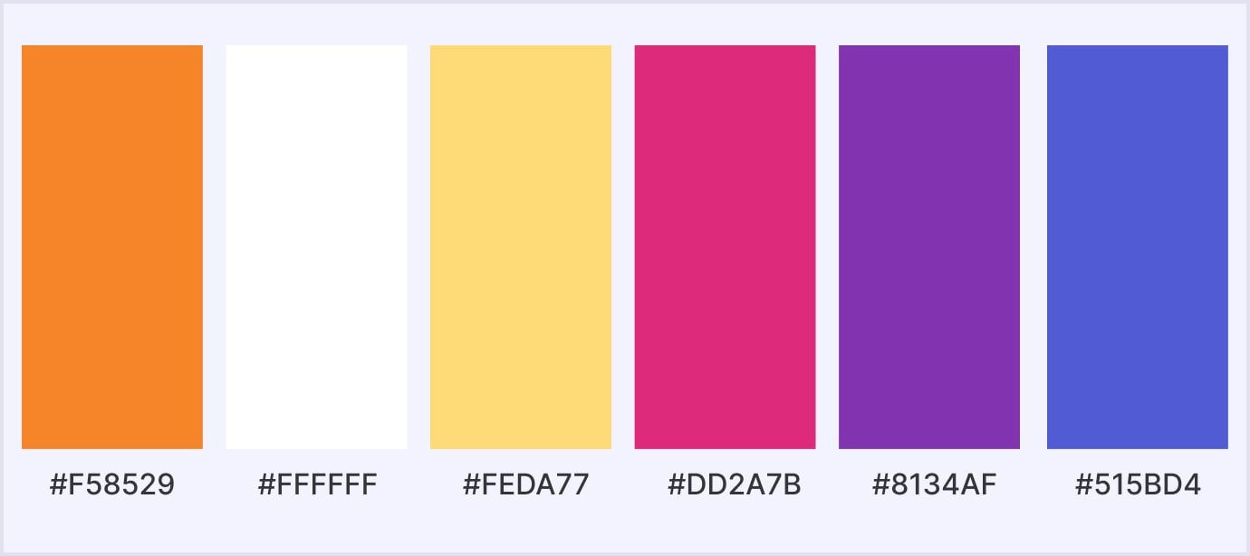
The trio of purple, pink, and white on Instagram conveys a sense of dynamism and creative zeal. Purple, associated with imagination, merges seamlessly with the approachable charm of pink. This color palette motivates users to share and actively engage with visual content, fostering a sense of online community.
Conclusion
Selecting the ideal color, whether it's for a new sofa, lipstick, or bicycle, can often prove to be a perplexing task. However, when it involves launching a website, the complexity deepens. Delving into the psychological and cultural connotations of various website color palettes and comprehending their impact on brand perception becomes crucial.
Engaging with color theory, scrutinizing the website color selections of your competitors, and embracing a fearless attitude toward pushing boundaries can offer valuable insights. Successful experimentation in this realm could spell the distinction between your brand standing out amidst the competition.
At our UI/UX design services company, we can help you choose the right color palette for your solution and implement it in life. Feel free to contact us right now!
