If you choose the right fonts, you can convey your brand tone and message to your customers. Such an impression is vital to establishing loyalty to your company.
Typography is more than selecting a beautiful font for web design. Fonts help you establish visual structure and graphic balance. The right font gives your customers an excellent experience with your website.
This article discusses the crucial aspects of font selection for your website. Also, you will discover how you can use fonts to help your customers get the best experience with your website. Let’s get started.
Basics of web typography
Generally, web typography is how the text appears to the reader on a screen. Fonts keep the website layout consistent and balanced. So, users enjoy navigating the website.
Web typography practices differ from the design of printed materials. When you design and choose fonts for a website, you should keep in mind the following aspects:
- Shorter time for viewing information: users visit websites for specific things to find. The website should be easy to read. Otherwise, users will look for better options from an abundant pool on the web;
- Accessibility: users have different text perceptions. So, web design should be adjusted to various users’ needs;
- Different device and screen types: the text should be equally lovely on desktop and mobile screens.
Also, web typography ensures that font size, color, and style are balanced to present the website's text.
Read also: How to Design a SaaS Application: Trends and Best Practices
How to choose fonts for your website?
You can use brand guidelines and standard font classification when choosing fonts for a website design. Let’s see how these means can help you find the right font.
Rely on the basic font classification
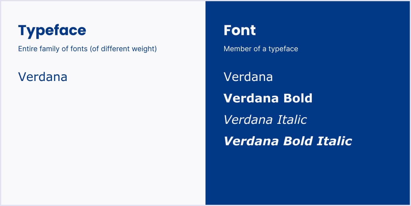
Before we dive into the specifics of website fonts, there is a question that is worth attention. The terms font and typeface are often used as the same. But that is confusion. The difference is simple: a typeface is a family of related fonts, and each font is a member of the typeface. The comparison below shows how the Verdana family holds fonts with different font styles and weights.
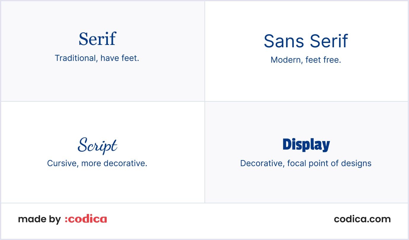
You can choose and combine many fonts and typefaces. The most common are serif, sans-serif, script, and decorative fonts. Let’s see in more detail how you can apply them in web design.
Serif fonts
Serif fonts are based on the Roman alphabet and have ornamental points on the letter strokes. Serif fonts are web-safe fonts, which means you can be sure it is easy to read and load on a website. That is why serif fonts are used in text, headings, and subheadings. Below is an example of using the serif font in web design to make the starting page look concise and professional.
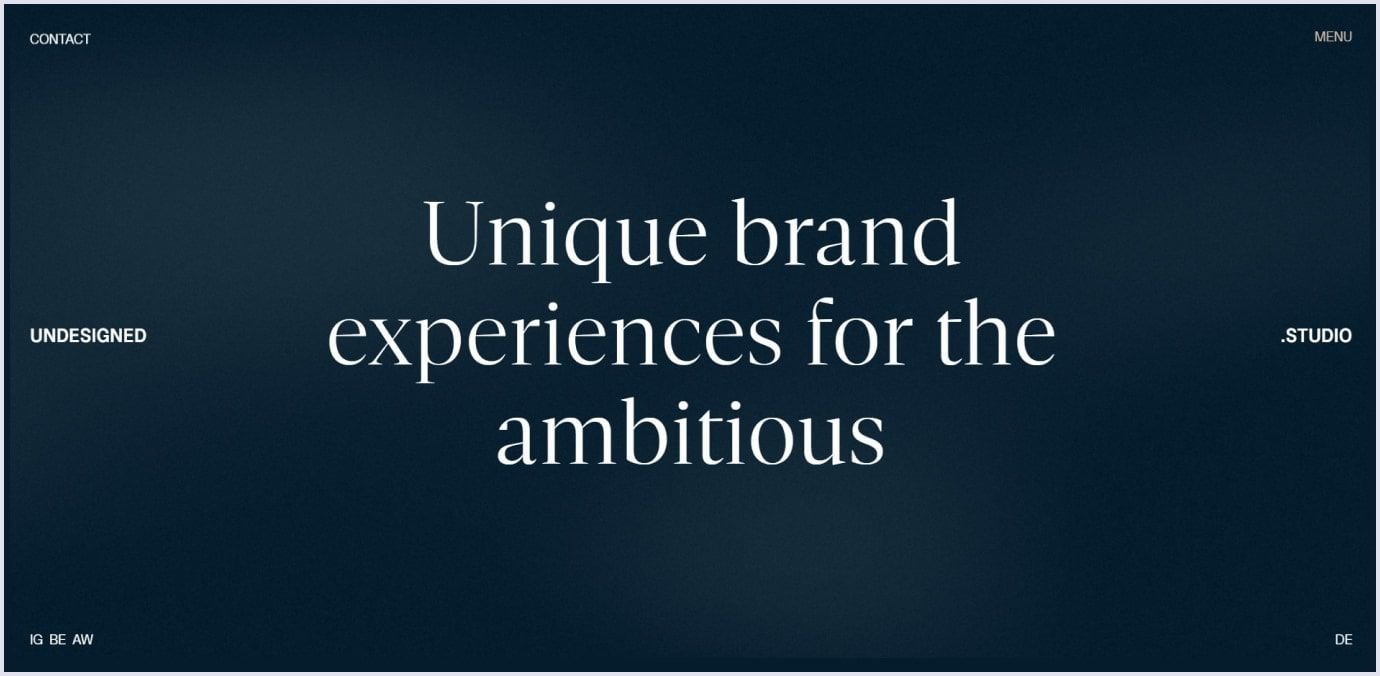
Serif fonts suit brands that want to sound serious and sophisticated. So, use them if you're going to convey those aspects to your customers. The popular serif fonts include Cambria, Garamond, and Juana. As for free fonts, you can also use Google fonts, such as Crimson Text and Playfair Display.
Sans-serif fonts
These fonts have no strokes on the letters and are opposite to their serif counterparts. The sans-serif font is simple and carefree web-safe font. They remind us of friendly letter writing, where you use letters without decorum. This font suits websites that want to seem casual, like educational platforms and blogs.
For example, Jitter uses the Inter sans-serif font for their starting pages. The brand applies this simple yet vivid font to outline the main value of its software, namely the easy approach to motion design.
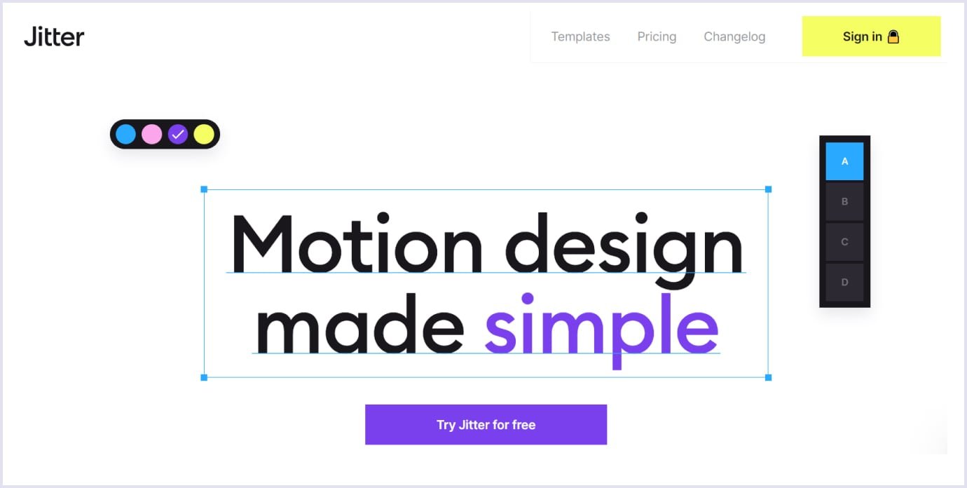
The sans-serif fonts work best in content to be read on the go and without hassle. So, these fonts are used for photo captions, web advertisements, social media posts, and bylines. The best sans-serif fonts include Arial, Calibri, and Helvetica. To try more striking font families, you can turn to free Google fonts and choose Roboto, Heebo, or Montserrat.
Script fonts
Script fonts are also called cursive fonts. They imitate handwriting with curvy, nebulous shapes. These fonts have different stroke weights to mimic the pressure in a handwritten font. Their texture copies discrepancies that appear when you use ink. Script fonts can be highly ornamental and straightforward.
When do you use script fonts? They suit formal and casual styles. A script font is also applied to give a retro-style look to the website. Some well-known cursive fonts include Berkshire Swash, Pacifico, Molle, and Dancing Script.
Below is an example of using handwritten fonts throughout the website of Mint Design Company. It is a boutique branding and design agency. Handwritten pieces they use on the website give a personalized feel and convey creativity. It is the right approach to keep users’ attention and spark interest in the website and relevant company.
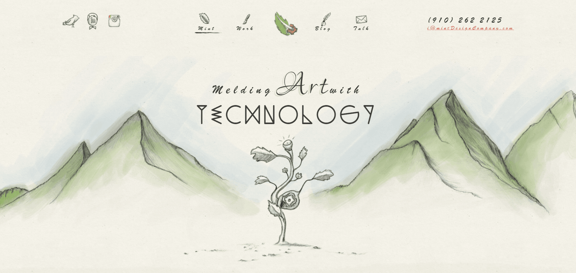
Nevertheless, we advise using script fonts in headings and titles. Thus, you can attract users’ focus to those elements. Also, you can use them when you need to outline specific parts, such as subheaders, taglines, or calls to action. Script fonts help to make a bright accent. Meanwhile, they are less used in body text due to poor readability in that case.
Another recommendation is to use one script typeface at a time. Applying two typefaces or more will burden your design and make it look messy. Also, use script fonts carefully because they add friskiness, and not all brands need it.
Decorative fonts
They are also called ornamental or display fonts. Their name explains the primary purpose of using them. They adorn, brighten, and embellish the text. With the decorative font, any message becomes more reader-friendly as it helps perceive the text as unusual and dazzling. For example, the Chainzoku beverage website uses a decorative font to present the brand in a whimsical way.
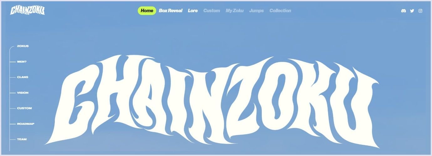
Decorative fonts target every audience. They can be reserved and refined, as well as childish and playful. For example, Arastin can be used for romantic themes, and Northills is to bring a retro touch.
You may also like: Online Marketplace Design: Why UI/UX Matters
Rely on brand guidelines
When you need to select a font for your site, you can be overwhelmed by the opportunities you discover. When choosing a font, you want something that conveys a specific brand identity. You can rely on brand guidelines to help you select suitable options.
Brand guidelines are a collection of rules that describes what messaging and tone of voice, as well as visuals, you should use when presenting your company. Brand guidelines give universal coverage on the following brand aspects:
- Logo: peculiarities of the main and secondary logos and relevant icons, with various formats;
- Brand color schemes: specific primary and secondary shades and how they should be used;
- Typography: particular font designs, font size, and style;
- Images: photos, illustrations, and artwork representing the brand;
- Voice and tone: language and emotions of the brand in written communication.
Brand guidelines help ensure consistency in presenting your company. In the long run, it will build familiarity for customers, making them more loyal to your brand.
For example, at Codica, we follow the best web design standards and the client’s requirements to provide custom UI/UX design services. We carefully preserve brand uniqueness with fonts and colors. At the same time, we make the solution accessible to different people and across various devices.
Our typical process of choosing a website design starts with the product discovery process. This is the preliminary step where our team clarifies the aspects of the future web design with a client.
To deliver the best result, we start from the very basics needed for the website design, including:
- What is your brand’s message? Is your brand established and formal or friendly and simple?
- Is the website concise, or has many pages?
- Is your website aiming for a practical approach, or can sophisticated fonts be chosen?
- Does your website use graphics, such as images, photos, animations, and videos? Or does it present text content?
Knowing these details, we choose fonts and colors highlighting your brand identity and vividly presenting it to your customers. Thus, we help you create an accessible and engaging website you customers will enjoy.
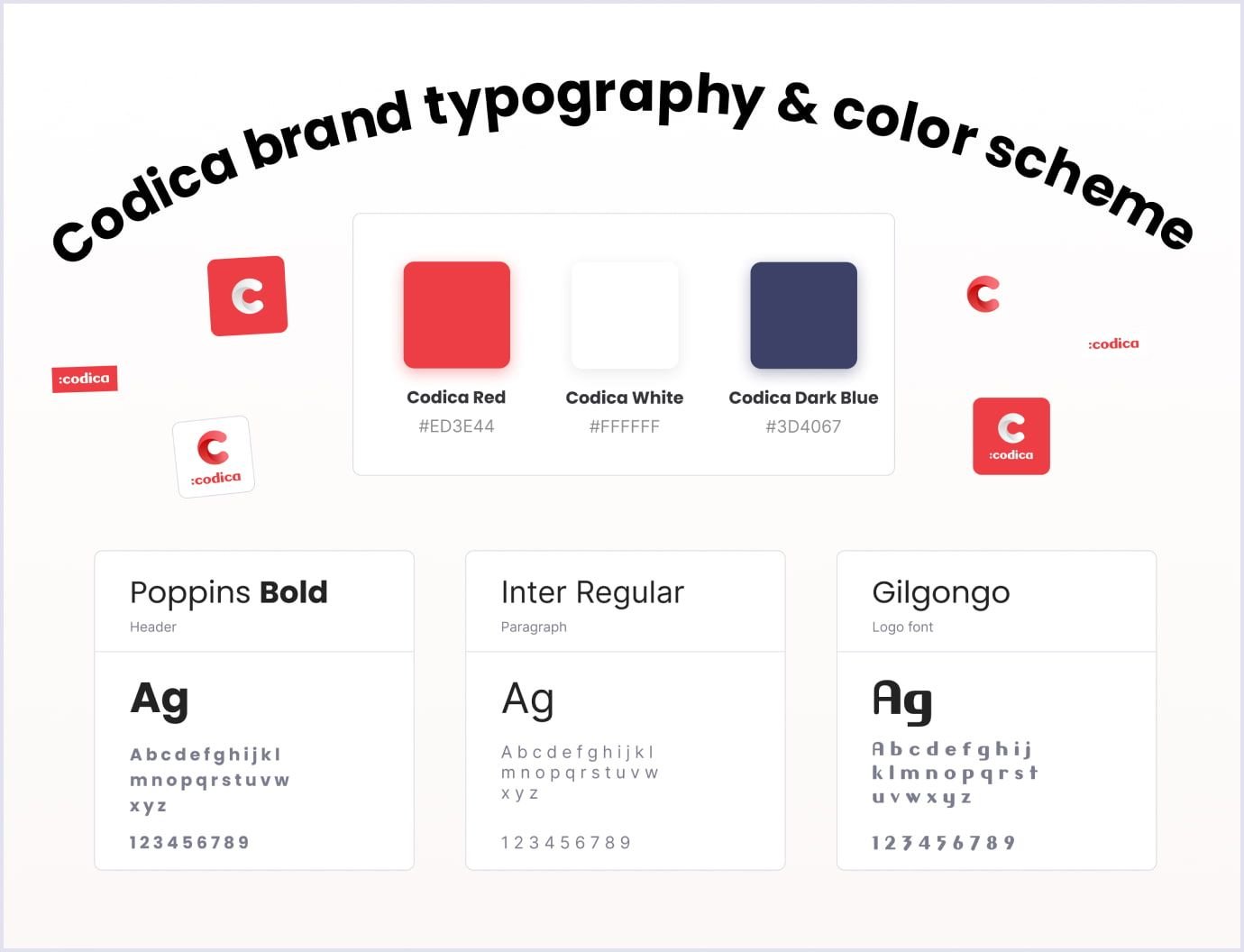
For example, our design team created our logo using the Gilgongo font. It looks casual yet conveys a friendly feel. This way, we show that our team is approachable and listens to a client’s ideas regarding a project.
Also, we chose other sans-serif fonts for our title page, which are Poppins for headings and Inter for text blocks. They make the text easy to read, so they are suitable for larger content chunks.
See below the palette for our primary and secondary logos and typography to present texts about our team.
Experiment with fonts following web design trends
If you are still searching for a fresh look for your website, you can check the fonts that are part of web design trends in 2023.
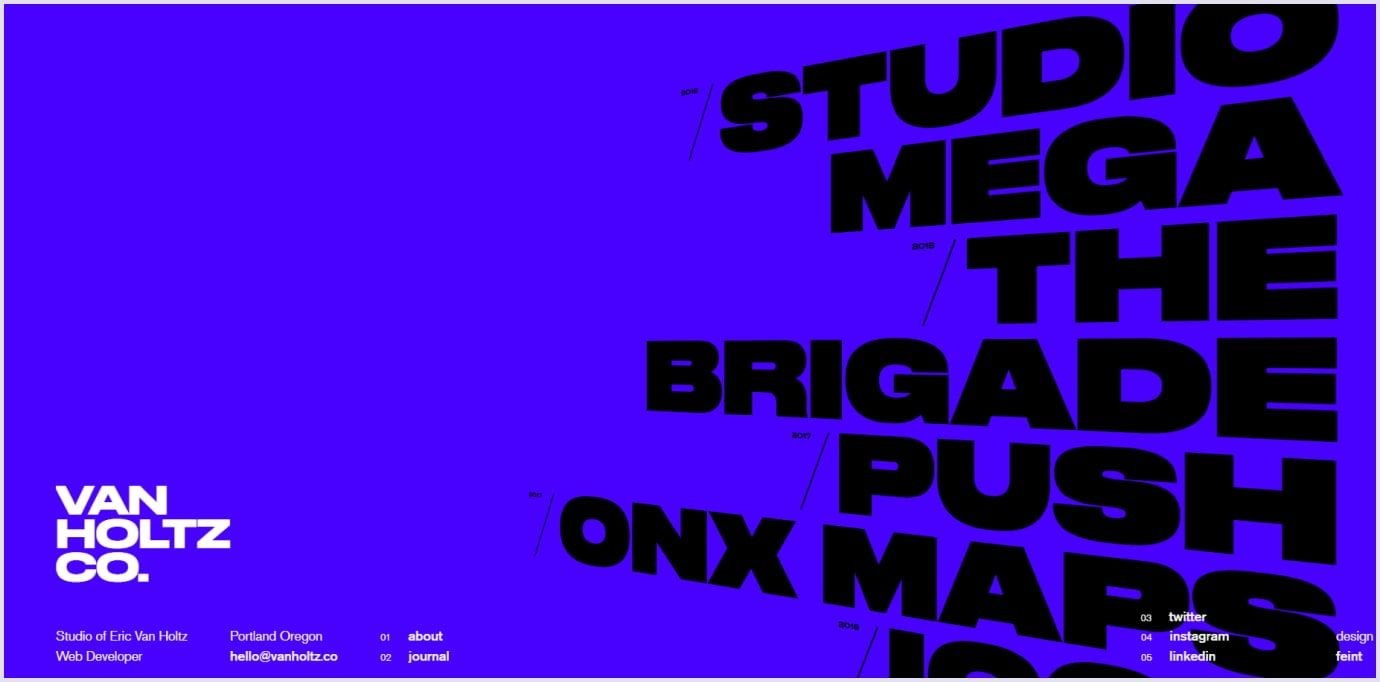
For example, the Van Holtz Co. studio specializing in interactive content weaved oversized typography into their web design. This showcases their creativity and makes it fun to load the website. Hover your cursor on each starting line, and you will see how the text changes.
Another recent trend in typography is using 3D fonts. 3D elements have been applied widely over recent years. 3D fonts add depth and mass to web design. Such fonts can be of various looks and create different moods. Below is an example of 3D typography you can edit and use in your web designs.
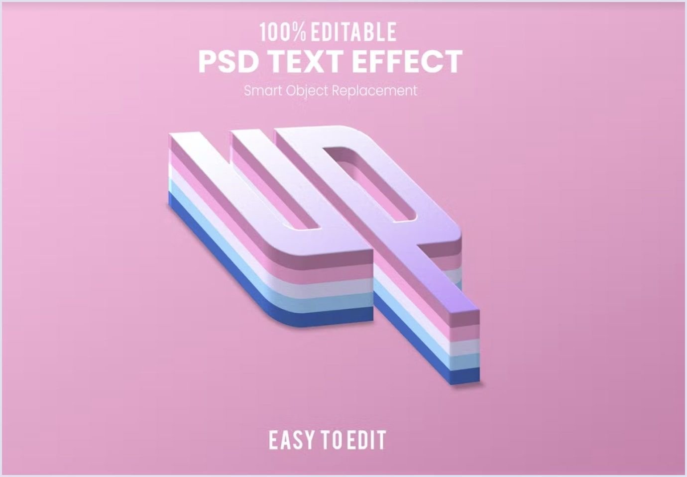
Source: elements.envato.com
Other typefaces used in web design include oversized, edgy, bubble, and retro fonts. They can highlight your brand with a unique statement and help your website look exceptional. To learn more about typography and other web design trends in 2023, check the video below in which our UX/UI designer, Inessa, tells about their details.
There is one thing to remember when using trendy and new fonts: following the best design standards and practices is advisable. Thus, you will ensure the website design brings an excellent user experience.

Font priority
As you organize the content on the website, some areas, like the header or call to action, are more critical. So, you can use web fonts to highlight vital parts of the website and use less accenting fonts for secondary content.
It may be tempting to use different web fonts, but this may result in a feeling of cluttered and overwhelming website space. So, we recommend sticking with one font family. Applying no more than three fonts will make your website look uniform and harmonious. Here is how you can prioritize your fonts.
Primary font
It is the most visible font on your website. Use primary fonts to highlight your brand spirit. For this purpose, you can use the primary font for headings. Also, you can make the font hint in the brand logo.
Secondary font
This font is used for the body of your website. The secondary font is applied to text chunks, such as descriptions or articles. The font choice, in this case, should be based on acceptable readability.
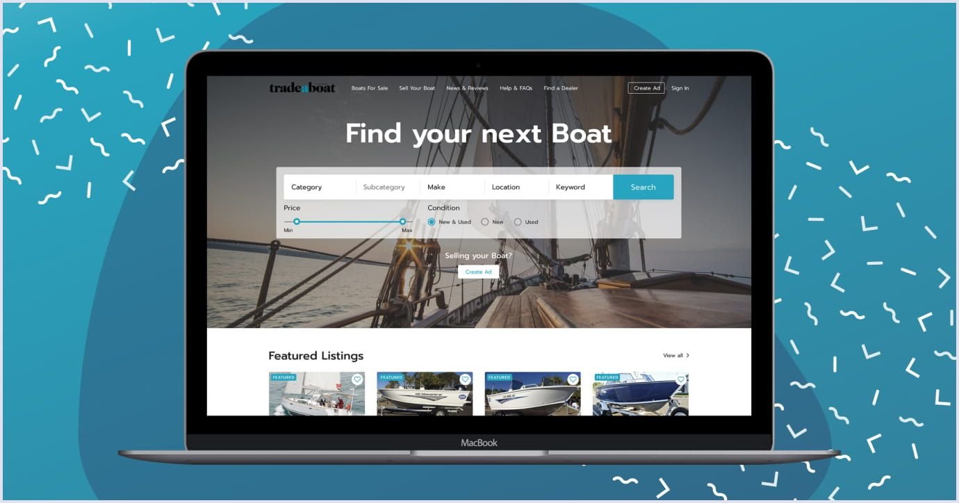
For example, a marketplace boats for sale we delivered website redesign services uses two fonts for different purposes:
- Prompt is the primary font for the menu,
- Nunito Sans is the secondary font for boat cards.
The image below shows how these fonts work together.
Tertiary or accent font
Accent fonts are typically used for specific website elements, such as the navigation menu or call to action button. The accent font should be vivid enough to notice the relevant detail. At the same time, the tertiary font should not interfere with your primary and secondary fonts. So, the users focus on the content presented by the font type.
Accent fonts are optional. Typically, in Codica, we use two fonts, primary and secondary.
Font combinations
Each font has a unique spirit. Some fonts look grave and professional, while others offer a friendly feel with an offbeat tone. Combining different fonts with contrasting moods creates mixes that bring up your website’s messages.
So, how can you use more than one font in your web design? We recommend combining straightforward and rigid typefaces with soft and restrained ones. The best way to use pairing fonts is to apply the first for headings and the second for minor texts.
Another method to combine fonts when you win anyway is mixing serifs and sans-serifs.
Highlighting various messages on your website is all about contrast. So, combining these counteracting font groups creates a feeling of slight yet vivid difference.
For example, we applied this approach to an activity booking marketplace. It is created for parents who want to find exciting leisure activities for their kids. The founder of this platform, David Watkins, is a father himself. So, he wanted to help other parents. This platform is a cozy place for children and adults, and we embodied its friendly feel in a subtle design.
In this project, we combined two fonts, DM Serif Display for headings and Nunito for body text. This font pairing brings the spirit of harmony and accents the diversity of activities for children.
Check the image below to see how we implemented the design in reality and how it looks on mobile screens.
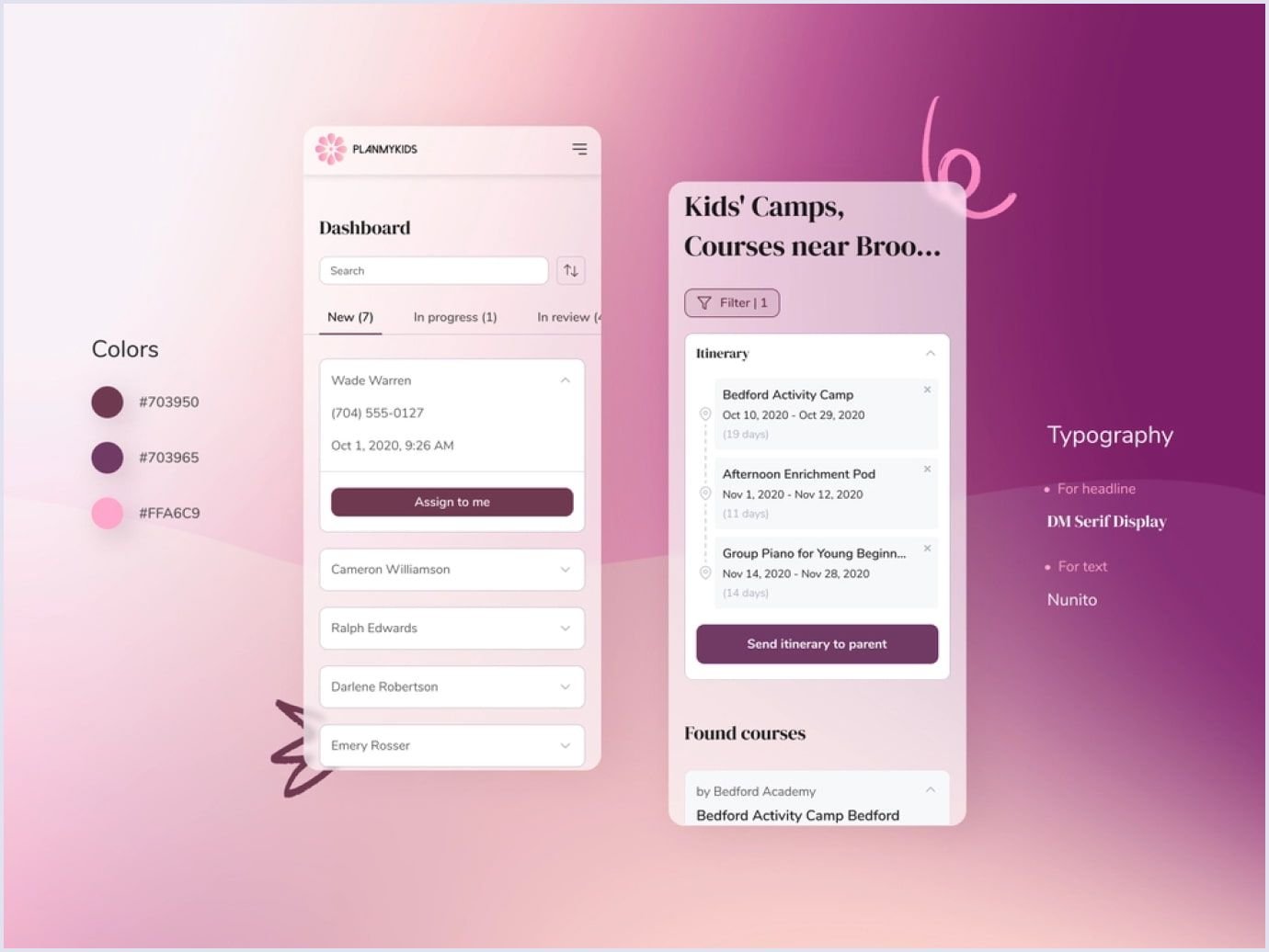
As it was vital to keep the platform functional, these fonts fit just right to keep the text vivid and readable. Check our Behance for more designs we created for different projects.
If you still hesitate about choosing a font contrast path, go a safe way. This means combining the fonts from the same font family. They are a good fit because they were created to match in the first place. Creating contrast, in this case, comes from mixing the case, weight, or regular typefaces with italics. Besides, using related fonts for different parts of your copy brings the feeling of constancy and balance.
You can use software that helps pair various fonts to make the process easy for you. For example, a good tool is fontpair. It has a substantial base of fonts that you can explore. If you want more options, you can check Google Font pairings that are excellent when combined.
Related reading: Common Web Design Mistakes Startups Make
Font readability
Your website visit different people with diverse perception of the text. So, it is advisable to foresee website accessibility. It is unlikely that there exist typefaces suitable for all people. Still, certain fonts are more readable than others. The most common readable fonts include Arial, Helvetica, and Tahoma. The default font types for readability also embrace Open Sans, Roboto, Merriweather, PT Sans, and PT Serif.
People visiting your website will scan the text without going into detail. Fonts without ornament and irregularities serve this scanning purpose better. Also, letter spacing should allow for clear reading of letters. For example, this lets you read the lowercase letters “r” and “n” correctly and not mix them with “m”.
Readable fonts distinguish symbols to make each character recognizable. For example, in Tahoma, the upper case “i”, lower case “l”, and “1” have different looks compared to Gill Sans.
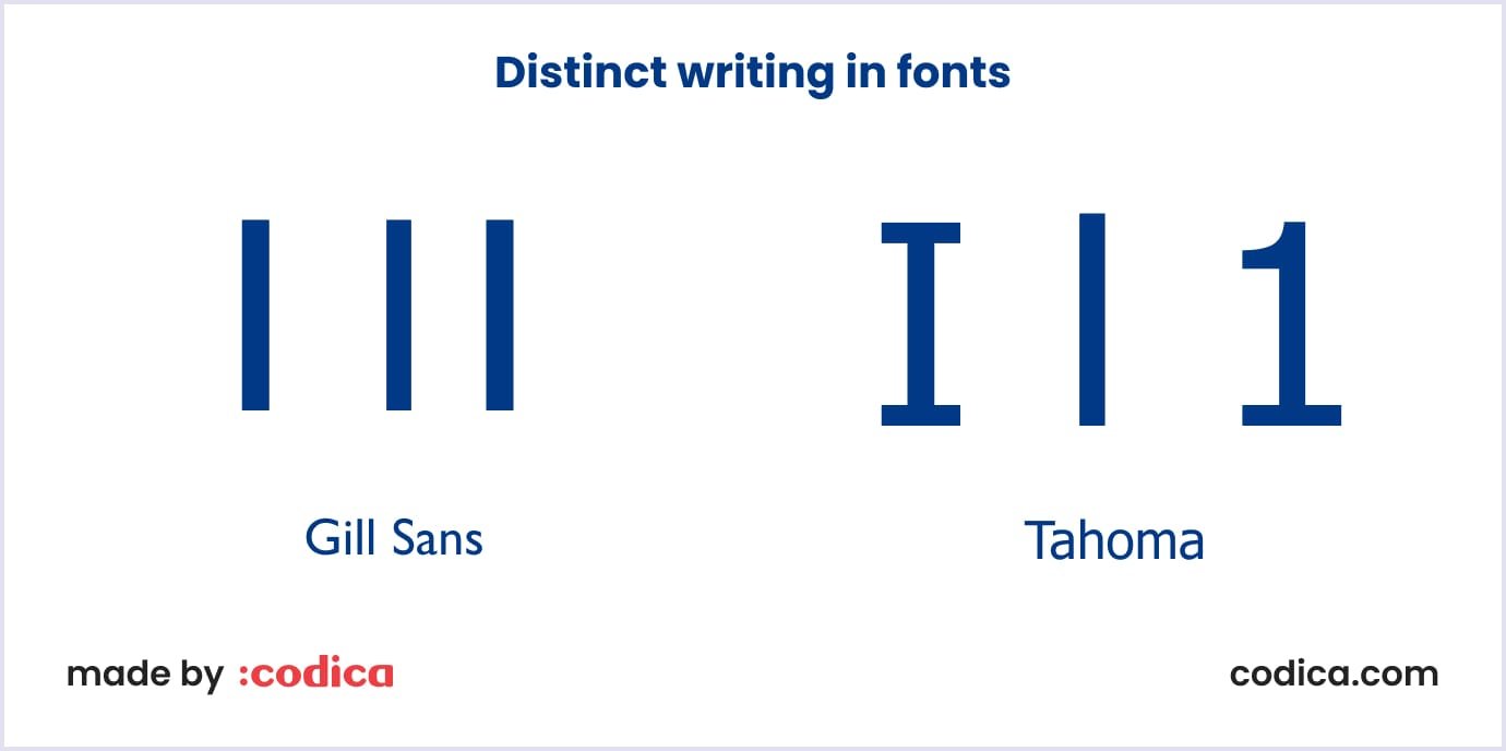
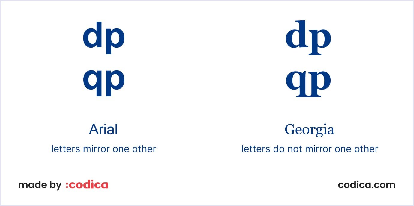
Also, it is nice when letters do not mirror one another. For example, in Georgia, the letters “d” and “b”, “p” and “q” have different writing without mirroring.
Along with standard readable fonts, there are fonts developed for specific needs, called specialist fonts. They include Hargreaves (Scope), FS Me (MenCAP), Dyslexie, and Aktiv Grotesk.
One more tip about font readability. Consider using larger fonts with more letter spacing and lower line height. Thus, lines do not step into each other. It is a good practice to set the line height to 1-1.25 and line spacing to 0.5-1.
Font scalability
Some typefaces look well when enlarged. Meanwhile, elaborate fonts with decorations can break into constellations of unreadable elements. Thus, choosing scalable fonts is a vital step when creating user interfaces.
Scalable fonts are also called outlier fonts or vector fonts. You can change their sizes to larger or smaller without distortions. Each character in such fonts is kept as a mathematical expression to achieve such a result. Rollete Qaku, Bromello, and Rothe are examples of vector fonts. Below you can see a sample piece created with Rollete Qaku.

In addition to numerous font sizes, scalable fonts allow you to use the device’s resolution best. With the more resolution of the device, scalable fonts look better.
Some typefaces are intended for different devices from the start. They are created to use both in headings and in crowded text parts for high readability. In this case, make sure that when you use such a font, it scales nicely on monitors and screens of different sizes.
We recommend using real texts when you test the scalability of a font for your website. This way, you will ensure more reliable results than testing with placeholder texts.

Load times
One important thing that should not be overlooked is how fonts affect website loading speed. If the website loading lasts too long, users will leave the page. For example, the tech agency Portent found that a website loading in 1 second raises the conversion rate by 2.5x - 3x compared to a website that loads in 5 seconds. Also, in case of long loading, your website will be ranked lower in search engines.
The best solution for you is to choose a web font allowing the webpage to load promptly. Here are more tricks on using fonts to keep load times fast.
- Choose the styles that you will actually use in font design. This way, you can limit the number of fonts. For example, you can download a font with regular and bold styles. They consume less memory space than italics, so they will not hinder the load time. We recommend Gotham Pro, Bebas Neue, and Proxima Nova for better usability.
- Limit the number of typefaces. We mention above why you should avoid using too many fonts and keep to 2-3 of them. One more reason for that is the loading speed. If a font or their combination extends the website loading time, you should look for other options.
- Deselect unnecessary languages. When downloading fonts for your website, you can deselect the languages you will not use for a particular font. Thus, you will save operating space and reduce loading time.
Also, you can use fallback fonts. A CSS snippet is a small piece of CSS code that can be used to apply styles to a specific element or group of elements on a web page. For example, CSS snippets can be used to change a web page's layout, color, font, and other visual elements. They can be added to a website by adding them in a separate .css file or directly to the HTML file.
Let’s take the following CSS snippet:

In the example above, the browser will choose Helvetica Now if Joanna slows down the website load. The browser will try between the listed font options until the best match is found.
You may also like: Minimum Viable Product Design: How to Build a Successful MVP
Font inspiration: websites offering fonts and font detection
If you still search for inspiration in typography, some resources can help you make a choice. There is a wide range of websites where you can find a consistent font for your project. One of the greatest websites to look for fonts is Typewolf, where you can find many recommendations and resources on typography. At least, you will find the way for your font design with this resource.
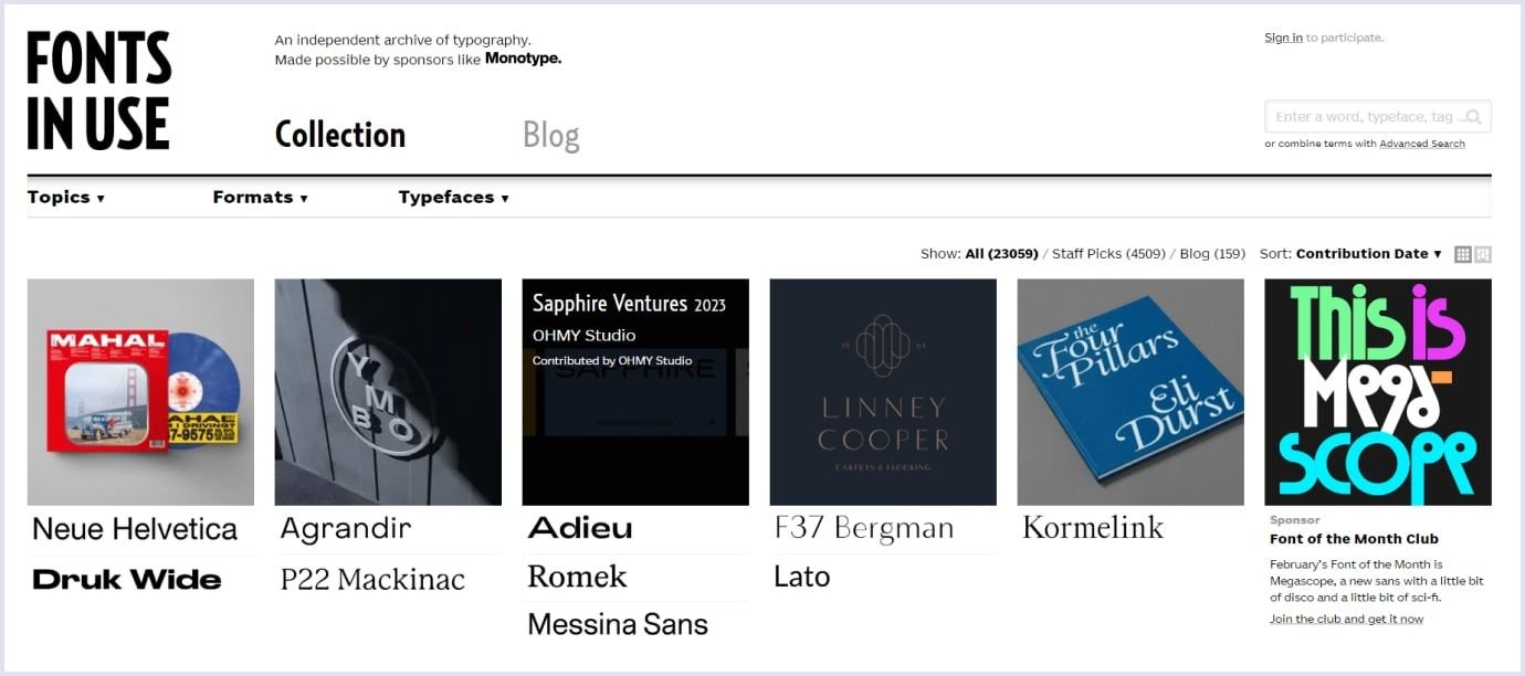
Another excellent website to choose the best fonts is Fonts In Use. The website offers typefaces designers use for printed graphic solutions and web design.
Also, there can be another situation. Let’s say you have found a website with a font that perfectly matches your project. In this case, you can use websites and tools that help to detect the fonts. For example, WhatTheFont allows you to upload a picture with the font you need, crop it, and find the results for the desired font.
You can add another option as an extension to your web browser. For example, Rapid Font Finder allows you to detect fonts right on web pages.
Read also: Website UX Discovery Process: Roles, Tools, and Main Steps in Web Design
Wrapping up
Choosing the fonts for a web project relies on two main aspects: user convenience and communicating your brand identity. The fonts you choose should be easy to read and accessible for different groups of users. Also, they should scale for different devices with various screen sizes and support the fast load of the page.
Fonts also translate your brand uniqueness. They should be coherent across your logo, website, and other imagery you use to show your brand. This will help you make your brand familiar to users and build strong brand loyalty.
Our team applies this approach to create vivid designs for marketplaces, SaaS solutions, and mobile development. Check our portfolio to see designs from our experts.
If you have a project where you want to decide on the right font, contact us. Our experts are eager to help you make the right choice.

