When creating a website or an app, user interface (UI) and user experience (UX) design are crucial to making your solution resonate with users. Design communicates the main idea behind your product and determines how people feel about it. So, what are the UX/UI trends and means that designers will use in 2024?
Design in 2024 is about creating dynamic experiences for users in UI and UX. Whether it is a fancy animation or a convenient flow, design helps users discover more about a product at a glance. Emerging device technologies and artificial intelligence make designs more creative, personalized, and accessible.
Our team has rich experience in creating designs for digital solutions. So, we selected the leading UI/UX design trends 2024 to explore how designers weave them into their web projects. Thanks to trendy approaches in 2024, your website or app will highlight your value to users, leading your brand to success.
UI design trends 2024
The user interface (UI) defines the visual side of the product or service. The UI includes brand colors and interactive design elements of the interface. This is the primary aspect that helps users perceive your solution and its benefits.
UI trends that enrich user experience and interaction with solutions through visuals are gaining popularity in 2024. So, let's have a look at them.
Dynamic color gradients
This tool has been used for years, and it will see a new application level in UI design trends 2024. Traditionally, designers use gradients for headers, backgrounds, logos, and text. Gradients allow broad experiments with colors and mixing them to add dimension to a design.
Now, there are even more opportunities to push the boundaries of perception with dynamic effects and UI design software. Designers use different color schemes and seamless transitions between hues to give a feeling of expansion. Also, gradients allow for creating unique styles to support a brand’s idea in a particular project.
For example, a dynamic gradient is an accent point for PrismData’s web page. The company is a transaction intelligence platform that provides financial insights and forecasts risk scores. The web page uses a black-and-white color scheme with scattered gradient spots.
It is interesting how designers use gradients to focus the viewer’s attention on the different sections of a website. The top of the homepage features a gradient in the lower right corner. While you look through the page, the gradient starts moving, breaking into three colorful spots and uniting again.
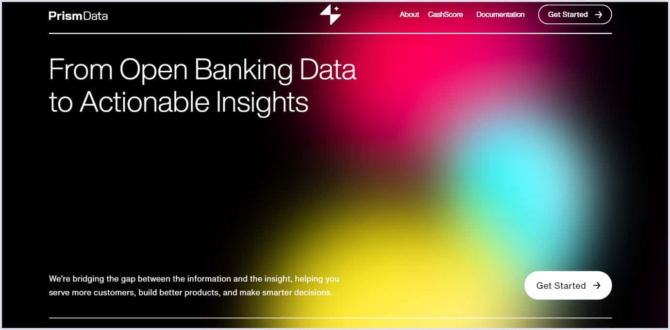
You will find more gradient spots on the homepage, woven whimsically. For instance, a dynamic vertical line ends with a gradient sparkle, like a bulb.
The impression that the webpage induces is an effect of how you can get an “aha” moment when you get an insight. It supports the principal value that the company offers. The webpage from PrismData proves how dynamic gradients suit businesses in various industries.
We recommend using dynamic gradients wisely when you embrace this UI design trend 2024 in your project. They should be experimental and help your solution stand out. Yet, they should also enhance the overall usability of the website or app.
This is the case for the Atlas card for reservations and bookings of prestige places. Created by Atlas Inc., a technology company, and issued by Lead Bank, the credit card has no pre-set spending limits, unlike traditional cards. So, “No limits” is the central message conveyed in the website design.
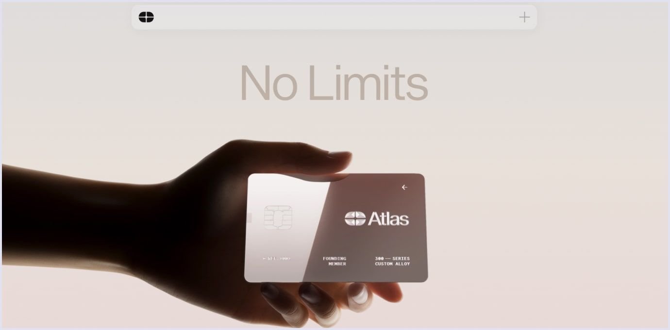
The sense of transition accompanies different elements of the site. The homepage is created with minimalism and uses pastel gradients. At the top, the theme gradually changes from a pink shade to a light blue tone, mesmerizing the viewer.
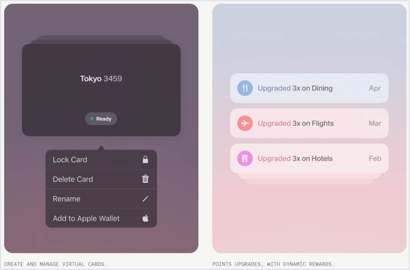
Scroll down, and you can spot more elements with gradients. For example, the website highlights how you can manage and upgrade your card. These features are also designed with soft gradients, using dark and light color schemes.
Kinetic typography
Applying fonts with transformations means kinetic typography. It is also known as dynamic or motion typography. This technique applies motion to text or a screen and is one of the UI design trends.
There are a variety of dynamic changes applied to a font. They can be disappearing text, shrinking or expanding letters, text moving around the page, color-changing fonts, and more.
Changes can be simple and short or complex and elaborate. It depends on the designer’s creativity and the purpose of the web solution.
In contrast to static typography, kinetic text better captures the viewer’s attention. Moving text makes emphasis where needed, evokes emotions, and transforms simple fonts into vivid messages.
One such case of using kinetic typography is the Danish company G-uld (G-wool), which provides wool and accessories for knitting.
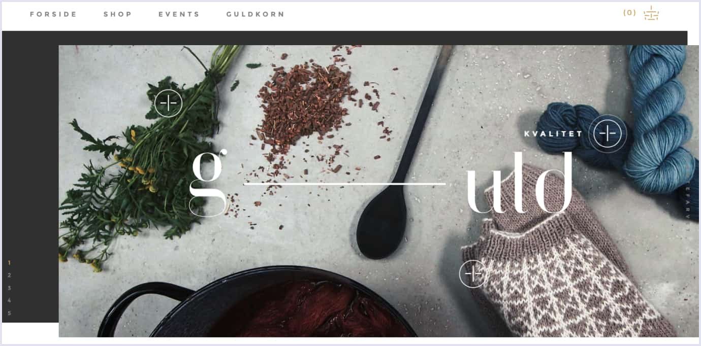
The top of their homepage presents a video with the benefits of the brand, namely plant use, quality, and design. Each encryption appears and disappears as you hover your mouse over and out. Also, if you click on the cross next to the encryption, the whole text disappears, giving way to a short video highlighting the brand’s features.
Moreover, if you scroll down, you will see that small text pieces also move when you hover the mouse over them. Moving text focuses attention and brings up the relevant message.
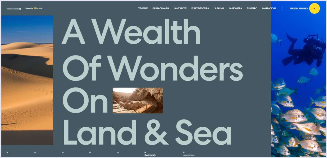
Another example of typography as a design focus is Expedia’s presentation of the Canary Islands. The travel technology company presents marvelous experiences to discover in the Spanish archipelago.
The headings are prominent to attract attention to the main adventures and outstanding characteristics you can spot on the islands. Also, kinetic text pieces are appearing as you scroll down the website. With rich graphics, moving text elements add dynamics and make key sections stand out.
Hand-drawn illustrations
This UI design trend 2024 returns to its full potential, and you can see more hand-drawn illustrations in the future. Generally, illustrations are a potent design tool to keep users’ attention. Regarding the short observation span of website visitors and app users, we can use illustrations to engage viewers quickly. Also, illustrations explain complex ideas with a simple story and can create a mood.
You can use different kinds of illustrations for web design, such as vector, flat design, 3D, animated, and many more kinds of illustrations.
In this regard, hand-drawn illustrations take a prominent place. They add a personal touch and unique charm that no other illustration can give. Hand-drawn illustrations can range from simple sketched pieces to elaborate artwork, depending on the website’s goals and style. That is why such illustrations hold a prominent position among 2024 UI design trends.
For example, Leeroy Playground, a creative studio, designed a website to present Montreal sight spots. The site leads you through several places in Montreal with a series of hand-drawn animations. The animations and sound accompaniment create a spirit of mystery and curiosity to inspire viewers to see the city.
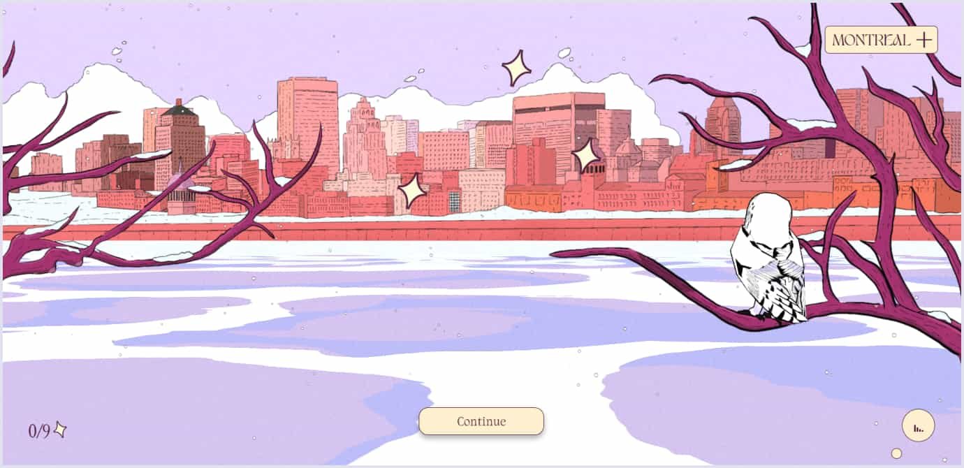
The natural carelessness and inherent imperfections of hand-drawn illustrations create a sense of warmth and authenticity. Such elements make the brand more approachable and related, setting a deeper connection with the customers and users. So, hand-drawn illustrations as one of UI trends help to do the following:
- Build your brand. Hand-drawn illustrations give a consistent visual style across the website. They reflect the brand’s values, which differentiate it from competitors.
- Tell your story. With hand-drawn illustrations, you can tell the story of your brand’s mission and values in a memorable way.
- Engage your audience. Using illustrations makes the journey through your website or app fun and personal.
- Highlight important information. As hand-drawn illustrations have visual appeal, they make information on your website more visible and enhance usability.
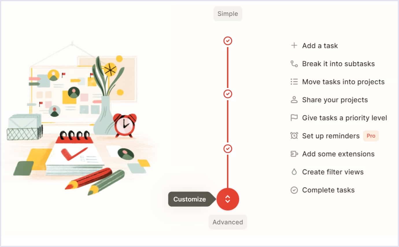
Another prominent example of incorporating hand-drawn illustrations is Todoist. It is a leading task manager and to-do list app with millions of users. The homepage’s aesthetics accentuate the relief you can get when organizing your daily life or business tasks with an app.
The website highlights the app’s ability to scale depending on task complexity. This is a crucial characteristic of why people love the app. So, the website design incorporates a hand-drawn illustration to outline this app’s value.
It goes this way. Scroll down the relevant section, and you will see a drawing with the basic things and features. The picture will be replenished with more details as you scroll down further.
Cards
Using cards is another technique that stays among the top UI design trends. Early websites used cards with visible borders as a necessity. Web pages used simple elements and applied cards to avoid clutter. Later, web design avoided cards to give a modern look and neatly arrange the content without additional lines.
Yet, the borders are the website’s reality, as they are organized with a grid to separate elements. So, cards come back to present the website’s elements. Moving from minimalistic designs with no borders, websites now tend to return to realistic yet responsive grids.
With cards, you can highlight website sections with many elements that must be seen and distinguished. Also, cards range in style. So, designers use asymmetric or symmetric line art, shadows, or stripes of color or images to embrace the latest UI design trends 2024.
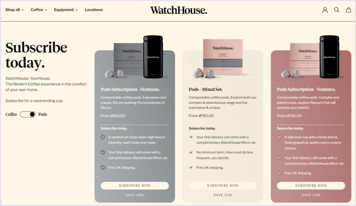
For example, WatchHouse, a network of coffee houses, uses cards in their creative and stylish website to tell customers their story. The cards help us see the product varieties, the company’s values, and the people behind the brand. Thus, a viewer catches important information simply and concisely.
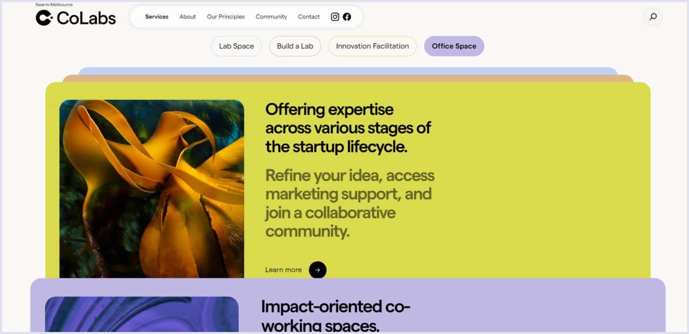
Cards are also an essential element for CoLabs’s website design. The company offers laboratory space for tests with a view to eco-friendly innovation and respect for nature’s ability to sustain life.
The website uses cards to present the company’s advantages and services. Using cards with visible borders, the website presents the company’s offers clearly. The viewer can see each service by scrolling the website down and checking out each card to view details.
Cards organize the section space and help a viewer understand the opportunities that the company provides.
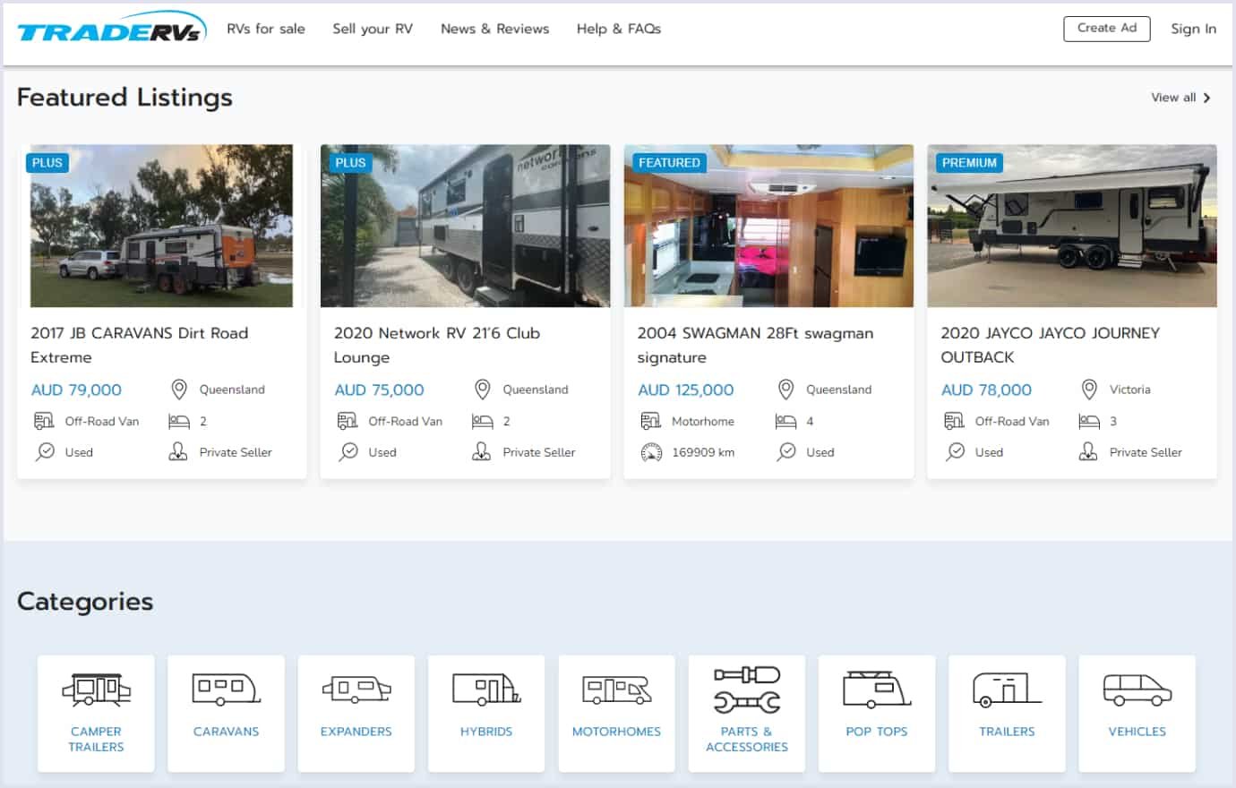
At Codica, we also use cards to outline vital points in website design. For example, we chose this technique for TradeRVs’ website for selling recreational vehicles, caravans, and camper trailers.
The approach is handy for presenting listings and product categories with simplicity and convenience. Separate sections enhance visibility, making it easy for a viewer to navigate the listings and categories. Thus, the design contributes to a faster and simpler search.
The approach is one of several crucial enhancements our team has made to the platform. Our website redesign services included revamping the website by choosing the block structure, adding quality illustrations, selecting fonts, and more. As the company required, we made the improvements, preserving the brand identity and aiming for better user engagement.
Our team’s redesign and development improvements increased the company’s lead generation performance by 480% compared to the previous platform. We appreciate Celso Prado sharing the company’s success in the video below.
Check out our case study for more details about this project.
Motion effects
Moving elements have been a web design asset for a while so far. Regarding their versatility, we expect them to increase among UI design trends 2024 and beyond. Motion elements include animations and transitions that bring up crucial sections and texts on a website.
Motion effects create perceptions and evoke emotions. At the same time, they improve usability and create engaging experiences for users. You get the following benefits from motion effects in web design:
- Improved user engagement. Motion elements lead users through the website and keep observers engaged with the website’s story.
- Guidance and focus. Animations and other motion effects attract users’ attention to crucial elements.
- Smooth transitions. With moving effects, you can show transitions between website sections. This approach enhances the overall flow.
- User interface feedback. Thanks to transformations in shapes and colors, users understand the progress of particular actions, such as loading, form validation, or error messages.
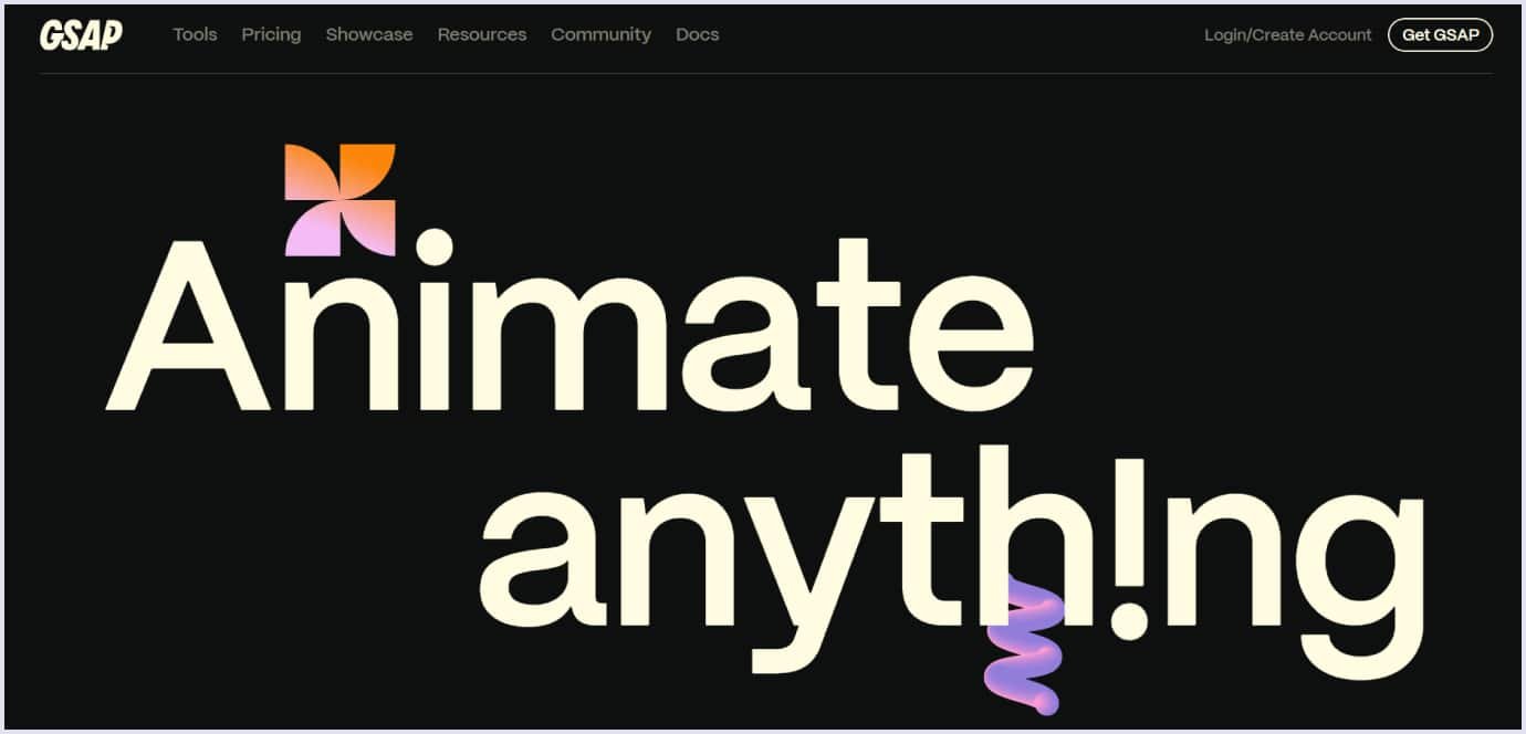
An outstanding example of enriching a website with motion effects is the GSAP website. It is a JavaScript (JS) toolset for creating animations that work with any CSS (Cascading Style Sheets) or JS property and in any major browser.
The website design includes elaborate motion effects woven into text elements and specific sections to present GSAP’s animation potential. As you scroll down, motion elements appear in the letters and texts created in different colors and gradients. The design also includes bouncing and springing shapes accompanying text and adding a playful mood to the page.
Along with kinetic typography that accents particular pieces of text, colorful moving elements add a dynamic touch to the website. These color and shape transformations show how you can use GSAP for your projects and bring the user experience to a new level.
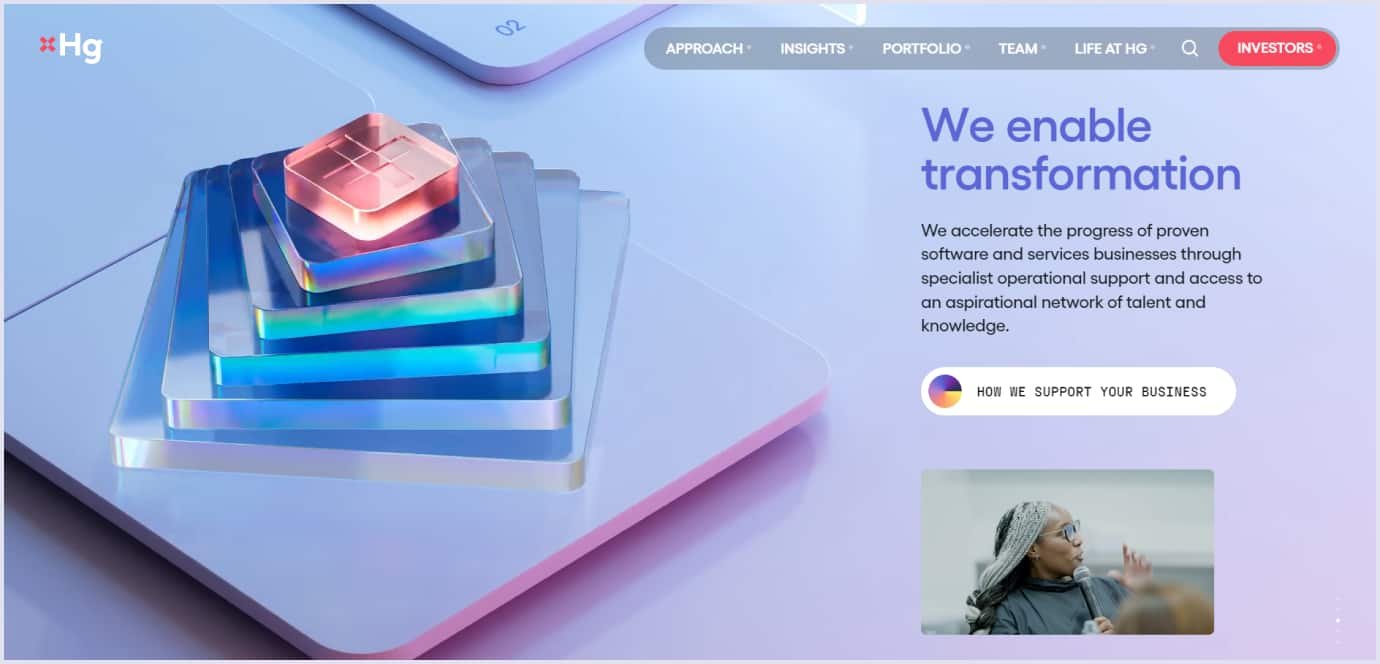
Another prominent example is how the Hg company highlights its logo throughout the website’s 3D animations. This software investment leader in the European and transatlantic regions leverages 3D moving elements to outline its brand identity.
The logo cross is a key theme in the website’s animations. The cross appears as a multi-level shape, centralizing in the opening video. Then, it appears as a pyramid unfolding as a staircase. The palette and volumetric objects create an enchanting effect. So, the company highlights transformation, reliability, and innovation support as its crucial values.
Bauhaus style
It originates from the German art movement in the early 20th century. The word Bauhaus means “construction house” in German. The main motto of the Bauhaus school is “form follows function”, and other principles follow it. So, the Bauhaus style holds the following characteristics:
- Form follows function. This principle means designing elegant forms regarding the element functions. That is why the Bauhaus style focuses on geometric forms.
- Use of minimalism. Bauhaus artists preferred simple and modest forms, avoiding curvilinear and floral shapes. The artists focused on pure forms and clean designs, leveraging the natural forms of objects without ornamenting.
- Experiments with new forms and techniques as design trends. The Bauhaus artists focused on using new materials and technologies to design products for mass production. This approach resulted in using negative space and avoiding extra elements.
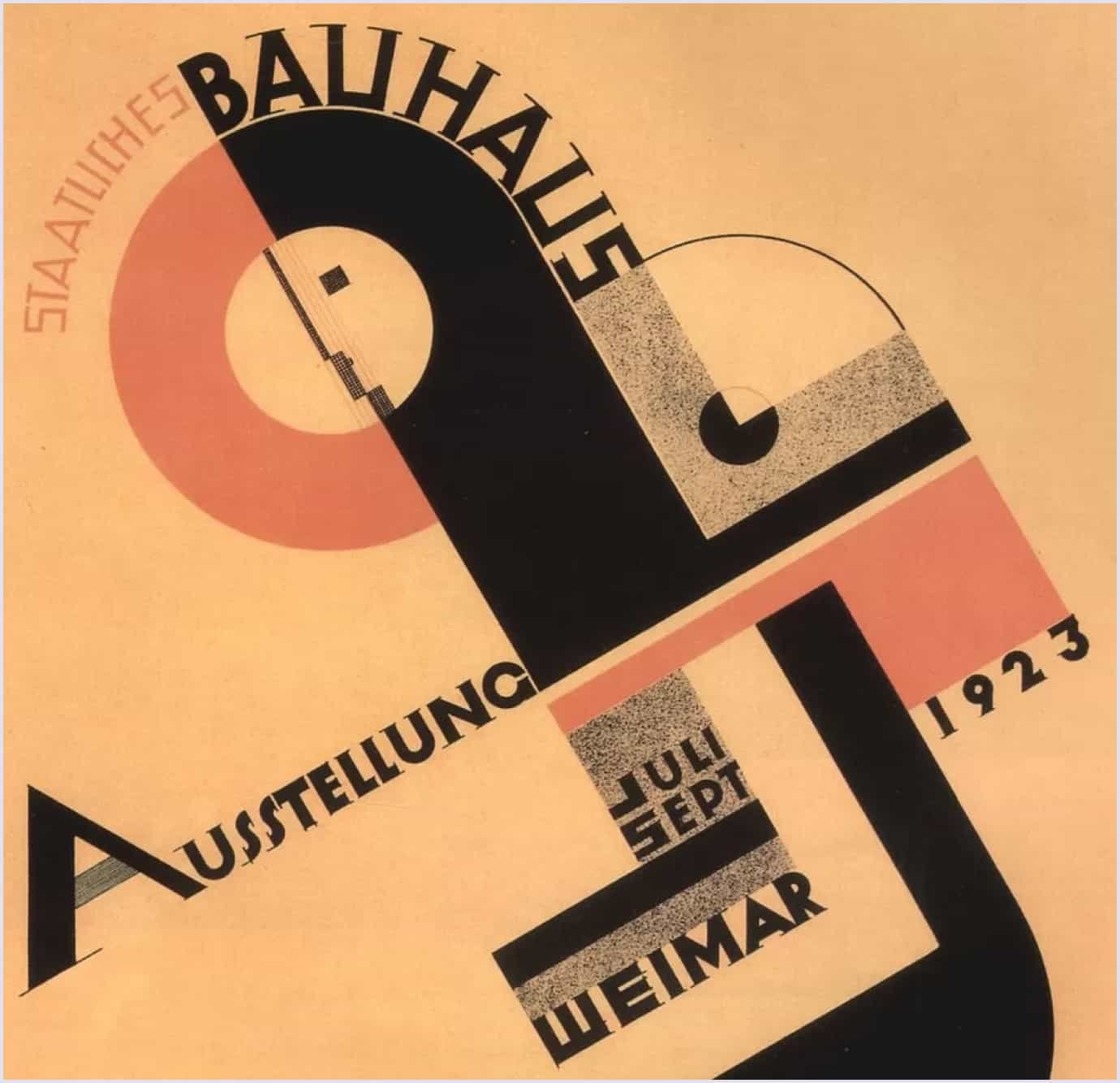
Below is a poster by Joost Schmidt, a typographer and graphic designer, created for a Bauhaus exhibition in Weimar in 1923.
In today’s world of digitalization, the Bauhaus principles have been revived with new potential in graphic, industrial, web, and app design. Relying on the ideas of this art movement, designers make forms functional and accent the technical side of web solutions and apps. Today, designers use the following principles in the Bauhaus style as part of web and product design trends:
- Importance of geometry and minimalism in typography. The Bauhaus designs incorporate geometrical elements and simple fonts. Some Bauhaus fonts are digitized and used for designs targeting functionality.
- Experimental layout. The spirit of experimentation is embodied in going beyond standard layouts. So, the design includes “broken” grids, common among Bauhaus artists.
- Focus on collaged design. Using separate elements or human features, such as eyes or hands, is widespread. They bring a surrealistic touch to the design.
- Color scheme with primary colors. Bauhaus's palette uses primary color palettes. Also, the style combines black and white with accent colors, such as red or blue.
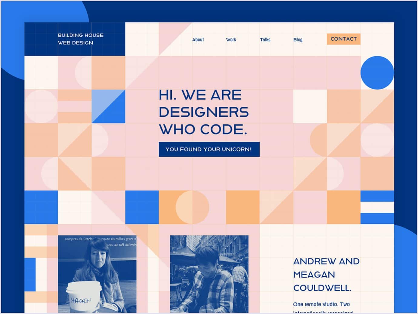
The image below is an excellent example of using the Bauhaus style following a UI design trend 2024 to convey the spirit of technology. Uniting elegance and functionalism, the design accents the combination of creativity and technical capabilities.
Source: dribbble.com
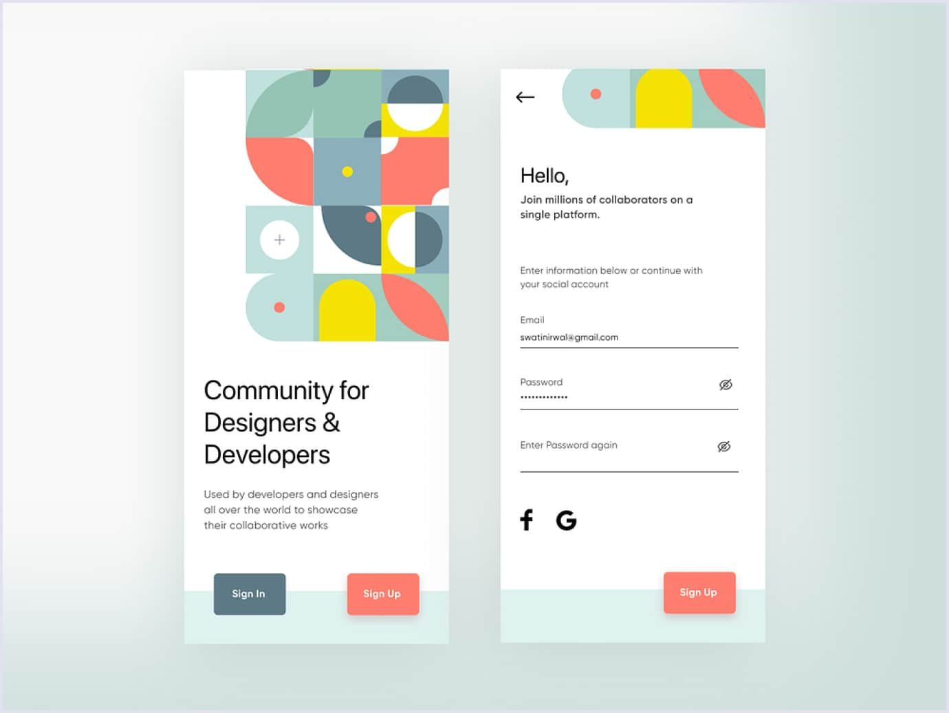
Also, you can use the Bauhaus style to design apps. Using flat colors and geometric shapes, you can convey a sense of comfort thanks to simplicity and convenience. Just like in the collaboration app concept below.
Source: dribbble.com
UX design trends 2024
The UX (user experience) is a broad definition, including all the experiences users get when interacting with a website or mobile app. To compare, UI focuses on a product’s interface, and UX aims to meet users’ needs via element arrangement and flow. A good user experience is the best indicator of proper design for different websites, such as ecommerce platforms or SaaS solutions.
In addition to UI trends 2024, we decided to share a selection of top UX design trends that have arisen along with new technologies that enhance user experience. So you can apply them to your app or site.
Hyper-personalization
Implementing hyper-personalization in UI/UX means creating user interfaces using artificial intelligence (AI) and real-time data. This approach ensures an interface is tailored to users’ needs, preferences, behaviors, and capabilities. So, hyper-personalization stays among UX trends in 2024.
Typical personalization is based on the user’s name, location, browsing history, and purchase history. Hyper-personalization takes a step forward with emerging AI and ML (machine learning) technologies and leverages more precise data. Such information includes demographic, behavioral, and psychographic aspects. Compared to personalization, the hyper-personalized approach considers users’ preferences on a micro-level.
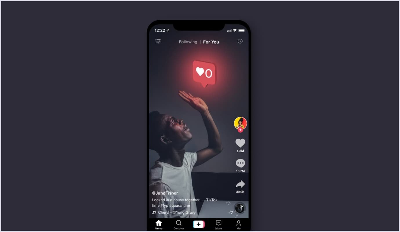
An example of hyper-personalization is TikTok. Every swipe, scroll, tap, like, and dislike counts to TikTok’s algorithms. Depending on UX interactions, TikTok offers users specific content and groups.
Also, TikTok uses a “For You Page,” a personalized feed of suggested video content for users. It offers TikTok users relevant and engaging videos based on their likes and preferences.
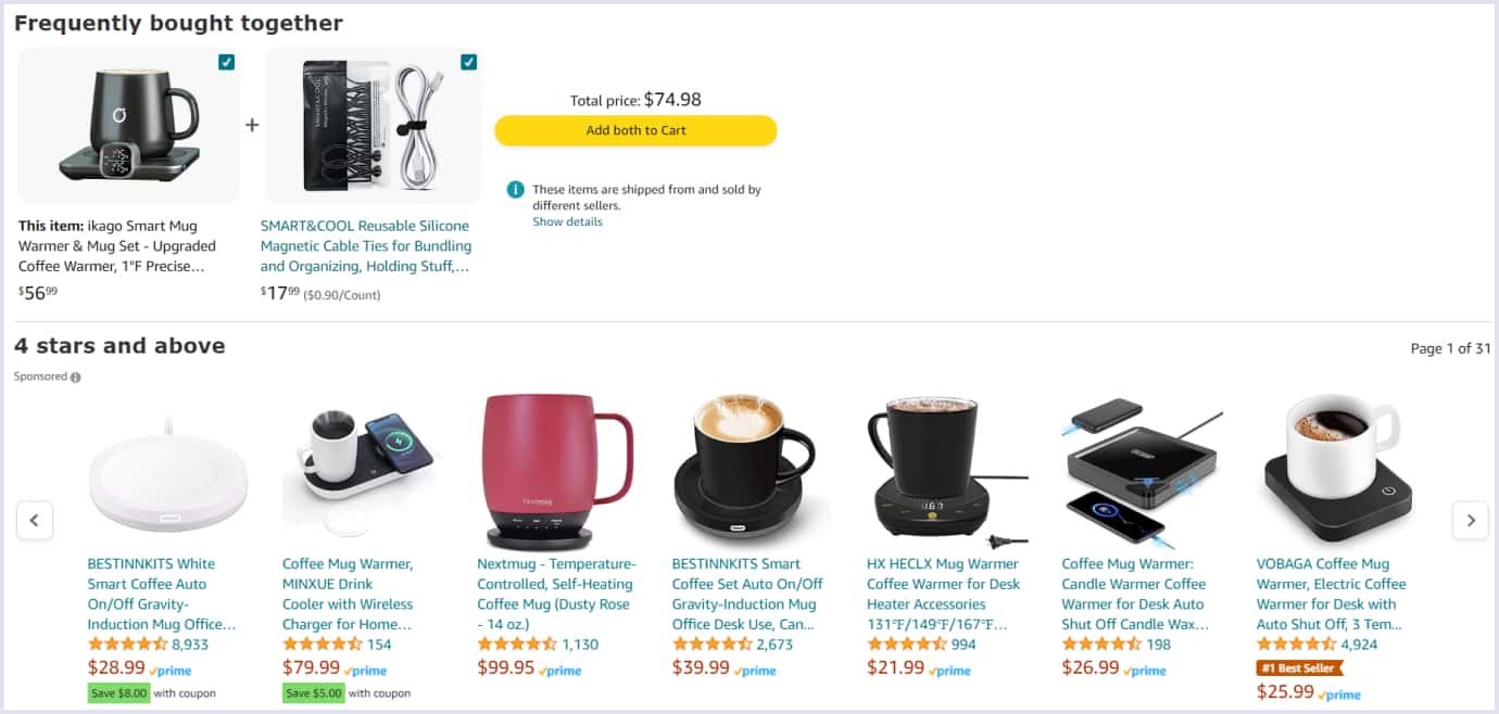
The ecommerce sector also leveraged hyper-personalization to provide better services. For example, Amazon's engine considers specific product data when a shopper adds a product to the cart, say a coffee mug warmer. Based on the user’s product search, Amazon shows relevant featured listings and suggests complementary items. So, users get the impression of a personal shopping assistant, which makes them return to Amazon.
Though hyper-personalization delivers tailored experiences, it raises crucial aspects of data privacy. So, companies should be transparent about how they use personal data. Advanced security systems are essential in supporting the safe processing of sensitive information.
Read also: Online Marketplace Design Why UI/UX Matters
Biometric authentication feature
Applying biometric authentication to mobile apps provides better usability, so it comes as one of the UX trends. Biometric authentication is a process of user authentication based on physical parameters. They include fingerprints, face, voice, or iris.
With biometric authentication, users can access apps simply and reliably, compared to passwords and PINs (personal identification numbers). Despite the drawbacks, such as the possible improper work of sensors or physical feature changes, biometric authentication simplifies user access to apps compared to using passwords.
This method is also applied in banking, payment, and healthcare apps where safe personal data processing is vital. Prominent financial companies like Bank of America and FirstBank have incorporated this feature into their mobile app, following user experience trends.
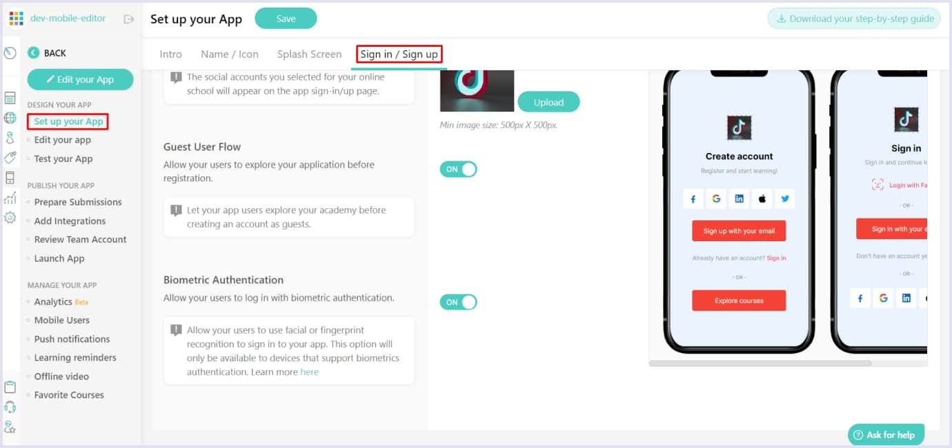
Another example is the LearnWorlds app. It helps create educational courses and has a biometric feature in its settings menu. Users can select biometric authentication by toggling the feature on or off. So, customers can select Face ID or Touch ID depending on their iOS or Android devices.
Source: support.learnworlds.com
Multi-screen designs
Today, we use different devices with various screen sizes for different purposes. We use desktops for work and smartphones for simple operations on the go. Tablets and TVs also provide unique experiences for reading and entertainment.
User experience trends in 2024 embrace adaptation to different devices to bring the best experiences and help users reach their goals. Thus, companies engage broader audiences with their websites and apps.

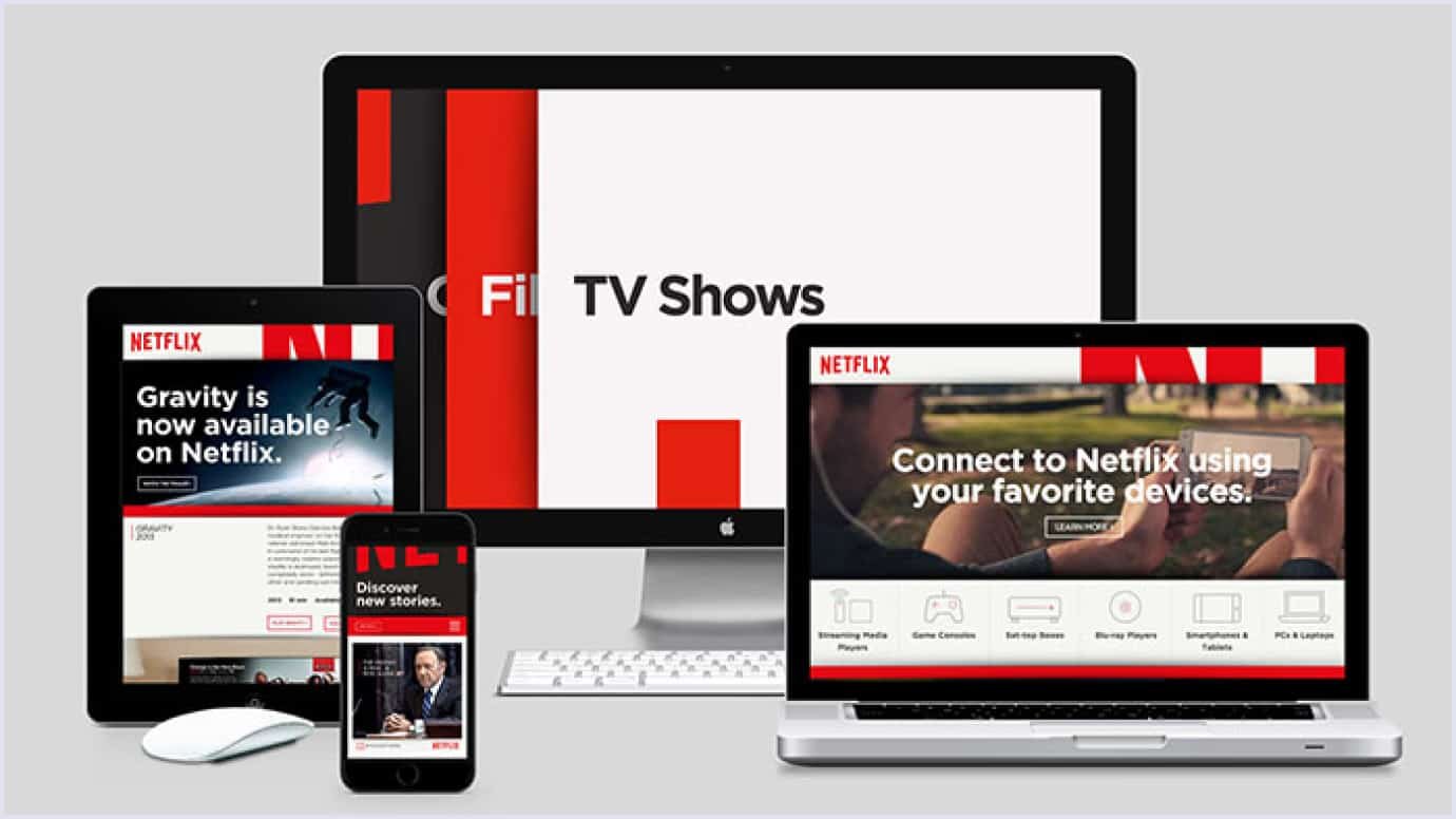
A prominent example of crafty multi-screen design is Netflix, a streaming service that enables users to watch videos on different devices. Thanks to impeccable UX, Netflix’s videos play smoothly across smartphones, tablets, desktops, and TVs.
Netflix highlights its “download” option to help users watch videos offline if they need. The video turns horizontal quickly once a user turns the device. Also, Netflix gives a story-like preview to give users an initial impression of the video. This is a straightforward adaptation for mobile devices as one of the UX trends 2024.
Integrations with conversational AI
Designers have been creating graphical user interfaces (GUI) for decades. Now, technologies have shifted the design toward conversational user interfaces (CUI) with chatbots and virtual agents. CUI will stay among UX design trends 2024.
You can use conversational AI on your website to give recommendations, provide customer support, book tickets, order food, and more. By taking on routine tasks, conversational AI relieves people and enables them to deal with more complex issues.
Many companies use conversational AI chatbots to provide better services. The design of such chatbots is minimalistic. Typically, a chatbot should be designed to help users solve their issues without distraction from the general website’s or app’s information.
This is how Seismic Learning designed its chatbot. Previously known as Lessonly, the company offers a learning platform for teams and companies. Their chatbot is hidden in the lower right corner and is available once a user clicks on it.
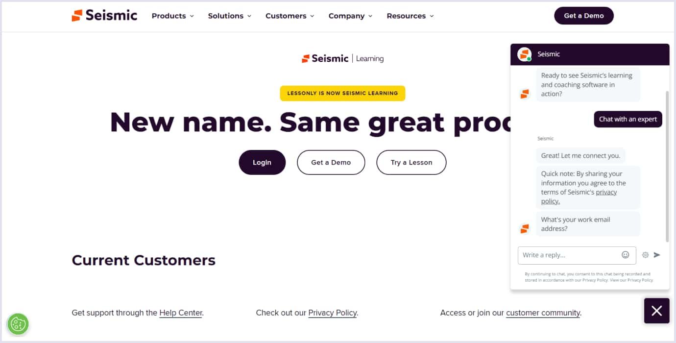
The chatbot offers several options for a website visitor, for example, an instant connection with an expert. The design ensures smooth user flow and the convenience of closing the chatbot if a visitor wishes. A color highlight makes a closing button with a cross visible and easy to use.
Chatbots with conversational AI can perform different tasks. That is why, following the tech design trends, we also integrated a chatbot into a platform for HR specialists. With this chatbot, recruiters can create job descriptions that align with the relevant standards.
AI and a vector database, Weaviate, power the chatbot so recruiters can get a human-like interaction. Also, we included a series of questions a chatbot asks an HR specialist to compose the job description. The inquiries include the following:
- Profession category;
- Experience and skills;
- The main tasks of the position;
- Must-have qualifications for candidates;
- Benefits;
- Working hours per week;
- Salary range and more.
Below is a sample chat text for a recruiter from the HR platform.
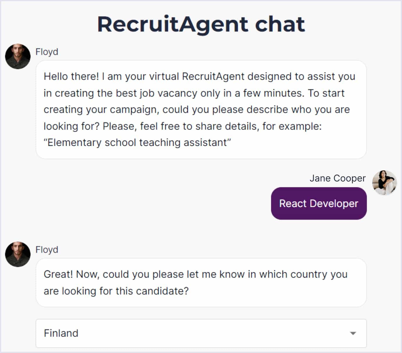
The chatbot's design is simple and concise and follows usability trends in UX design 2024. So, nothing distracts HRs from the points they fill in. A photo avatar brings a realistic touch to the chatbot, making the dialogue more human-like.
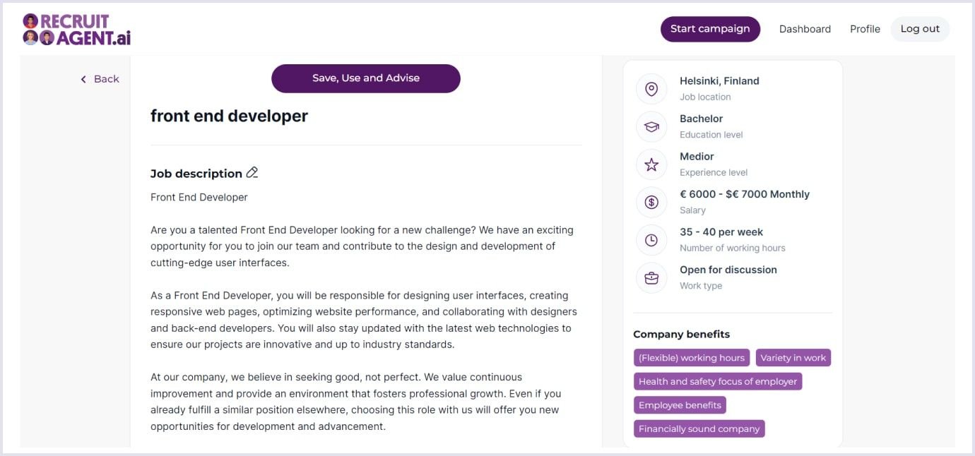
The bot offers an auto-complete or typing option, so recruiters can choose what better fits their goals. After answering the questionnaire, a recruiter gets the complete job description ready to be posted on prominent job websites according to relevant standards. For example, below is a job description for a frontend developer.
Accessibility as normal
In 2024, accessibility is what your product should aim for in UX design. Every person, regardless of their perceptions, has equal rights with others. People differ in physical and mental abilities, race, cultural background, gender, age, and language. Thus, all these aspects must be considered in the website and mobile app development.
First of all, the designer thinks about the needs of users. How do you make everyone feel comfortable and safe when using the product? Accessibility stays among the leading UX design trends. It is becoming standard with the mobile-first approach to creating websites and apps.
In order to make a website or mobile app accessible to everyone, it should be tested by different people. There are four principles of inclusive design:
- Determine what precisely in design may not be available to users with unique abilities;
- Find out what situations may arise when all users will not be able to use your product fully;
- Involve people from different communities in the development process;
- Offer several options for interaction with your design, and strive to provide an equal experience for all users.
More and more companies are paying attention to the diversity of their users. So, they create websites and apps with different customer needs and capabilities in mind.
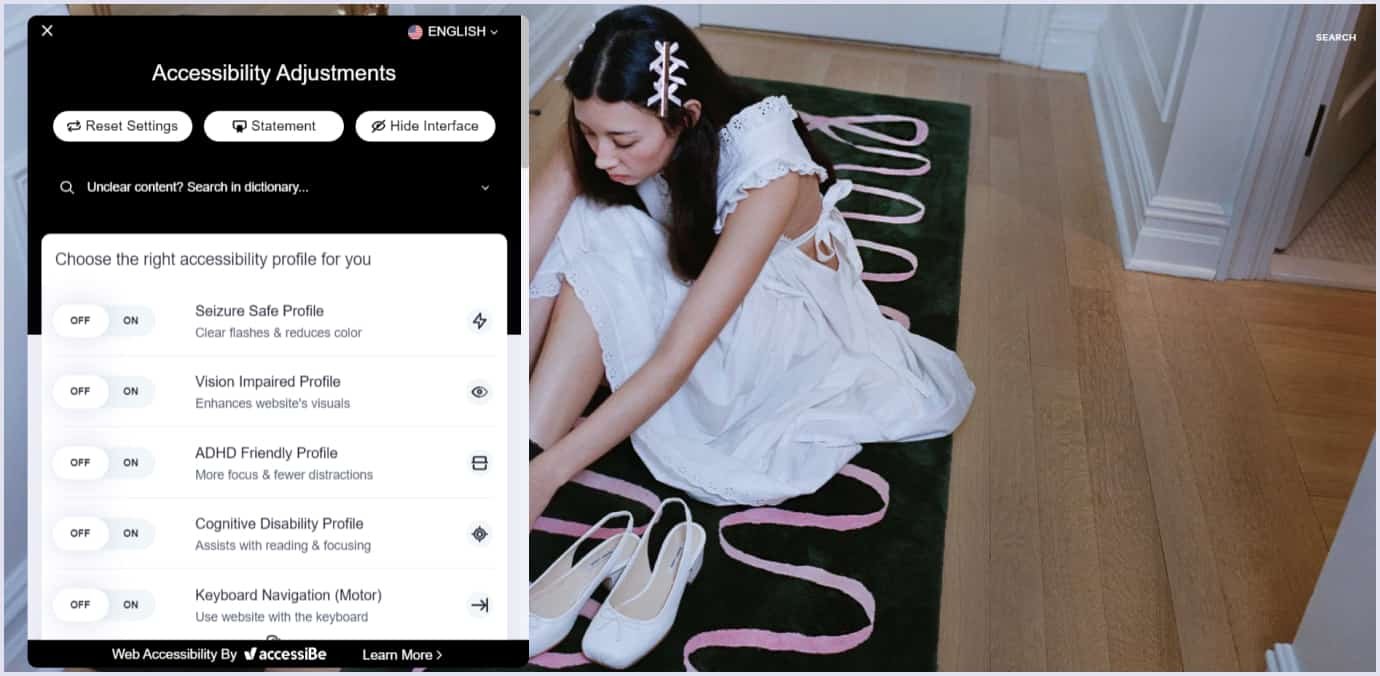
For example, the fashion brand Sandy Liang excels at customer service via their website. With a simple UI and thoughtful UX design, the brand caters to how its customers will navigate the stock.
The website holds a widget in the lower right corner with enhancements for viewing and navigating. The widget offers specific profiles, such as seizure-safe, vision-impaired, and more. Also, users can make custom choices by selecting from content, color, and orientation adjustments.
Synchronization of your apps and websites on all your devices
The mobility of our lives determines this trend in UX design for 2024. At different times of the day, various devices are always with us. But the tasks we want and need to perform remain the same. There are many different ways to do this, but users will always choose convenience.
This convenience is to synchronize the content and settings of apps and websites between your computer and mobile devices, such as your phone, tablet, and smartwatch. This is useful both at work, when you need to be on the course all the time, and in everyday life.
Let’s take the Spotify app as an example of this UX design approach. You can start listening to a podcast or song on your laptop and continue from the same moment on your phone. At the same time, you always have the opportunity to switch or press pause on the smartwatch.
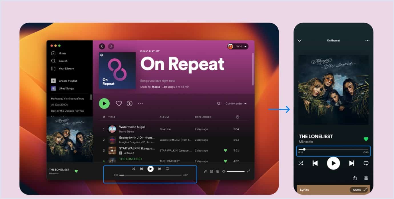
Source: open.spotify.com
To sum up
Hopefully, we have helped you understand web design tendencies and inspired you to make practical and delightful pages. Now you are acquainted with many UI/UX design trends of 2024, but remember the main thing - whoever the design is for, it should be clear and user-friendly.
At Codica, the main goal of UI/UX design is to help users achieve their goals. For this purpose, we track the latest UI/UX trends when building our products, be it software as a service platform for real estate or a domain marketplace.
If you are looking for a UI/UX design company to implement all your needs and requirements, hire experienced and skilled designers from Codica. Our team will gladly provide custom software development services for your business according to the best industry practices.
Contact us to get a free quote and turn your idea into reality. Also, you can check out our web application projects, where we share our expertise in programming and design.

