The progressive web applications outcompeted native apps and proved its effectiveness for the business. For example, the TOP 30 PWA Benchmarking Study found that the average conversion rate for PWAs is 36% higher than native apps. Thus, progressive web app design has become a hot topic for companies wanting to stand out from their competitors.
In this article, we gathered the most efficient progressive web design guidelines to help create the best user experience for your website.
What is a PWA, and why you need it?
A PWA stands for a progressive web application. As the name suggests, PWAs are one of the mobile app developmet services, based on standard web technologies. At the same time, the addition of the newest JavaScript features makes them a great substitute for native apps.
In other words, progressive web applications work like ordinary websites and cell phones. It offers functionality like offline mode, pushes notifications, and adding to the home screen without visiting an app store.
So basically, we can say that a PWA is a low-cost cross-platform solution. Users can access the PWA from the web browser on any device without installing it.
The core benefits of progressive web apps are as follows:
- Higher conversion rate;
- Increased security;
- Improved engagement;
- Cost-effectiveness;
- Improved search ranking of the website;
- Smooth performance on unstable networks.
Notably, e-commerce businesses that have already invested in PWA development services came up trumps. The PWA technology implementation brought marketplaces fantastic results. For instance, the MishiPay company has increased transactions 10 times after turning its solution into a fast and easy-to-use PWA.
These significant benefits make progressive web applications more than a hot web app design trend. They became a powerful tool for offering mobile users a great native app experience.
Further reading: 16 Leading UX/UI Design Trends to Dominate in 2022
Ways to create a great PWA design
Tip 1. Focus on progressive web app design for both desktop and mobile
Since a PWA is cross-platform, it should have great UI (user interface) and UX (user experience). It is an essential condition for both desktop and mobile apps. The version for smartphone users should remain your high priority, though.
Codica's developers and designers did their best to create attractive and user-friendly PWAs. Below we will consider the Impact PWA project developed by Codica. Impact is a fitness web application with many sports programs. This PWA is intended to connect clients with fitness trainers online.
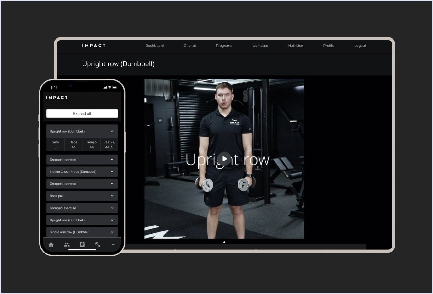
In terms of UI, we chose the dark theme of the app to highlight the determination and focus on progress. We also created clear and handy dashboards and a convenient management system to build fitness programs.
Let’s compare two PWA design examples of the Impact fitness app for desktop and mobile.
Desktop PWA
As for the PWA design for the desktop, you may extend the grid, add some spacers and graphical elements such as illustrations or photos (optional). The Impact desktop version is clear and coherent with a minimalistic design. The PWA example of Impact for desktop is extended and has diverse features. Below you can watch a brief video showing the desktop version.
Mobile PWA
When it comes to a version for a mobile device, first of all, define the most necessary and popular content. Remember that the visitors of your progressive mobile website usually use several core features. For example, they may want to pay a bill and get a receipt or search for a hotel room and book the most suitable option.
Bearing this fact in mind, add the most required functionality to the navigation bar. This way, users will always have the commonly used functions at their fingertips.
In general, the Impact PWA has an appealing design and intuitive and functional user experience. You can see a short video below about the outcomes our client got at the end of the mobile PWA development.
Further reading: How to Create a Fitness App: Codica's Expertise
Tip 2. Keep it simple
The more hurdles the customers have to go through, the bigger the chances of them walking away. And this is an absolute truth.
A good design means a user-oriented interface. Throughout the PWA development, remove all sections or details that end users can easily do without.
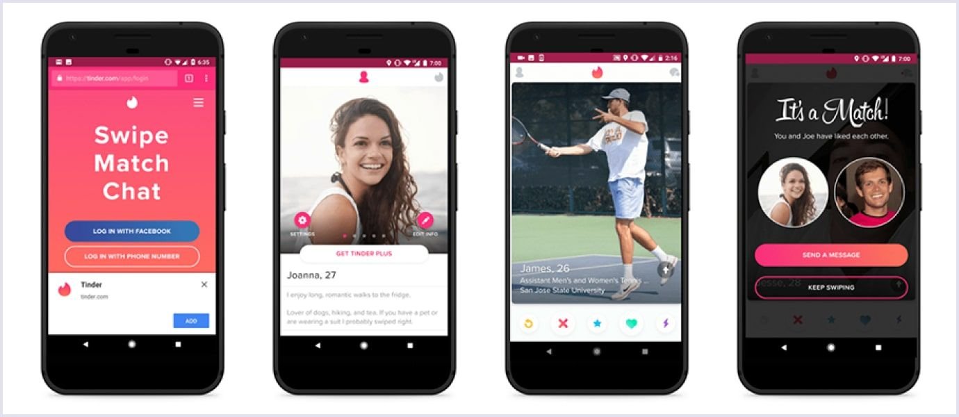
Below is an example of the Tinder PWA. It is one of the most well-known dating apps nowadays, allowing users to like or dislike other users. Thanks to the PWA, Tinder engages more people that join and remain. The Tinder PWA is simple and convenient with an understandable interface, so a large audience can use and enjoy it.
Interactions on Tinder are in a fast, responsive manner. The main advantage of this PWA are the effortless and intuitive navigation. The bottom banner is fixed and simplified. Thus, it makes the whole web solution completely simple to use.
Tip 3. Reduce ads quantity
The PWA is a concise app. It means you don’t have a lot of space to place many advertisements. Keep in mind that too many ads make the reading experience worse for users.
Indeed, you and your customers need to monetize by placing ads, but you should find an optimal way to do it. For instance, you can leave smaller or fewer ads or switch to another monetization model.
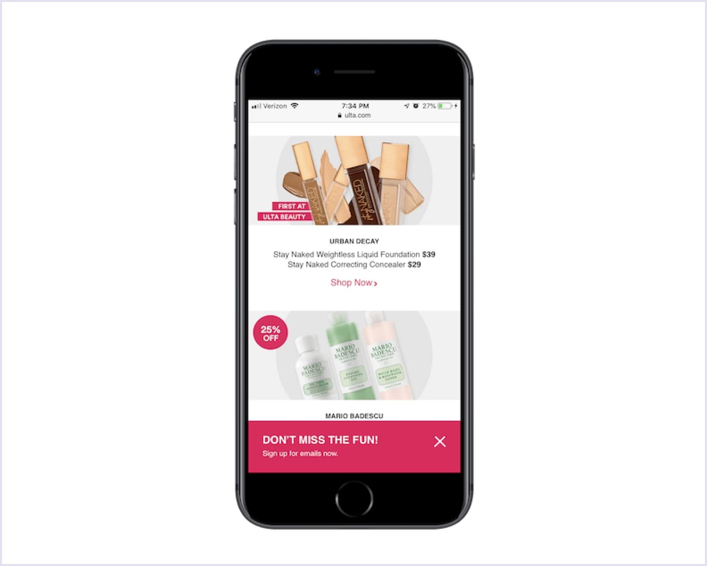
The beauty brand Ulta handles ads by minimizing them and providing users the choice to click on them.
Further reading: Website UX Discovery Process: Roles, Tools, and Main Steps in Web Design
Tip 4. Get rid of the footer
Footer has the same information on every page. It is a typical place for copyright notices, terms and conditions of use, links to social media accounts, and newsletter signup.
Sometimes, this page element takes up too much space. While it is not an issue for large desktop screens, mobile device screens don’t have that much area. Given that, it is not surprising that there is no footer in native apps. It means that progressive web apps should follow their lead.
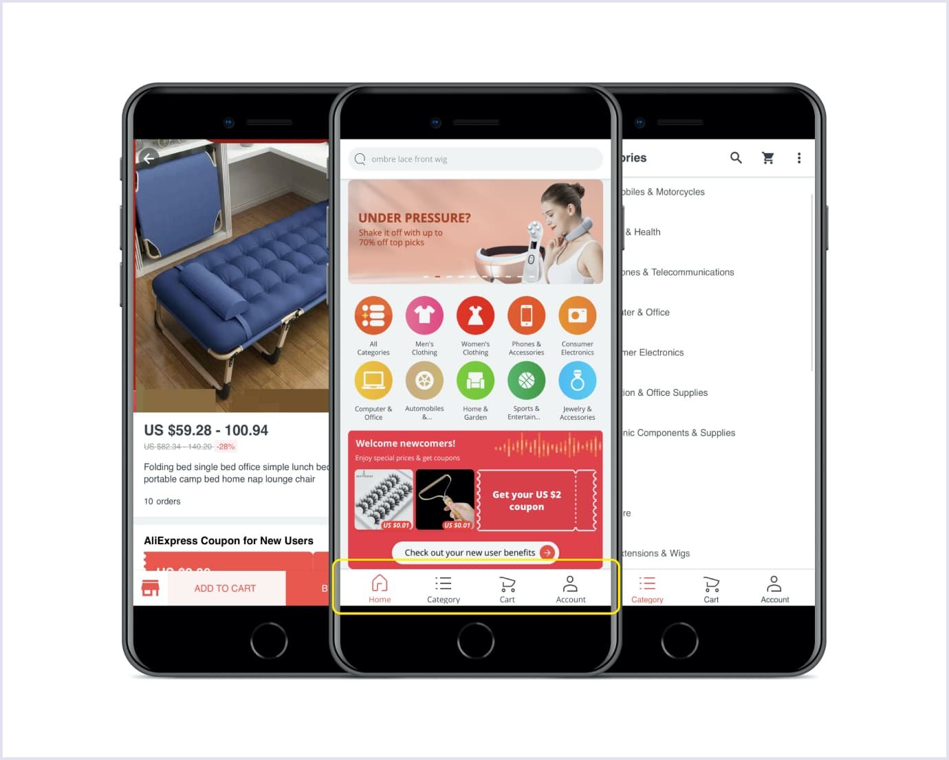
It will be a good idea to define the most important navigation items and create a navigation bar. Below you can see how AliExpress successfully adopted this tactic.The buttons have the right size with a proper range of the thumb zone. As a result, users can get immediately to the most important pages or actions.
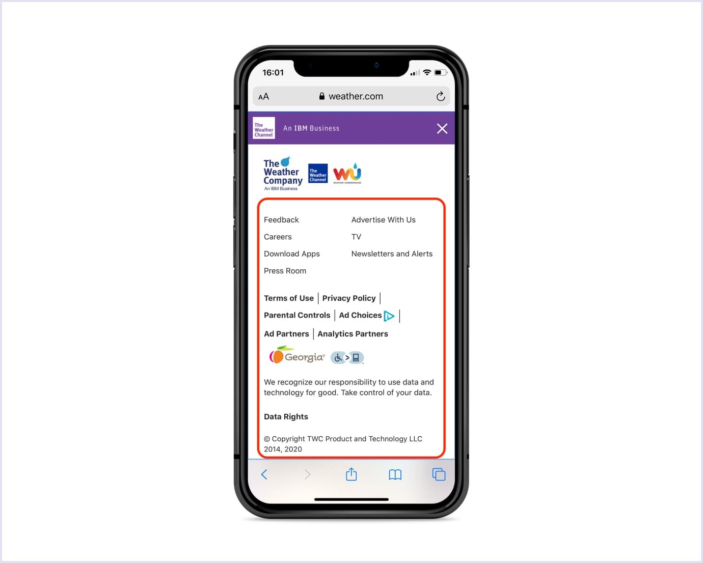
If you have some additional information that could not fit into the navigation panel, you can move it to the menu. The example below by the Weather Channel illustrates how to do this the right way.
Tip 5. Retain the exact scroll position of the list
Suppose a user looks through a list of articles or products. They click on a particular item to get more information. After specifying the item details, the user wants to return to the list.
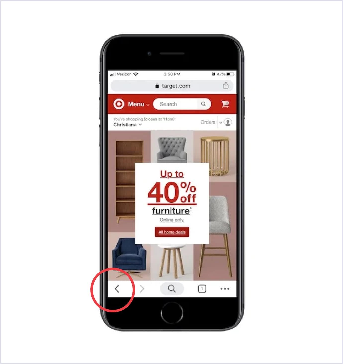
Your main task is to get them back to the exact scroll position they were in. Otherwise, users will be annoyed when they are redirected to the top of the list. Therefore, the “back” functionality becomes an important element of progressive web design.
Below you can see an example of the Target shop PWA. Target made a “back button” clear and quite big. So users don’t need to look for it. They can easily find this button. Thus, it is convenient for users to scroll through web pages and return where they want.

Tip 6. Show interaction
When users tap a button, link, or menu section, they must see that the tap was recognized. For this purpose, you may highlight the selected area with a different color. Also, you can to add an instant start of a webpage transition.
Still, ensuring that the instant start function is not triggered accidentally when a user clicks an app element to scroll is essential.
Wego is a good example of a PWA that shows interaction the right way. Every tap on the webpage is highlighted with different colour. So, it makes user journey more convenient and clear.
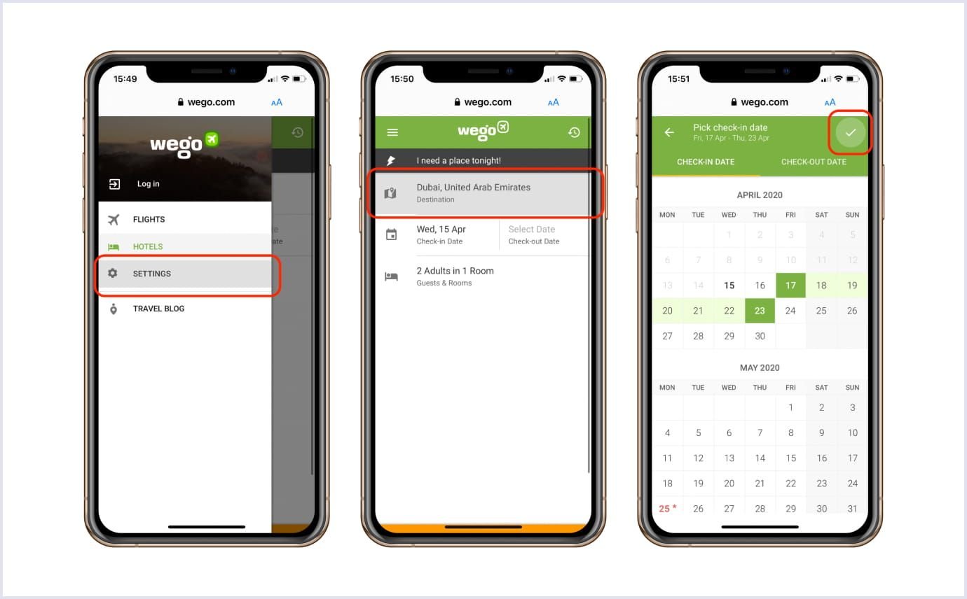
At the same time, when you implement the touch feedback as a part of progressive web app UX design, check that it does not trigger by mistake. This can happen when users only touch an element to scroll the page.
Tip 7. Ensure smooth page loading
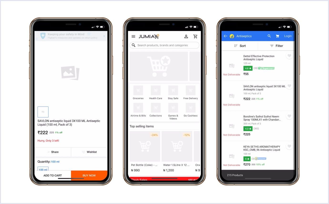
Remember the rule of thumb, when designing a website layout: all HTML image tags on your webpage should have the dimension of the image. These tags are instructions on displaying an image on the webpage. In this case, a browser will be able to layout the screen properly even if the picture has not loaded yet.
Otherwise, the content will jump when the visuals are downloaded. Such jumps will negatively influence user experience. To avoid this mishap, you can show a placeholder where the image should be displayed. It can be a grey square or blurred thumbnail.
Let’s see how Jumia solved the issue with loading images.
You may also like: 5 Key Principles for a User-friendly Website
Tip 8. Add custom splash screens
A splash screen (also called boot screen or launch screen) is displayed for 2-3 seconds before an application loads. Businesses often display their logo, the company’s name, or the motto on a splash screen to increase brand visibility.
Besides, this approach makes users’ interaction with progressive web apps more engaging. Make the splash screen right, and your users will enter the app with anticipation. If you make it wrong, they leave your app quickly.

The tips below will help you strengthen your brand with a remarkable splash screen design.
- Customize image size based on the screen size
The right image size is key to creating the best launch screen. Make sure that your chosen visuals are customizable to fit all mobile devices, be it an Android gadget or an iPhone.
- Keep users informed
If your PWA takes some time to load, keep users updated about the progress. Let them know that there are no errors. Thus, consumers will wait more patiently until they can interact with your application.
- Think of a simple but not boring design
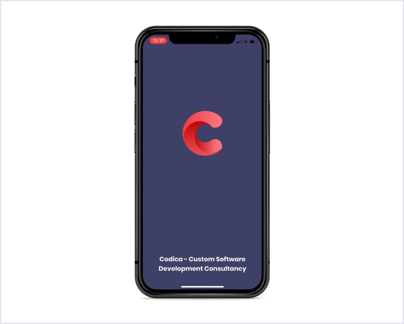
You should create a launch screen with the idea of catching users’ attention in mind. Believe us, you can engage users even with the simplest design. You just need to choose the right color gradient and add some creative elements to the background. The splash screen of Codica’s PWA looks the following way.
You may also like: Choosing a PWA Development Company: Key Points to Consider
Tip 9. Create an attractive home screen logo
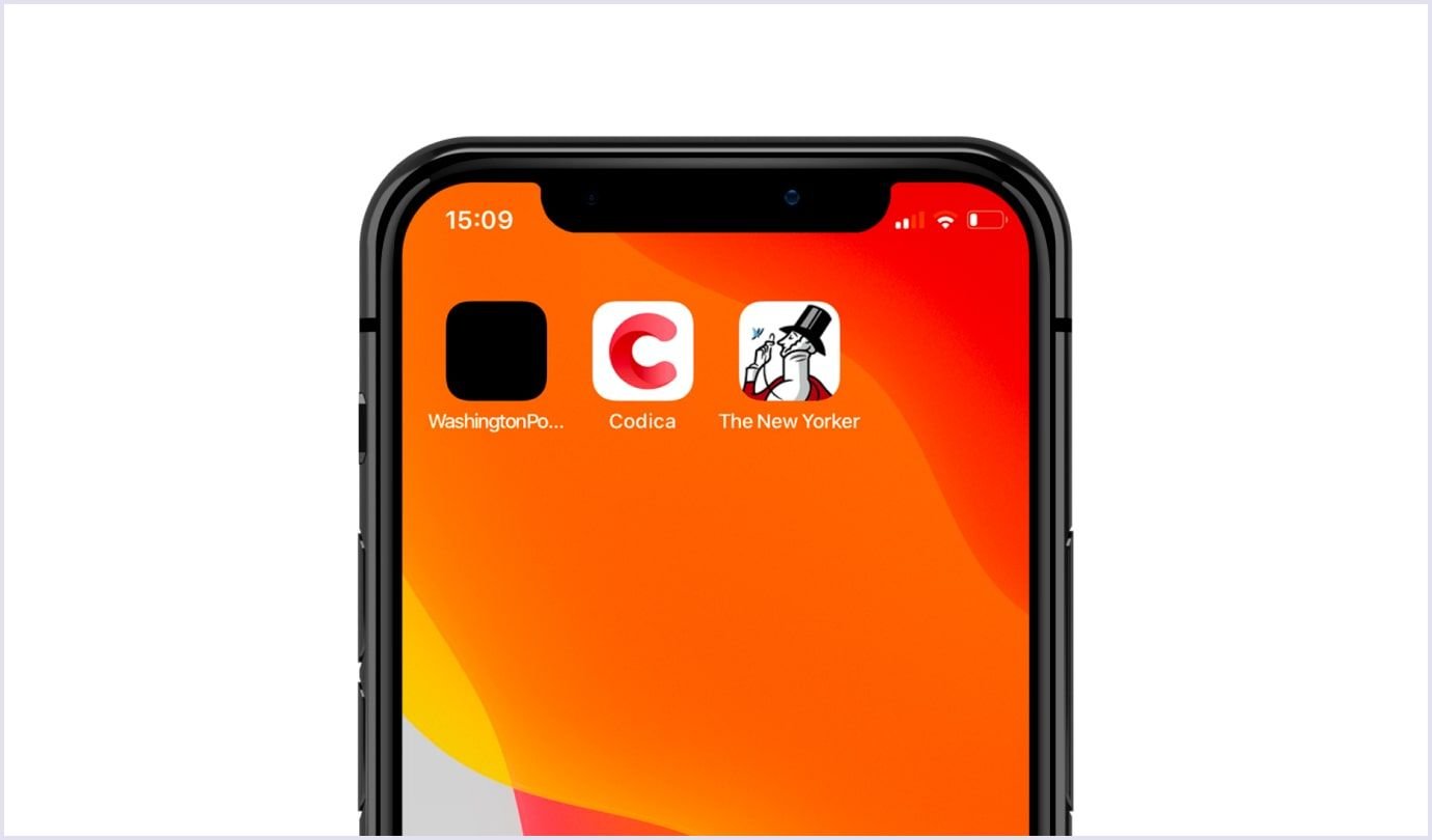
Users will add your PWA to Home Screen, which will stick around with other apps. Therefore, your task is to ensure it will stand out from the crowd. How can you do this? The answer is to create a unique and catching icon.
The following example will show why it is so important. Look at three PWAs from left to the right. These are Washington Post, Codica, and The New Yorker. You will definitely agree that Codica and The New Yorker icons catch your eye.
It's also a good idea to review our detailed guide on custom mobile app development services. There you can also find many exciting things about UI and UX design services.
Conclusion
We believe that with our best progressive web application design practices, you will take your PWA to a new higher level. When everything is done right, you will provide your customers with an exceptional and smooth user experience. In their turn, satisfied users will reward you with increased conversions and engagement.
If you already have an idea of designing a PWA, contact us. Our team has vast experience in PWA development and will eagerly help you grow your business with this innovative technology.

