Web design is art. Still, web design also means functionality and structure, as well as art. Ideally, it makes a platform usable, enjoyable, navigable, and intuitive. Because that is a design that creates the first impression of the businesses for visitors.
To achieve this, there are some “rules” web designers must follow. Often, designers neglect these rules. As a result, business owners lose their money and potential customers.
At Codica, we have been creating a web design for over 7 years. And we know how to make a design that engages shoppers and drives sales. In this piece, we have collected the most common web design mistakes. They annoy website visitors the most. So you will be able to identify and prevent them.
What is a web design, and why is it essential?
Let's begin with the meaning of web design. Web design is what makes the general look and feel when using a web solution. A report by Stanford states that 75% of people judge a brand by its web design. It impacts their feelings in the user journey.
Visual elements of web design are images, text content, colors, fonts, various buttons, forms, icons, and the general layout itself.
What does the right web design bring to the business owner?
First, the right web design increases brand awareness. A satisfied user will recommend the site to their friends or share the link on their social networks. Undoubtedly, good web design is one of the core elements of attracting a wide audience in a short time.
Second, it is an increase in conversion. A usual visit to the site is not interesting for the owner. All business owners crave action from the user. If the visitor like the interface and quickly understands the site, the desire to register or purchase will be much higher. Surely, sometimes visitors will not do this right away. Yet, after a few days, the user will still return to you.
A web designer is a specialist responsible for the design of an Internet project. Designers deal not only with its visual components but also with issues of ease of the site’s usage. Their main task is to come up with a look and arrange the project as a whole so that it is the most convenient and attractive for users.
Do you know what distinguishes a professional designer from others? Attention to detail. A neat and clean design gives a sense of quality and evokes positive emotions in users. So, it influences future sales. Every detail, even if it seems insignificant, can be decisive.
Now it's time to consider the typical web design mistakes designers must avoid making a brilliant design.
15 main web design mistakes: overview
Here is the list of the most common web design mistakes we see in website projects.
1. Low-quality or stock images
This is not a secret that graphics and images are a crucial part of web design. When images are added incorrectly, they can confuse the visitor. However, many companies are still using poor-quality and irrelevant images. Don’t repeat this one of the main website design mistakes.
Poor-quality images will turn off your prospects, which hurts your sales. A buyer will involuntarily think that the business can’t afford a professional photo session. So this means that this brand should not be trusted. Or the goods do not exist at all since the pictures are downloaded from the Internet. Also, irrelevant images will only confuse your potential customers.
It is not advisable to use stock photos. These photos do not inspire confidence among page visitors and cheapen the businesses. Moreover, if you download a picture from a stock, another brand could also download it. So, it will be clear that you are repeating. Often, on stock images, people are with very artificial emotions. And this also can repel the buyer.
If you still use stock images, process them, add branded style elements, and fit the image into the overall design of the site. This maintains style uniformity. Thus, the offer becomes more valuable, and the brand is remembered by the audience. Yet, we recommend trying to take your own photos.
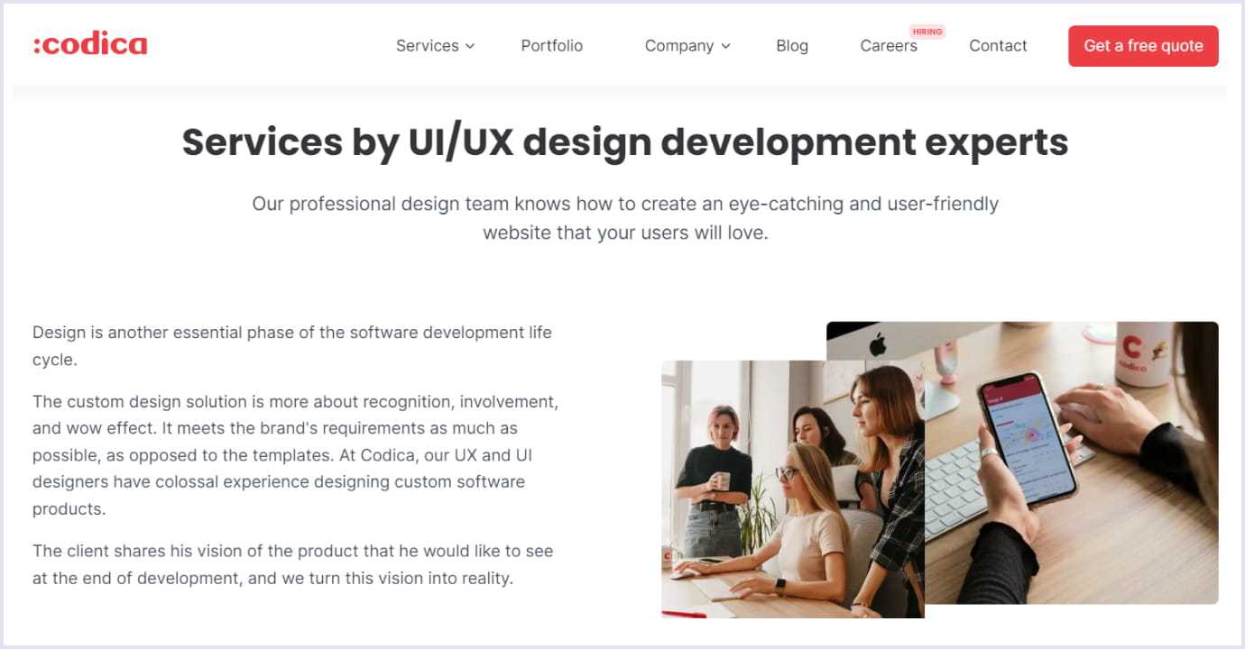
For instance, at Codica, we use photos of our teammates instead of stock photos. The page below demonstrates the custom UI/UX design services we provide.
Also, you shouldn’t clutter your web pages with too many images. Why? They can take the focus from CTAs (call-to-actions), and that leads to a loss in conversions.
Read also: Latest UX/UI Design Trends That You Should Know in 2023
2. Hard to find contact info
A lack of contact information is the next one of the most common web design mistakes.
The moment website visitors define to purchase or order your services is crucial. So, it is essential to provide them with the necessary contact information when they choose your company to order something.
If users search through your solution for contact info for some time, they will likely become frustrated and exit. Keep in mind that the section “Contact Us” should always be one click away from the user. Your company's information should be at the bottom or sometimes on the top of every page.
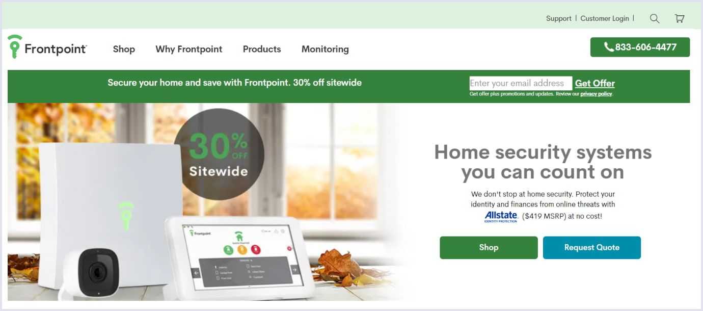
Below you can see an example of clear contact information by the Frontpoint shop.
3. Unclear CTAs
A CTA is a link, banner, or button that tells the user on your site what to do next.
When potential customer scrolls through your web page, they may see a CTA telling them to "Create an account," "Buy now," or "Download here." In general, CTA is a call to a specific action.
Some of the powerful website CTAs that will help you to achieve your digital marketing goals include the following:
- Get Started,
- Add to Cart,
- Sign Me Up,
- Contact Us,
- Order Now,
- Shop,
- Subscribe,
- Buy Now.
Not implementing a clear call to action at the appropriate places can result in not converting many prospects. Overusing CTAs can also lead to annoying website visitors. So, it is crucial to avoid this one of the website design mistakes and add CTAs thoughtfully.
Below you can see how Apple implemented a short and working call to action on their website.

4. Wall of text
A solid wall of text puzzles and scares off users. Users do not read all the text about products and services on the site's main page. All of us are really busy and don't want to spend time reading a lot of material. The Nielsen Norman Group states that users read about 20% of the text during an average visit. So, it is important to grab users’ attention without overdoing it with the text.
Use the following things to make the text pleasant to read:
Use many headings to separate each section in the text. Headings inform readers about the main content of the page. However, do not make too long slogans and appeals. They look visually sloppy. And they can also cover important background elements - this should also be avoided. If you have a long title, try splitting it into several parts.
Paragraphs should be short because long ones are difficult to perceive.
Use bulleted lists. If the text contains a sentence with several homogeneous points, make a few paragraphs.
Highlight key phrases. It is better to highlight the most important with bold fonts, but don't overuse the selections.
Also, a single distance between the semantic blocks of the page is an important condition for the perception of information. Keep thematic blocks equidistant from each other. Otherwise, one gets the impression that they have different significance. Also, the pages look sloppy.
There must be enough free space on the website. Don't make too small indents. The right amount of "air" increases the users' comfort. So they spend more time on the platform. If the blocks are too close to each other, then it seems that all this is one big text.
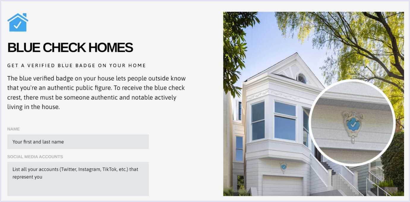
Below you can see a great and light-looking design with text enjoyable to read by Blue Check Homes.
5. No optimization across various devices
Users open web pages on mobile apps almost as much as on desktops. So, your web design should work amazingly on screens of all sizes. If you don’t make the design responsive to desktop devices and mobile-friendly, you can lose out on conversions and sales.
Sometimes designers create the desktop website design first, then make the mobile interface. Others put efforts into the design of mobile apps. However, they don’t observe user behavior sufficiently. This is also one of the biggest web design mistakes.
At Codica, we always research to understand what devices will the majority of the target audience of our client use. These can be desktop, mobile, or tablet devices. It is crucial to understand the main priority in web design development.
To define the priority in development, we deliver the product discovery services. Here you can watch a video about this practice.
Related reading: Website UX Discovery Process: Roles, Tools, and Main Steps in Web Design
In general, the product discovery phase helps us validate the client’s idea before creating a product. So, we can build a solution that faces the real needs of the end-users and avoid many website design mistakes.
Recently, our experts created the design for a cross-platform fitness progressive web application.
This app is intended to connect clients and personal fitness trainers. We made the website design appealing and responsive on both desktop and mobile devices. The web solution can be accessed from any device's web browser. In addition, users don't need to install it.
Thanks to the mobile-friendly app, clients access their applications from the home screens of their mobiles. Trainers mainly use the desktop version. By preparing both mobile and desktop app versions, we were able to meet the needs of clients and their trainers.
Below you can watch a short video that shows the work of this mobile-friendly fitness app.
Related article: How to Create a Fitness App: Codica's Expertise
6. Lots of ads
Advertising on the site is one of the best monetization strategies. However, websites that stick ads through every paragraph are frankly off-putting.
The desires of the website owners are understandable. They want to extract the maximum profit. But, when you overdo advertising, you achieve the opposite effect. The visitor loses concentration and leaves the website without performing the target action.
Because of this, the owner does not receive a client, and the site has an increasing bounce rate. And a high bounce rate is a wake-up call for search engines that it is necessary to show such a site in search results less often. So, this also impacts the search engine optimization of your online business.
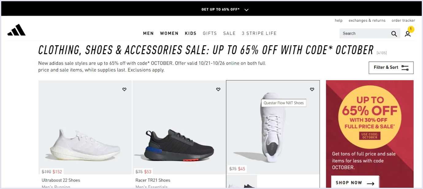
Here is a good example of the right ads added by the Adidas website.
7. Unconvenient search
Many users start looking for a search box when they just enter a site. Maybe they know exactly what they're looking for or just don't want to spend time learning about the structure of a website.
Search is essential, whether it's a big site or a small business, whether it's an online store or a blog. Users may come looking for a specific product or service, and they most likely want to find everything with a quick search.
Sometimes, site owners like to arrange a whole quest in search of the necessary goods. This can cost lost orders. But what is the solution? When searching for a product on the site, the user should understand that the intent of their request is taken into account.
If the search cannot be tailored to the user, suggest they go to the site's main categories or the catalog and search for something there.
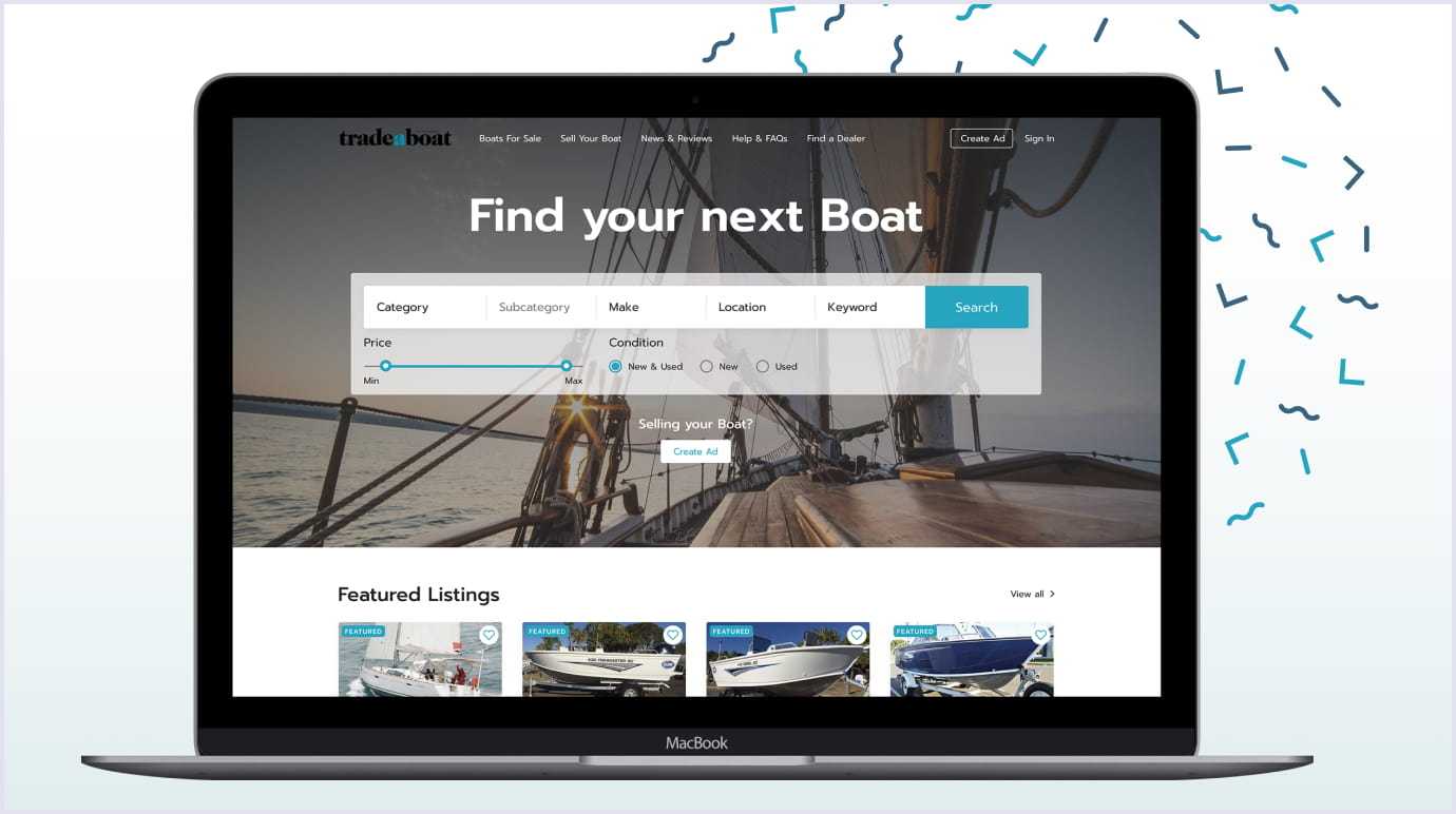
Recently, the Codica team worked on the boat sales marketplace development. The client applied to us to redesign and improve the existing solution. In terms of UX (user experience) design, we have enhanced search filters. So, we made the search more intuitive, structured, and user-friendly.
New website search brings visitors to the products, services, and content they’re looking for in a shorter time. Thanks to the search improvement, we helped the client to engage more users to stay on the website and shop.
You may also like: How We Delivered Boat Selling Website for Tradeaboat (Case Study)
8. Irrelevant pop-ups
Pop-ups are specific messages that automatically open on a web page while users browse the content.
When implemented correctly, pop-ups can attract potential customers to businesses. In contrast, irrelevant pop-ups hinder viewers consume the content, especially on mobile devices. So, users will leave your platform very quickly.
You should place pop-ups in a way that they don’t annoy users. The following tips can help you:
- Develop pop-ups to appear only if a visitor has scrolled down 70% of the site page.
- For the experiment, display a floating banner pop-up that lets a visitor start your solution trial.
- Make sure that the design of the popup matches the overall web design.
- Create the CTAs on the pop-up to be understandable and actionable.
- Select the applying fonts, spacing, and color contrast to streamline your conversion rates.
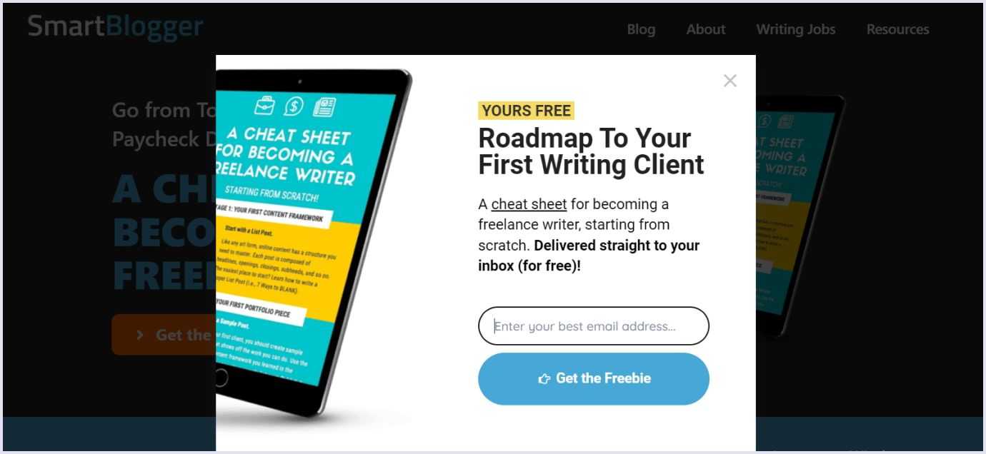
Below is an example of a pop-up by the Smartblogger educational platform.
9. Obscure brand message
Surely, branding is far greater than logo design. Right branding helps create brand awareness.
A unified feel and look of your solution allow users to go beyond your offerings. They will identify with the things your business and brand represent.
A great example of successful branding is the Airbnb rental marketplace.
Like many present-day brands, Airbnb used messaging that people respond well to. But what helped the Airbnb business stand out? Humanity. In contrast with many overpriced hotels with nameless staff, Airbnb enabled people to open their houses to travelers.
Thus, people staying in these houses will relate to them as to their homes. Airbnb's slogan, “Belong anywhere,” reflects its main message to users.

Nowadays, Airbnb's market capitalization is almost 73.15 billion. This brand has successfully gained the confidence of customers and grown into a real market giant.
So, it is vital to develop your own website style. Use specific colors and illustrations that will be associated only with your brand. Strive for style consistency at all levels of site design - typography, colors, and illustrations.
10. Visual noise
The noise effect occurs when there are too many elements on the page. Maybe separately, these elements are beautiful, but when they are together, it can be confusing, and the main thing is lost. Measure in everything is an excellent rule for website designers!
Sticks, dots, strokes, circles, and ticks are the favorite decorations of many novice designers. But it is not worth littering the design with unnecessary elements.
It is essential to understand the difference between noises and details. By working with the details, you improve the website design. By using noise, you worsen it. Noises litter the space. They don't reflect the idea and style of your brand. On the contrary, details are an indicator of your expertise.
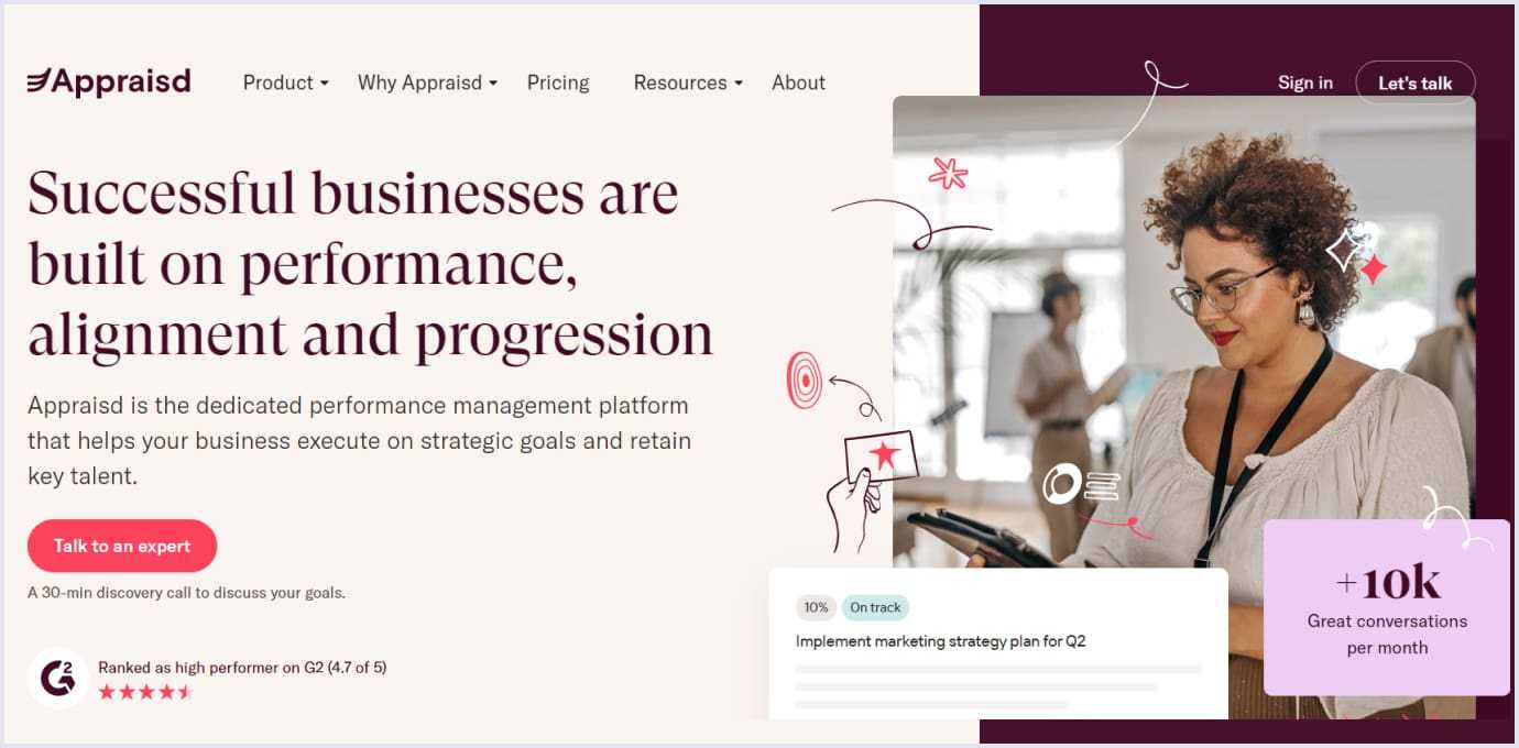
This is an example of a clear and appealing design by the Appraisd performance management platform.
You may also like: Progressive Web App Design: 9 Tips for Great PWA UX and UI
11. Motion design overuse
Dynamic animation can become the advantage of the site, or it can spoil its impression. Here you should follow the golden mean and not oversaturate the page with the number of gifs and other video elements. An excess of animated objects distracts the user from the purpose of the visit.
Too active use of motion design and gif animation does not solve business problems. Why? Because they perform a decorative function without inducing sales. In addition, the site should be convenient for users who access it from any device and with any connection quality. And a large number of moving elements slows down the page.
This mistake is often made by novice designers who want to be creative and make the visual colorful. It is important to remember that any creativity in the context of business tasks should be appropriate. You should analyze competitors' offers and identify what works for them.
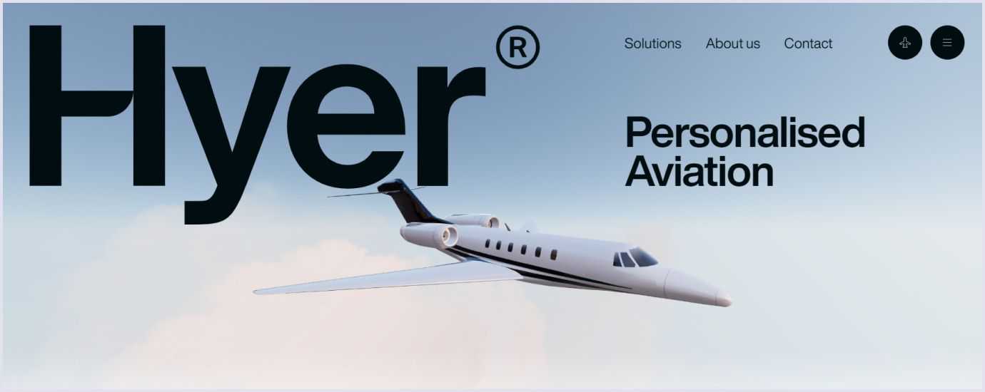
For instance, the FlyHyer website used motion elements on the first page but in moderation. So, it looks eye-pleasing and, at the same time, grabs users’ attention.
12. Sophisticated registration forms
This is one of the most common web design mistakes of experts who make designs for web solutions. It seems to them that the more information they request at once, the better they will know customers. And eventually, convert them into customers. But this does not work. When a person sees that it may take them more than 10 minutes to fill out the form, they simply leave the site. Then they better go to a competitor, where it will take up to 2 minutes.
Ideally, when the contact form has a maximum of 4 lines, 2 is even better. Usually, this is a name and one of the contacts (phone, mail). The optimal time to complete the form is 2 minutes.
If this is an online store, then you should divide the form into several blocks (information about the client, delivery method, payment method, etc.). But it should still not take more than a couple of minutes to make an order.
By the way, we have a short video for you about web design trends. It will help you to find great ways to improve the design of your digital solution.
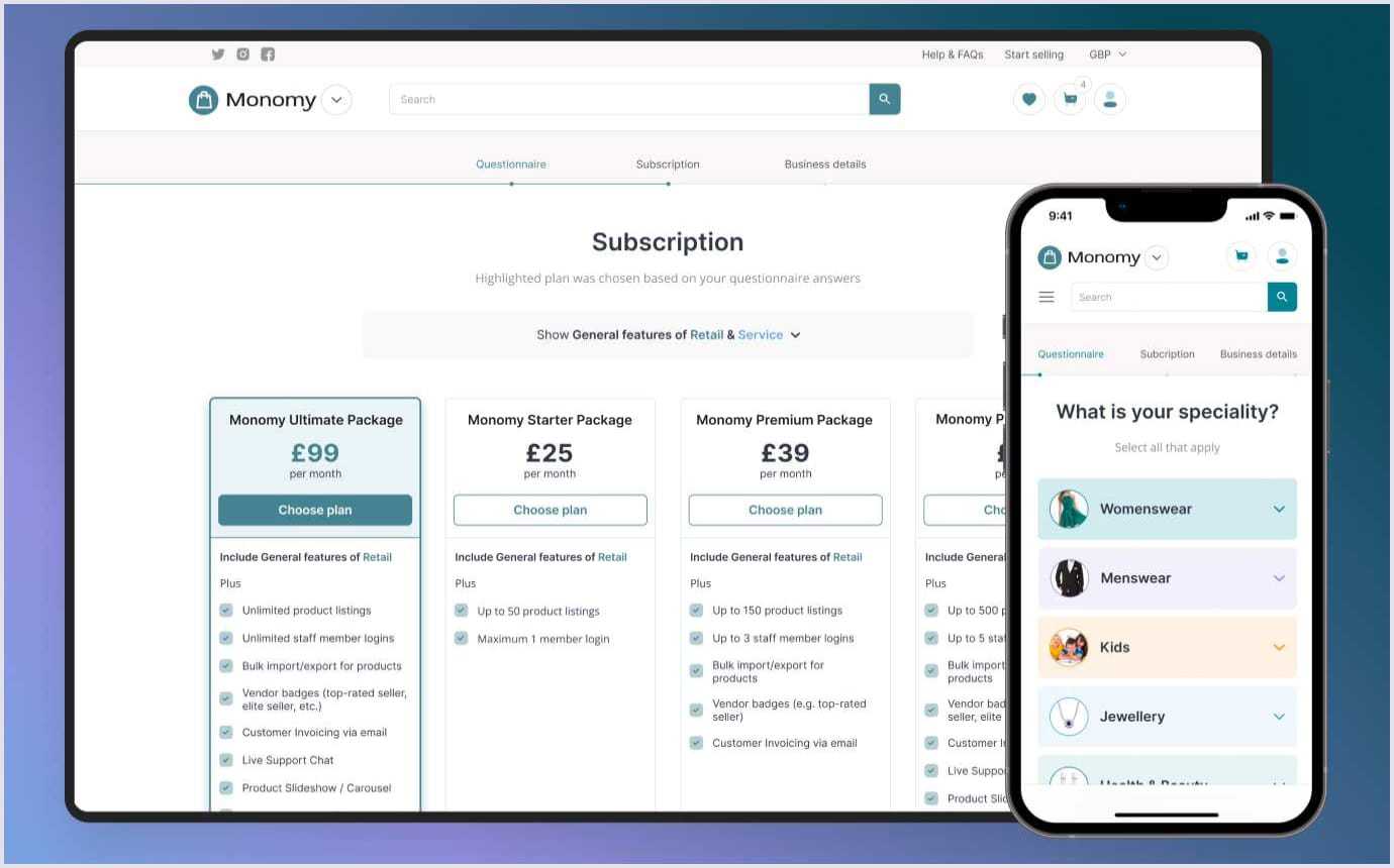
Not long ago, Codica's experts worked on custom e-commerce solution development. And we created the interactive sign-up feature for sellers.
So, when vendors aim to register on this e-commerce site to trade services or products, they should fill in the questionnaire form. For that, they answer certain questions.
The sign-up form is clear and enjoyable, with icons on which vendors can click to answer questions. With these answers, suppliers are offered the most appropriate membership type for them in the end.
This way, the small business does not pay as much for a subscription as the big store. Moreover, if the user sells just services, they will not pay for the functionality of trading goods.
Recommended reading: Minimum Viable Product Design: How to Build a Successful MVP
13. Inappropriate location of product cards and categories
Placing promotional or popular products on the main page is a common and understandable decision. It immediately pushes the user to go to the catalog. But sometimes, designers overload the page with product cards, which is confusing. The goal is to show the customer a variety of products, but the result is the opposite.
Too much choice scares away. And this is the next of the main website design mistakes.
Pay attention so that the user does not run up eyes from the number of products. Group them into categories and work on accessible, simple, and smart navigation. It helps to increase conversions.
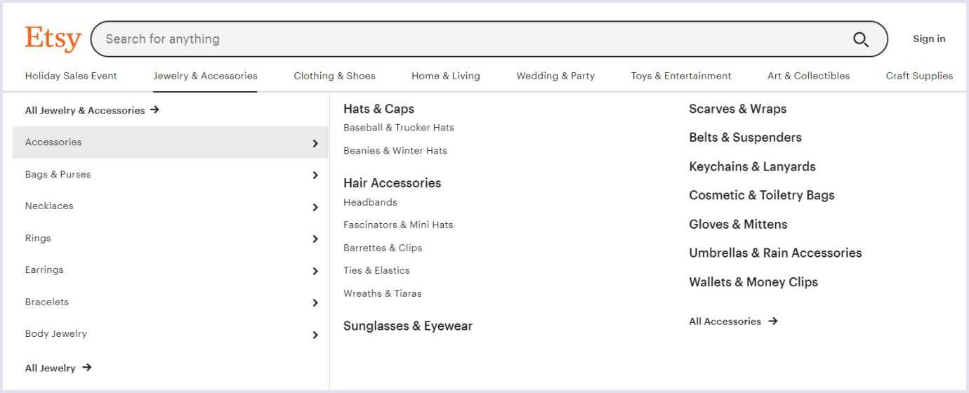
Focus on successful websites that demonstrate the competent organization of the page space. For instance, Etsy. The categories of products on the Etsy site are simple and convenient, despite plenty of them.
Read also: 5 Major Principles for a User-Friendly Website You Need to Know
14. Un-modern design
Regardless of your industry, your website must be up-to-date in both technological and design aspects. It is essential for customers to know that the brand is keeping up with the times.
This also applies to modern product cards, news feeds, recent publications on the company's blog, and current promotions. Your audience may not follow new design trends, but they will intuitively feel cared for if you make a quality web product.
For instance, Codica’s experts redesigned the TradeRVs caravan selling website. It is a complex project intended for campers in Australia. There, they can sell or buy new or used motorhomes, caravans, camper trailers, and other recreational vehicles.
The client wanted to obtain complete website redesign services for the existing platform. So, we improved the previous solution, developed a new web design, and integrated the website with third-party apps. Thanks to the new modern design and other improvements, our client enhanced lead generation performance by 480%.
Below, you can see a Youtube video that demonstrates how this platform works.
15. Wrong color combinations
The main professional quality of a designer is observation. So, it is necessary to constantly develop a sense of beauty and follow the trends of graphic design. Knowledge of color and understanding of the psychology of its influence are important competencies.
Users are annoyed by flashy color combinations and bright navigation elements on a neutral background. They do not like a large number of shades in one picture. In this case, the visitor does not understand what to pay attention to and how the semantic hierarchy of the page is built. Don't forget that a color is an effective tool that emphasizes what is important.
Furthermore, make sure that the accents are placed correctly. So, you should not highlight the heading with a too-narrow color block. The title is already noticeable due to the font size. It is better to use one color for the entire semantic fragment, separating it from others.
One of the most common mistakes is picking a shade that is too pale for a typeface. Light grey on the white background, for instance. In this case, the text readability may suffer.
It is necessary to build effective communication with the client. You should create the necessary emotional connections and increase sympathy for the brand.
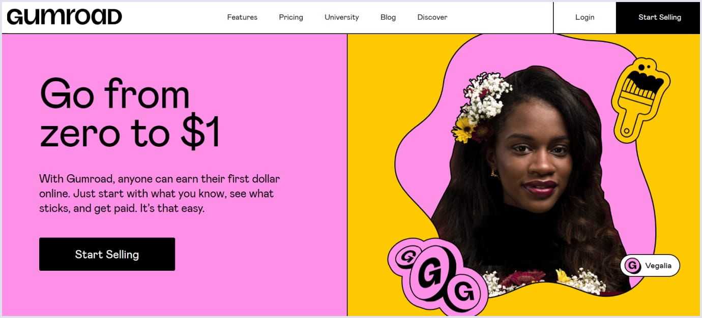
Below is a great example of a beautiful and vivid design by the Gumroad web solution.
You may also like: Online Marketplace Design
Let your business evolve with stunning design
Mistakes are an invariable part of reaching a new level of knowledge. We hope this piece has assisted you see many common mistakes to fix them.
There are hundreds of examples of beautiful and stylish websites, but dozens of them really sell. Therefore, you definitely need analytical skills and the ability to look at the design critically from the client's side. In this case, the design will become a strong tool for increasing profits.
If you already have an idea for a web design and are looking for a partner to implement it, contact us. You can check our web applications portfolio and company profile on Behance to ensure our expertise. Our team will be pleased to help you succeed.


